Worksheet 14: Student’s t-Distribution and Statistical Power
Learning Objectives 🎯
Master the conditions for applying Student’s t-distribution confidence intervals
Construct confidence intervals when population standard deviation is unknown
Evaluate assumptions of normality through graphical diagnostics
Distinguish between Type I errors, Type II errors, and statistical power
Derive formulas for determining optimal sample sizes to achieve desired power
Apply R programming for assumption checking, confidence interval calculation, and power analysis
Introduction
In this worksheet, we continue our exploration of statistical inference, now addressing situations where the population standard deviation \(\sigma\) is unknown. When \(\sigma\) is unknown, we must estimate it from the sample data using the sample standard deviation \(s\). This introduces additional uncertainty into our inference.
As a result, our pivotal statistic changes from a standard Normal distribution (Z-distribution) to a Student’s t-distribution. The Student’s t-distribution, developed by William Sealy Gosset, accounts for this additional uncertainty and has heavier tails than the Normal distribution, especially for smaller sample sizes.
A crucial feature of the t-distribution is its degrees of freedom (df), which equals the sample size minus one \((n-1)\). Degrees of freedom reflect how many independent pieces of information are available to estimate the variability after accounting for the estimated mean.
Assumptions for t-Distribution Inference
Before applying confidence intervals based on the Student’s t-distribution, it’s essential to verify that the necessary assumptions are adequately satisfied. Recall from previous explorations, including your investigation of the Central Limit Theorem (CLT) with different underlying population distributions, that inference procedures rely on specific conditions being met:
Critical Assumptions ⚠️
1. Random Sampling (Independence):
Data must originate from a simple random sample (SRS) drawn from the population. The formula for inference using Student’s t-distribution explicitly assumes independence among observations. If your sampling scheme involves stratification, clustering, or systematic sampling, standard formulas require modification.
2. Normality or Approximate Normality:
The procedures assume the underlying population distribution is Normal or approximately Normal. Based on your previous explorations, recall the CLT helps justify this assumption for large samples when the population is not severely skewed or heavily tailed:
When the population distribution is symmetric and unimodal, the t-distribution methods are robust even for moderate or smaller samples
With small samples from heavily skewed, discrete, or strongly non-normal populations, the confidence interval may fail to achieve the desired coverage
Discrete data can be particularly problematic if there are few unique values or a substantial lack of symmetry
3. Unknown Population Standard Deviation:
When the population standard deviation is unknown and must be estimated from data \((s)\), additional uncertainty is introduced. The Student’s t-distribution explicitly accounts for this uncertainty by widening intervals, especially for small sample sizes.
Warning
The sample mean \(\bar{x}\) and standard deviation \(s\) are non-resistant statistics; thus, outliers can substantially distort both your point estimate and the resulting confidence interval. Resistant methods do exist (for example, median-based procedures or robust methods) if non-removable outliers or heavily tailed distributions are evident.
Note
The confidence interval margin of error specifically measures only random sampling variability. It does not capture or account for systematic errors, such as bias introduced through measurement errors, flawed sampling procedures, nonresponse, or improperly defined populations.
Part 1: Analyzing Chick Growth with Confidence Intervals
Consider the built-in dataset ChickWeight in R, which records the weights of chicks at different time points as they grow. Suppose researchers are interested in studying the growth patterns of chicks and how diet influences their weight over time.
Question 1a: Descriptive Statistics
First, compute descriptive statistics for the chick weights at each recorded time point. For each time point, compute the sample size \((n)\), mean \((\bar{x})\), median \((\tilde{x})\), sample standard deviation \((s)\), and interquartile range (IQR). Report your results for time points 0, 10, and 21 below.
Time |
n |
\(\bar{x}\) |
\(\tilde{x}\) |
s |
IQR |
|---|---|---|---|---|---|
0 |
|||||
10 |
|||||
21 |
Question 1b: Visual Assessment of Normality
Next, visually assess the distribution of chick weights at each time point by plotting histograms with overlaid smooth kernel density curves and fitted Normal curves. Arrange these plots in a clear grid layout, labeling each time point clearly.
To further investigate the normality assumption required for the validity of Student’s t confidence intervals, create QQ plots for chick weights at each time point.
Your Task: Describe the steps needed to display these visualizations (histograms with density curves and QQ plots) in a clear, grid-like format. What R packages and functions would you use?
R Visualization Exercise 🖥️
Creating Diagnostic Plots for Normality Assessment
You’ll need to create two types of plots:
Histograms with density curves: Use
ggplot2withgeom_histogram()andstat_function()to overlay a normal curveQQ plots: Use
ggplot2withstat_qq()andstat_qq_line()
Consider using facet_wrap() or gridExtra::grid.arrange() to display multiple time points together.
Starter code structure:
library(ggplot2)

data("ChickWeight")
# Filter data for specific time points
chick_subset <- ChickWeight[ChickWeight$Time %in% c(0, 10, 21), ]

# Compute per-time means and sds (base R)
m_by_time  <- tapply(chick_subset$weight, chick_subset$Time, mean)
sd_by_time <- tapply(chick_subset$weight, chick_subset$Time, sd)
times <- as.numeric(names(m_by_time))

# Build per-time Normal-fit curves without dplyr
norm_df <- do.call(
rbind,
lapply(times, function(t) {
   w <- chick_subset$weight[chick_subset$Time == t]
   x <- seq(min(w), max(w), length.out = 200)
   y <- dnorm(x, mean = m_by_time[as.character(t)], sd = sd_by_time[as.character(t)])
   data.frame(Time = t, x = x, y = y)
})
)


# Histogram with KDE and fitted Normal curves
ggplot(ChickWeight, aes(x = weight)) +
geom_histogram(aes(y = after_stat(density)), bins = 9, color = "gray30", fill = "gray80") +
geom_density(color = "blue", size = 0.9) +
stat_function(
   fun = function(x) dnorm(x, mean = mean(x), sd = sd(x)),
   color = "red",
   linetype = "dashed",
   size = 0.9
) +
facet_wrap(~Time, scales = "free") +
labs(title = "Histograms with Kernel Density and Normal Curves",
      x = "Chick Weight (grams)",
      y = "Density") +
theme_minimal()


# QQ plots by time
ggplot(ChickWeight, aes(sample = weight)) +
stat_qq(color = "black", size = 2) +
stat_qq_line(color = "red", lwd = 1.5) +
facet_wrap(~ Time, scales = "free") +
labs(title = "Normal QQ-Plots for Chick Weights by Time",
      x = "Theoretical Quantiles",
      y = "Sample Quantiles") +
theme_minimal()
Question 1c: Evaluate Normality Assumptions
Using the histograms and QQ plots you generated, evaluate the assumption of normality at each time point. Briefly comment on the appropriateness of using Student’s t-confidence intervals based on your visual assessments.
Note
Consider the following when evaluating normality:
Do the histograms appear roughly symmetric and bell-shaped?
Do the QQ plots show points falling close to the reference line?
Are there any outliers or strong departures from normality?
How does sample size affect the robustness of t-procedures?
Your Assessment:
Time 0:
Time 10:
Time 21:
Question 1d: Construct Confidence Intervals
Construct 95% confidence intervals for the mean chick weights at each time point using the confidence interval formula:
where \(df = n - 1\) and \(t_{\alpha/2, df}\) is the critical value from the t-distribution.
Confirm your calculations are correct by using R’s built-in t.test() function. Report your results for time points 0 and 21 below.
Time |
Manual Calculation (95% CI) |
R t.test() Calculation (95% CI) |
|---|---|---|
0 |
||
21 |
Show your work for manual calculations:
Time 0:
Time 21:
Question 1e: Graphical Illustration of Confidence Intervals
Finally, graphically illustrate your results by plotting these confidence intervals.
To visually illustrate your confidence intervals, you can use the ggplot2 package in R. Specifically, you will need to:
Create a dataframe that stores your summary statistics and confidence interval endpoints (lower_bound and upper_bound)
Use
geom_point()to plot the mean chick weight at each time pointUse
geom_errorbar()to add vertical lines representing the confidence intervals
Creating the Confidence Interval Plot 📊
Step-by-step approach:
First, compute confidence intervals for ALL time points in the dataset
Store results in a data frame with columns: Time, mean_weight, lower_bound, upper_bound
Use ggplot2 to create the visualization
w_by_time  <- split(ChickWeight$weight, ChickWeight$Time)

mean_weight <- sapply(w_by_time, mean)
sd_weight   <- sapply(w_by_time, sd)
n           <- sapply(w_by_time, length)
se_weight   <- sd_weight / sqrt(n)
t_crit      <- qt(0.975, df = n - 1)


# 95% CIs
lower_CI <- mean_weight - t_crit * se_weight
upper_CI <- mean_weight + t_crit * se_weight

# Assemble and pretty-print
summary_ci <- data.frame(
Time        = as.numeric(names(mean_weight)),
mean_weight = mean_weight,
lower_CI    = lower_CI,
upper_CI    = upper_CI,
row.names   = NULL
)

summary_ci <- summary_ci[order(summary_ci$Time), ]

# Rounded view similar to your style
summary_ci_print <- within(summary_ci, {
mean_weight <- round(mean_weight, 3)
lower_CI    <- round(lower_CI, 3)
upper_CI    <- round(upper_CI, 3)
})

ggplot(summary_ci, aes(x = Time, y = mean_weight)) +
geom_errorbar(aes(ymin = lower_CI, ymax = upper_CI), width = 0.3, color = "gray30") +
geom_point(size = 2.5, color = "black") +
geom_line(linewidth = 0.7, color = "black") +
labs(
   title = "95% Confidence Intervals for Mean Chick Weights by Time",
   x = "Time",
   y = "Mean Chick Weight (grams)"
) +
scale_x_continuous(breaks = summary_ci$Time) +
theme_minimal()
Interpretation Questions:
Clearly interpret your findings in the context of chick growth.
Are there time points where the confidence intervals overlap substantially? What might this indicate?
What might overlapping confidence intervals suggest about statistically significant differences between certain time points?
Note
Later in the course, we will learn statistical inference procedures (ANOVA and multiple comparisons) to formally compare means across multiple groups.
Part 2: Introduction to Hypothesis Testing
We now build on our understanding of statistical inference, transitioning from confidence intervals into hypothesis testing. In previous sections, we used confidence intervals to estimate unknown parameters. Hypothesis testing is another critical inferential method in statistics, which allows us to formally test claims or statements about these unknown population parameters.
A hypothesis test involves stating two competing claims:
Null hypothesis \((H_0)\): Represents the current belief or status quo
Alternative hypothesis \((H_a)\): Represents the claim we suspect might be true instead
The goal of hypothesis testing is to determine, based on sample data, whether we have sufficient evidence to reject the null hypothesis in favor of the alternative.
Types of Errors in Hypothesis Testing
Due to the inherent randomness and uncertainty present in sample data, hypothesis tests always carry the risk of making incorrect conclusions. Specifically, we must carefully consider two possible types of errors:
Types of Errors 🎯
Type I Error (False Positive):
Occurs if we reject the null hypothesis \(H_0\) when it is actually true. The probability of committing a Type I error is controlled by the significance level \((\alpha)\).
Type II Error (False Negative):
Occurs if we fail to reject the null hypothesis \(H_0\) when it is actually false. This represents a failure to detect an existing effect. The probability of committing a Type II error is denoted by \((\beta)\).
Statistical Power
To quantify our ability to detect effects when they truly exist, we introduce the concept of statistical power:
Statistical power is defined as the probability that a hypothesis test correctly rejects a false null hypothesis. High power (close to 1) indicates the test is effective in detecting meaningful effects when they exist.
In practical applications, we often want to determine the optimal sample size needed to achieve a desired statistical power. Determining the sample size involves specifying:
The magnitude of the difference we wish to detect
The desired significance level \((\alpha)\) (probability of Type I error)
The desired power (probability of correctly rejecting a false null hypothesis)
Part 3: Sample Size Determination and Power Analysis
An agricultural researcher is studying a new fertilizer formulated to increase tomato yields. Historically, a certain variety of tomato plants grown under standard agricultural practices produces an average yield of 18 pounds per plant.
To assess the effectiveness of the new fertilizer, the researcher selects a simple random sample of tomato plants and applies the fertilizer throughout the growing season. The researcher wants to perform a one-sample hypothesis test to determine whether the fertilizer significantly increases the average yield per plant.
Study Parameters:
Historical mean yield: \(\mu_0 = 18\) pounds per plant
Practically meaningful increase: 2 pounds per plant (to 20 lbs)
Desired statistical power: at least 90%
Significance level: \(\alpha = 0.05\)
Population standard deviation (known from previous studies): \(\sigma = 4\) pounds
Hypotheses:
Question 2a: Identifying Regions in Hypothesis Testing Distributions
The graphs shown below illustrate two probability distributions involved in hypothesis testing: one corresponding to the null hypothesis (left curve) and one corresponding to a specific alternative hypothesis (right curve). Each graph shades a different region between or under these curves.
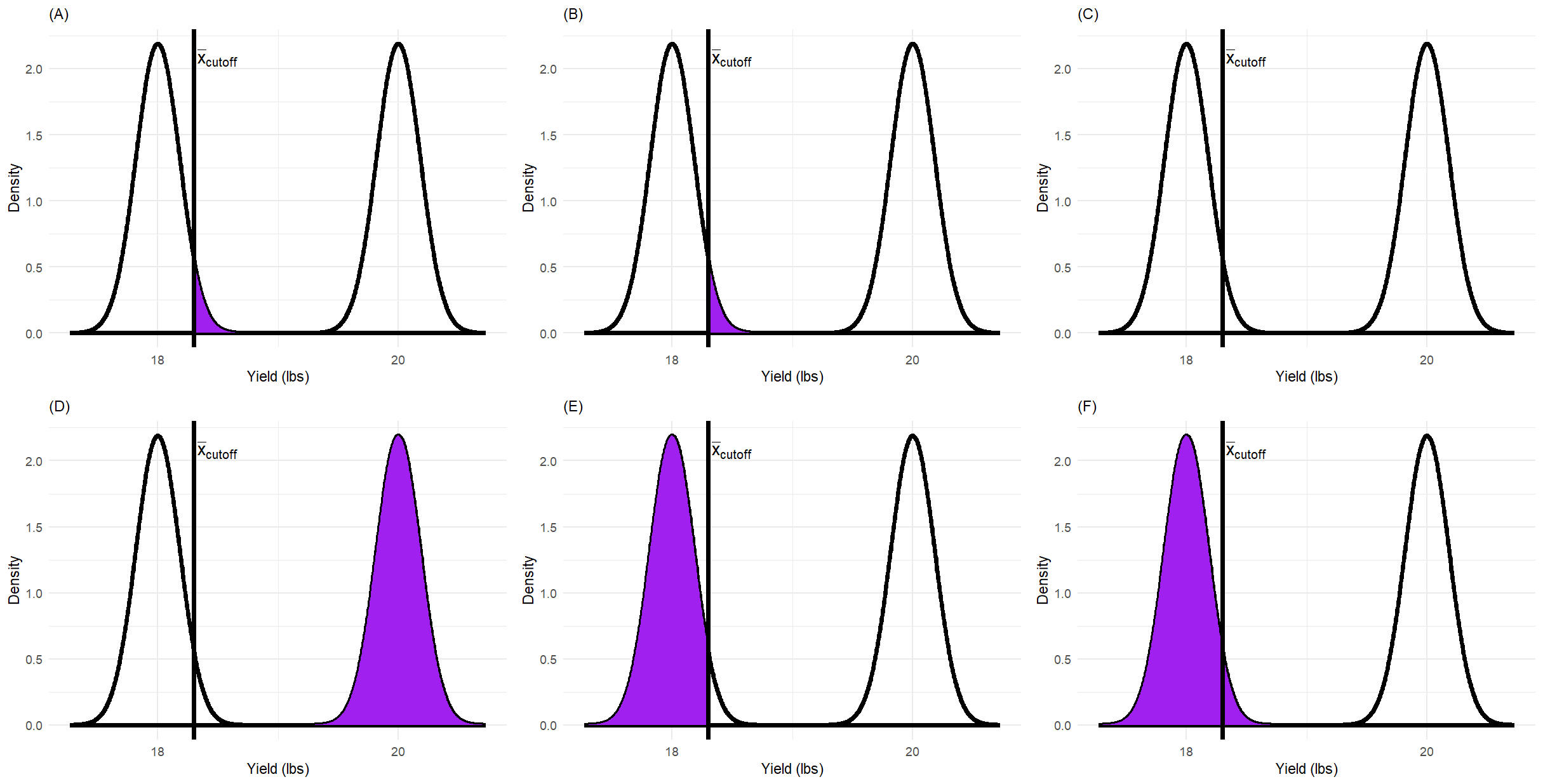
Fig. 4 Figure 1: Six probability distribution plots (A-F) illustrating different regions related to hypothesis testing. Each plot shows two normal curves: one representing the null hypothesis distribution and one representing the alternative hypothesis distribution.
Carefully examine each plot (A)-(F). Your task is to clearly identify which plot represents:
Type I error \((\alpha)\)
Type II error \((\beta)\)
Statistical Power \((1-\beta)\)
Additionally, briefly explain what the shaded regions in the remaining graphs might represent.
Plot |
Represents |
Explanation |
|---|---|---|
Warning
Common mistake: Confusing the distribution under \(H_0\) with the distribution under \(H_a\). Always identify which distribution you’re working with before determining what a shaded region represents!
Question 2b: Derive Minimum Sample Size Formula 🔍
Derive step-by-step the formula and calculate the minimum required sample size needed to achieve the desired statistical power level of 90%.
Given Information:
\(\mu_0 = 18\) (null hypothesis mean)
\(\mu_a = 20\) (alternative hypothesis mean we want to detect)
\(\sigma = 4\) (population standard deviation)
\(\alpha = 0.05\) (significance level)
Desired Power \(= 0.90\)
Therefore, \(\beta = 0.10\)
Derivation Structure:
Guided Derivation Steps 📝
Step 1: Write the formula for the critical value \(\bar{x}_{cutoff}\) in terms of \(\mu_0\), \(z_{\alpha}\), \(\sigma\), and \(n\)
Step 2: Write the formula expressing the relationship between \(\bar{x}_{cutoff}\) and the alternative hypothesis using \(z_{\beta}\)
Step 3: Set these two expressions equal to each other
Step 4: Solve for \(n\)
Step 5: Plug in the numerical values and compute the minimum sample size
Step 1: Critical value under \(H_0\)
Step 2: Critical value under \(H_a\)
Step 3: Set equal and simplify
Step 4: Solve for n
Step 5: Numerical calculation
Note
Remember to look up the appropriate z-values:
For \(\alpha = 0.05\) (one-tailed test): \(z_{\alpha} =\) ____
For \(\beta = 0.10\): \(z_{\beta} =\) ____
Your calculations:
Final Answer: The minimum required sample size is \(n =\) ____ plants.
Warning
Always round UP to the next whole number for sample size calculations, even if you get a decimal like 25.1. Why? Because you can’t have a fractional observation!
Question 2c: Verify Power Calculation
Double-check that your calculation for the minimum sample size is correct by computing power from scratch using your calculated sample size. Report:
The actual value for the power
The value for the cutoff \(\bar{x}_{cutoff}\)
Verification Process:
Using your calculated sample size \(n =\) ____, compute:
a) Calculate the cutoff value:
Your calculation:
b) Calculate the power:
Under the alternative hypothesis \((\mu_a = 20)\), calculate the probability that \(\bar{X}\) exceeds \(\bar{x}_{cutoff}\):
Your calculation:
c) Does the computed power equal (or exceed) 0.90?
Key Takeaways
Summary 📝
Student’s t-distribution is used when the population standard deviation is unknown and must be estimated from sample data. It has heavier tails than the normal distribution, especially for small sample sizes.
Degrees of freedom \((df = n-1)\) determine the shape of the t-distribution. As sample size increases, the t-distribution approaches the standard normal distribution.
Assumption checking is critical before applying t-procedures. Use histograms, QQ plots, and boxplots to assess normality, especially for small sample sizes.
Confidence intervals provide a range of plausible values for an unknown parameter with a specified level of confidence (e.g., 95%).
Type I error \((\alpha)\) is the probability of rejecting a true null hypothesis (false positive), while Type II error \((\beta)\) is the probability of failing to reject a false null hypothesis (false negative).
Statistical power \((1 - \beta)\) measures the probability of correctly detecting an effect when it truly exists. Higher power is desirable for effective hypothesis tests.
Sample size determination requires specifying the effect size to detect, significance level \((\alpha)\), and desired power. The formula involves critical values from both the null and alternative distributions.
R programming provides powerful tools for computing confidence intervals (
t.test()), checking assumptions (ggplot2visualizations), and performing power analyses (pwrpackage or manual calculations).Next steps: We will apply these hypothesis testing concepts to conduct formal tests, interpret p-values, and make statistical decisions about population parameters.
Computational Skills Developed 💻
In this worksheet, you practiced:
Computing descriptive statistics grouped by categorical variables
Creating diagnostic plots (histograms with density overlays, QQ plots)
Calculating confidence intervals both manually and using R functions
Visualizing confidence intervals with error bars
Deriving formulas for sample size and power
Verifying calculations through computational checks
Creating publication-quality statistical graphics with
ggplot2