Slides 📊
2.4. Exploring Quantitative Distributions: Modality, Skewness & Outliers
Histograms reveal patterns that help us interpret the overall shape of a data distribution. In this lesson, we will develop a systematic approach to reading histograms by focusing on three key characteristics: modality, skewness, and outliers.
Road Map 🧭
Identify patterns in histograms by examining their shape, center, and spread.
Distinguish between unimodal, bimodal, and multimodal distributions.
Recognize symmetric versus skewed distributions.
Learn to spot potential outliers that may require further investigation.
2.4.1. Looking for Patterns in Histograms
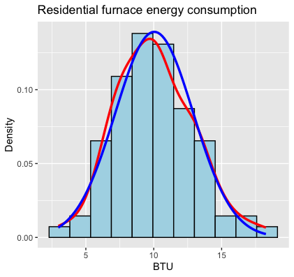
Fig. 2.23 Histogram of the furnace data set (see Section 2.3)
Once we generate a histogram, we begin our data-reading process by noting the basic properties such as the center and spread of the data.
Center: Where is the bulk of the data located? Is there one central location or multiple?
Spread: How widely dispersed are the values around these central locations?
According to Fig. 2.23, the center of the furnace data set is located around 10, and it spans a range between 0 and 20, approximately.
After covering the basics, we move on to classify the shape of the data distribution based on a few key characteristics:
Modality
Skewness
Presence of any potential outliers
Let us discuss each of these characteristics in detail.
2.4.2. Modality: Counting the Peaks
Modality tells us whether our data is concentrated around a single location or multiple locations.
A mode is a local peak in a histogram or density curve. Counting them helps us understand whether the data represents one homogeneous population or multiple distinct subgroups.
Unimodal distributions have a single peak, suggesting that the data is coming from a single population centered around a unique location. Most textbook examples show unimodal distributions in the classic “bell curve” shape just like Fig. 2.23, but a unimodal distribution can take many forms—it only needs to have one primary peak.
Bimodal distributions show two peaks in their histograms. The existence of two centers might indicate that the data was sampled from two different populations with distinct characteristics.
Multimodal distributions have two or more peaks in their histograms, potentially indicating that the data was collected from several different populations.
Caution 🛑
Sometimes, apparent multimodality in a histogram can be an artifact of using too many bins rather than a genuine feature of the data. If the bin count is too large, you’ll tend to see several modes because individual data points are highlighted rather than the overall summary. This is why choosing an appropriate bin size is crucial when creating histograms.
Example 💡: Old Faithful Eruption Data
Let’s examine the eruption data of the Old Faithful geyser in Yellowstone National Park. This built-in R dataset contains measurements on both the waiting time between eruptions and the duration of eruptions themselves. Let us plot the histograms of both variables.
library(ggplot2)
data(faithful) # Load Old Faithful dataset
nbins <- round(sqrt(nrow(faithful))) + 2

# Plot eruption times
ggplot(faithful, aes(eruptions)) +
geom_histogram(bins = nbins, fill = "dodgerblue", colour = "black", linewidth = 1) +
geom_density(colour = "red", linewidth = 1.2) +
labs(title = "Old Faithful eruption lengths – bimodal distribution",
      x = "Eruption time (minutes)", y = "Frequency")

# Plot waiting times using your own code
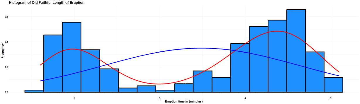
Fig. 2.24 Length of eruption
The histogram of lengths of eruption shows two distinct peaks—one around 2 minutes and another around 4.5 minutes. This indicates that eruptions tend to fall into two categories: shorter eruptions and longer eruptions, with relatively few eruptions of intermediate length.
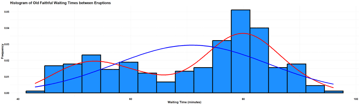
Fig. 2.25 Waiting duration
The histogram of waiting times also reveals two modes—shorter waiting periods and longer ones, with a dip in the middle region around 60 minutes.
The bimodality in both variables reflects the physical processes within the geyser. Short eruptions tend to be followed by shorter waiting times, while long eruptions precede longer waiting intervals. The red density curves capture this bimodal pattern beautifully. In contrast, the blue normal curves clearly fail to capture the two-peaked nature of the data, showing how misleading it would be to treat this data as a simple unimodal distribution.
This example illustrates an important principle: when you encounter multimodality, it often signals the presence of distinct subgroups that should be analyzed separately rather than averaged together.
2.4.3. Symmetry and Skewness
We call a data symmetric if its distribution is reasonably balanced around a central value. When the data is not symmetric, we call it skewed. A data can be right (positively) skewed or left (negatively) skewed depending on the direction of the longer tail:
If the tail stretches toward higher values, the distribution is right (or positively) skewed.
If the tail stretches toward lower values, the distribution is left (or negatively) skewed.
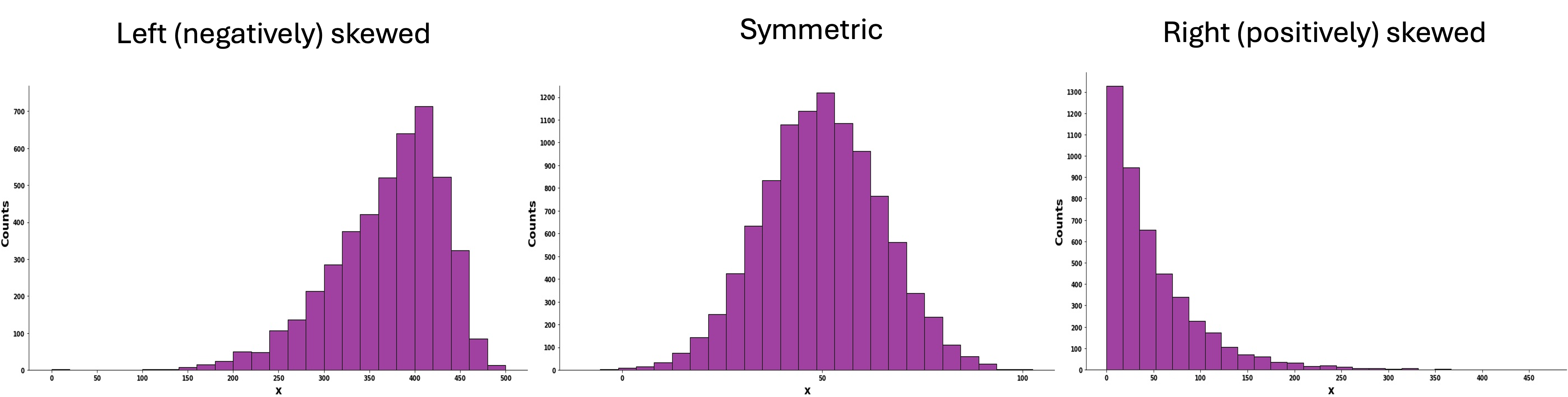
Fig. 2.26 Histograms with different degrees and directions of skewness
2.4.4. Identifying Potential Outliers
When examining a histogram, we also look for potential outliers—observations that deviate significantly from the overall pattern of the data. When encountered, they should not immediately be discarded but investigated thoroughly. This is important because:
They may represent errors in data collection or entry.
They could be valid but unusual observations that provide valuable insights.
They can significantly influence statistical measures like the mean.
They may indicate violations of assumptions in statistical inference procedures.
When R creates a histogram, it automatically determines an appropriate range for the axes to ensure all data points are included in the plot. If there are values far from the majority of the data, the plotting range will be extended to include them, creating visible gaps in the histogram where no observations fall.
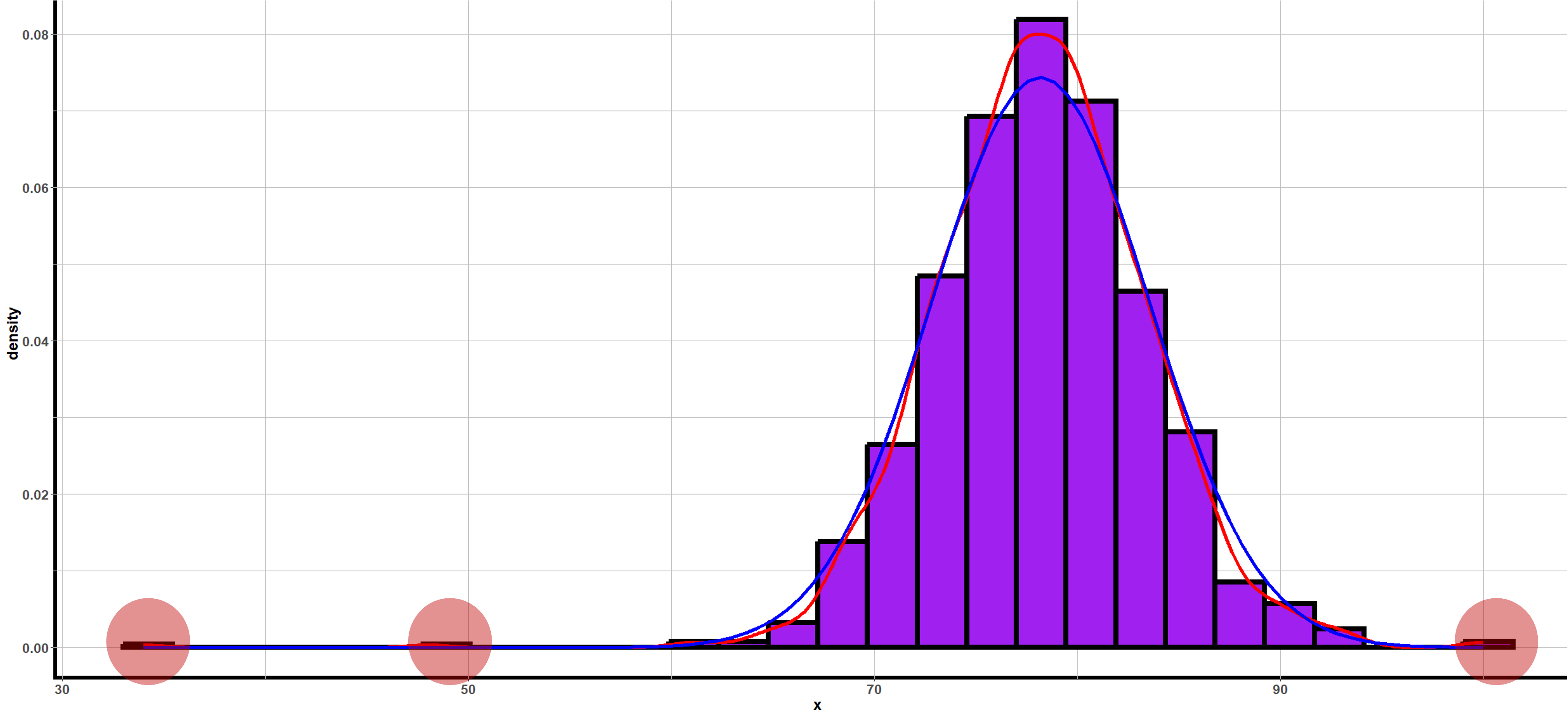
Fig. 2.27 Histogram with potential outliers marked in red circles
2.4.5. Bringing It All Together
Key Takeaways 📝
Histograms reveal the shape, center, spread, and potential outliers in a quantitative data.
Potential outliers require careful investigation—they may represent errors or important observations.
Understanding the shape of a data distribution helps us choose appropriate statistical tools and avoid misleading conclusions.
2.4.6. Exercises
These exercises develop your skills in describing the shape of distributions by identifying modality, skewness, and potential outliers.
Exercise 1: Identifying Modality
For each histogram description below, identify the modality (unimodal, bimodal, or multimodal) and suggest a possible explanation for the pattern observed.
A histogram of response times for a web server shows a single peak around 50 ms with values ranging from 20 ms to 150 ms, tapering off gradually on both sides.
A histogram of employee commute times shows two distinct peaks—one around 15 minutes and another around 45 minutes—with relatively few values in between.
A histogram of customer ages at a family restaurant shows three peaks: one around age 8, another around age 35, and a third around age 65.
A histogram of exam scores shows a single peak around 75 with a fairly symmetric spread from 50 to 100.
A quality engineer measures the diameter of ball bearings from two production lines (mixed together). The histogram shows two peaks: one at 10.0 mm and another at 10.5 mm. What does this suggest, and what should the engineer do?
Solution
Part (a): Web Server Response Times
Unimodal — Single peak around 50 ms.
Explanation: The response times likely come from a single, consistent server process. The tapering on both sides suggests natural variation around a typical response time, which is expected behavior for a well-functioning system.
Part (b): Employee Commute Times
Bimodal — Two distinct peaks at 15 and 45 minutes.
Explanation: This likely reflects two distinct groups of employees:
Those who live close to work (peak at 15 min)
Those who commute from farther away, possibly suburbs (peak at 45 min)
This could also reflect different transportation modes (driving vs. public transit).
Part (c): Customer Ages at Restaurant
Multimodal (trimodal) — Three peaks at ages 8, 35, and 65.
Explanation: Family restaurants attract distinct demographic groups:
Children (peak ~8 years)
Parents (peak ~35 years)
Grandparents (peak ~65 years)
The multimodality reflects the family-oriented customer base.
Part (d): Exam Scores
Unimodal — Single peak around 75.
Explanation: Students likely come from a single population with similar preparation levels. The symmetric spread suggests the exam difficulty was well-calibrated for the class.
Part (e): Ball Bearing Diameters
Bimodal — Two peaks at 10.0 mm and 10.5 mm.
This strongly suggests the two production lines are producing bearings with different mean diameters. This is a quality control concern.
The engineer should:
Separate the data by production line and create individual histograms
Investigate why the lines are producing different diameters
Determine which (if either) meets specifications
Calibrate the production lines to produce consistent output
Analyzing the mixed data together would be misleading—the overall mean would be between the two peaks, representing neither line accurately.
Exercise 2: Identifying Skewness
The histograms below show distributions for different engineering and business scenarios. For each, identify whether the distribution is symmetric, right-skewed (positively skewed), or left-skewed (negatively skewed). Explain your reasoning.
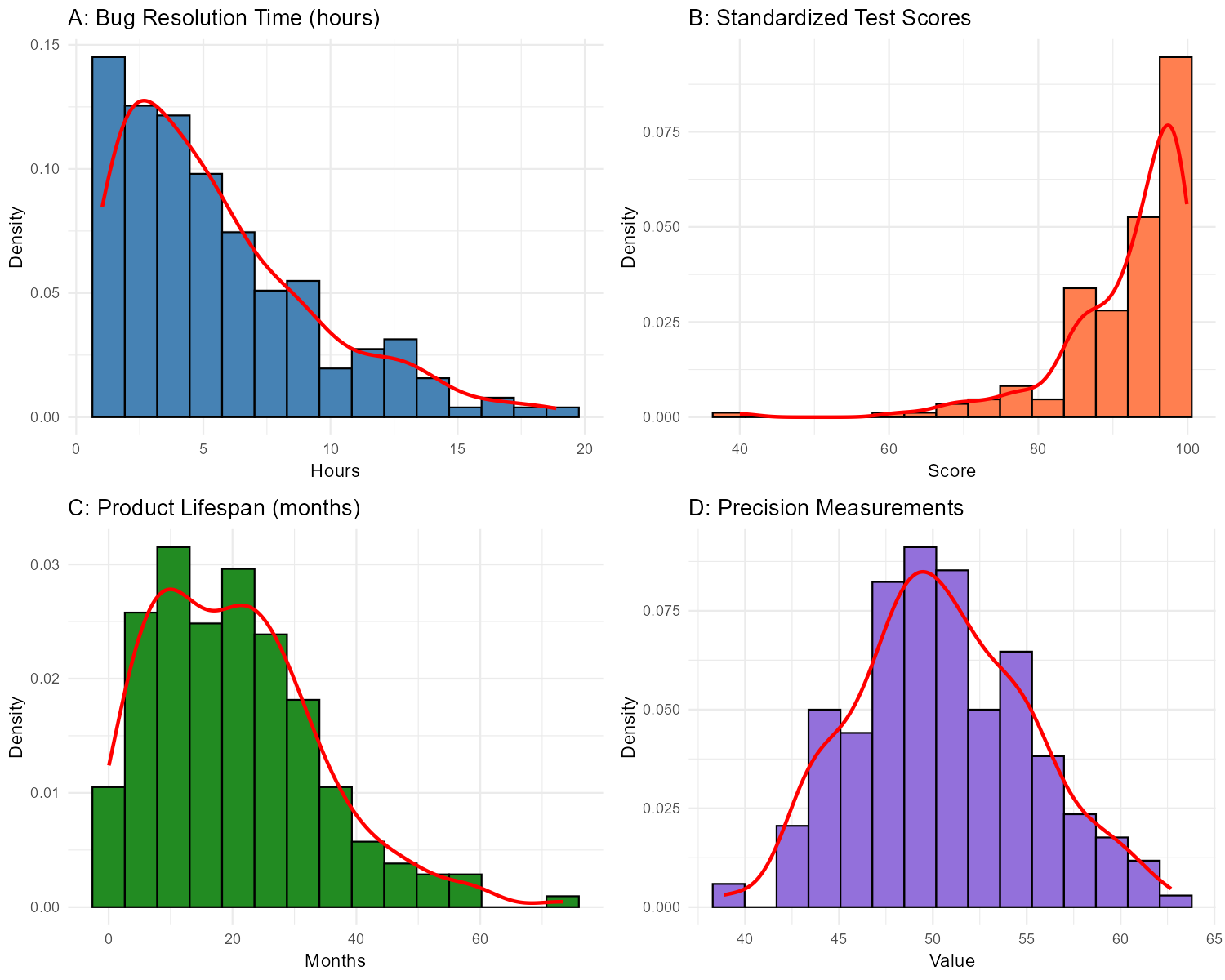
Fig. 2.28 Four distributions with different skewness patterns
Histogram A: Software bug resolution time (hours)
Histogram B: Standardized test scores
Histogram C: Product lifespan until failure (months)
Histogram D: Precision measurements from a calibrated instrument
For each skewed distribution above, explain why that type of skewness makes sense given the context.
Solution
Part (a): Bug Resolution Time — Right-skewed (positively skewed)
The tail extends toward higher values (longer resolution times).
Part (b): Test Scores — Left-skewed (negatively skewed)
The tail extends toward lower values (lower scores), with most scores clustered at the high end.
Part (c): Product Lifespan — Right-skewed (positively skewed)
The tail extends toward higher values (longer lifespans).
Part (d): Precision Measurements — Symmetric
The distribution is balanced around the center with similar spread on both sides.
Part (e): Why the Skewness Makes Sense
Bug resolution time (right-skewed): Most bugs are resolved quickly (simple fixes), but some complex bugs take much longer. There’s a natural lower bound (can’t be negative) but no strict upper bound, creating a right tail.
Test scores (left-skewed): If the test is relatively easy or students are well-prepared, most scores cluster near the top. The upper bound (100% or maximum score) creates a ceiling effect, while a few students score much lower, creating a left tail.
Product lifespan (right-skewed): Most products fail within a typical range, but some last much longer than expected. There’s a lower bound (products can’t fail before time 0) and no upper bound on how long something might last, creating a right tail.
Precision measurements (symmetric): A well-calibrated instrument produces measurements that vary randomly around the true value, with equal probability of being slightly above or below. This creates the classic symmetric, bell-shaped pattern.
Exercise 3: Identifying Potential Outliers
A manufacturing engineer collects data on the tensile strength (in MPa) of 50 steel samples. The histogram and data summary are shown below.
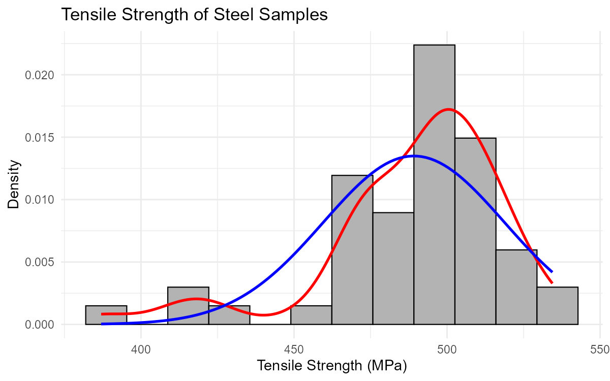
Fig. 2.29 Tensile strength distribution with potential outliers
Summary Statistics:
Mean: 485 MPa
Median: 492 MPa
Standard Deviation: 28 MPa
Minimum: 387 MPa
Maximum: 538 MPa
Q1: 472 MPa
Q3: 505 MPa
Based on the histogram, are there any potential outliers? If so, approximately where are they located?
The mean (485 MPa) is less than the median (492 MPa). What does this suggest about the shape of the distribution?
Using the 1.5 × IQR rule, calculate the lower and upper fences. Are there any flagged points according to this rule?
One of the low values (387 MPa) came from a sample that was accidentally heated to a higher temperature during processing. Should this value be removed from the analysis? Explain your reasoning.
Another low value (412 MPa) has no known processing issues. How should the engineer treat this value?
Solution
Part (a): Potential Outliers from Histogram
Yes, there appear to be potential outliers on the left side (low end) of the distribution. The histogram shows a gap followed by a few isolated observations around 380-420 MPa, separated from the main body of data centered around 490 MPa.
Part (b): Mean vs. Median
When the mean < median, the distribution is left-skewed (negatively skewed).
The low values (potential outliers) pull the mean downward, while the median is resistant to these extreme values. This is consistent with what we see in the histogram—a few unusually low values creating a left tail.
Part (c): 1.5 × IQR Rule
First, calculate the IQR:
IQR = Q3 − Q1 = 505 − 472 = 33 MPa
Calculate the fences:
Lower fence = Q1 − 1.5 × IQR = 472 − 1.5(33) = 472 − 49.5 = 422.5 MPa
Upper fence = Q3 + 1.5 × IQR = 505 + 1.5(33) = 505 + 49.5 = 554.5 MPa
Checking the extremes:
Minimum (387 MPa) < 422.5 → Flagged point (below lower fence)
Maximum (538 MPa) < 554.5 → Not flagged (within upper fence)
According to the 1.5 × IQR rule, at least one flagged point exists on the low end (387 MPa, and possibly others below 422.5 MPa).
Part (d): Value with Known Processing Error
Yes, this value should likely be removed (or analyzed separately).
Reasoning:
The value has a known assignable cause (improper heat treatment)
It does not represent the normal manufacturing process
Including it would bias the analysis of the standard process
It should be documented and investigated, but excluded from the main analysis
This is an example of an outlier caused by a measurement or process error.
Part (e): Value with No Known Issues
This value should NOT be automatically removed.
Reasoning:
No assignable cause has been identified
It may represent natural variation in the manufacturing process
It could indicate a real issue that needs investigation
Removing data without justification can bias results
The engineer should:
Investigate whether there were any unusual circumstances
Consider whether this represents a real subpopulation of weaker samples
Report results both with and without this observation if doing sensitivity analysis
Never remove data simply because it’s inconvenient
Exercise 4: Comprehensive Shape Description
For each histogram below, provide a complete description of the distribution including:
Center: Approximate location of the typical value
Spread: Approximate range of the data
Shape: Modality and skewness
Outliers: Any potential outliers
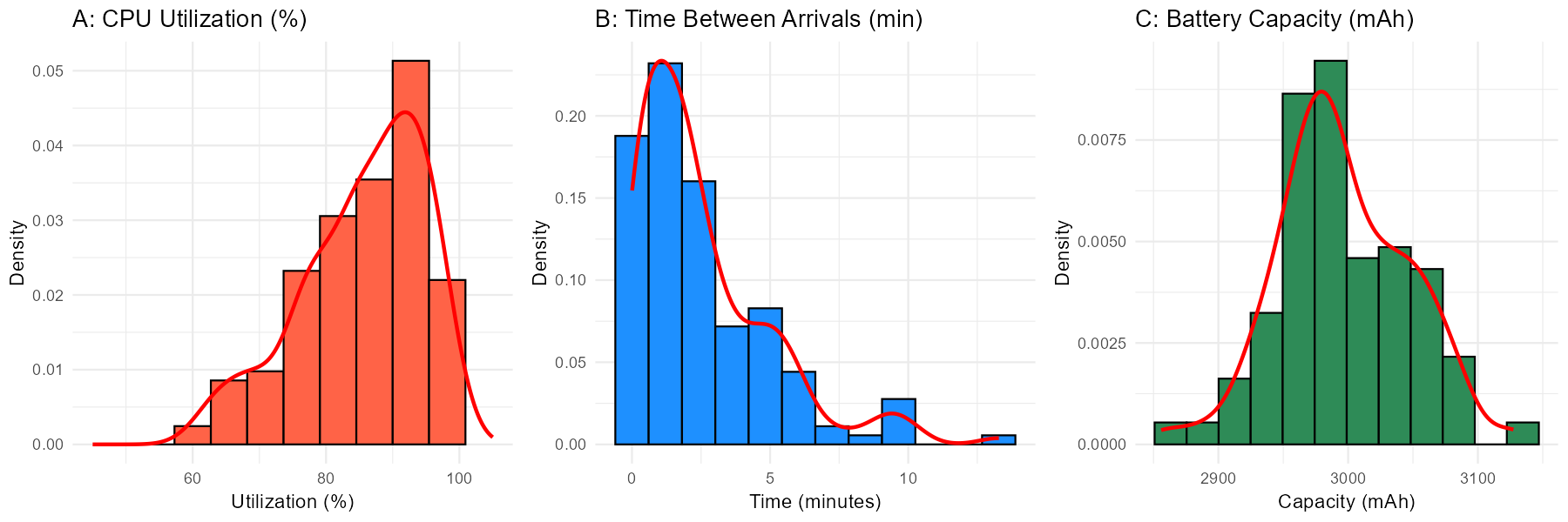
Fig. 2.30 Three distributions requiring complete description
Distribution A: CPU utilization (%) during a stress test
Distribution B: Time between customer arrivals at a service desk (minutes)
Distribution C: Battery capacity measurements (mAh) for smartphone batteries
Solution
Distribution A: CPU Utilization
Center: Approximately 85-90%
Spread: Ranges from about 50% to 100%
Shape: Unimodal, left-skewed (negatively skewed). The distribution is bunched up against the upper limit (100%) with a tail extending toward lower values.
Outliers: No clear outliers; the lower values appear to be part of the natural left tail.
Interpretation: During a stress test, CPU utilization is expected to be high most of the time. The 100% ceiling creates a natural boundary, and occasional dips in utilization create the left tail. This is typical behavior for stress test data.
Distribution B: Time Between Arrivals
Center: Approximately 2-3 minutes (but note: for right-skewed data, the median is a better measure than the visual “center”)
Spread: Ranges from near 0 to about 15 minutes
Shape: Unimodal, right-skewed (positively skewed). Most inter-arrival times are short, with fewer long gaps.
Outliers: No clear outliers; the long times are part of the expected right tail.
Interpretation: This pattern is typical of arrival processes. Most customers arrive in quick succession, but occasionally there are longer gaps. The distribution resembles an exponential distribution, which is commonly used to model waiting times.
Distribution C: Battery Capacity
Center: Approximately 3000 mAh
Spread: Ranges from about 2850 to 3150 mAh
Shape: Unimodal, approximately symmetric. The distribution is roughly bell-shaped with balanced tails.
Outliers: No obvious outliers visible.
Interpretation: This suggests a well-controlled manufacturing process. Battery capacities cluster tightly around the target value with natural, symmetric variation. This distribution appears approximately normal, which is desirable for quality control purposes.
Exercise 5: Modality Investigation
A data analyst notices that a histogram of employee salaries at a tech company appears bimodal. Before concluding that there are two distinct salary groups, they should investigate further.
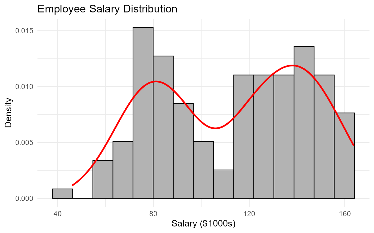
Fig. 2.31 Employee salary distribution showing apparent bimodality
List three possible explanations for why the salary distribution might be bimodal.
The analyst creates faceted histograms by job category (Engineering vs. Sales). What would they expect to see if job category explains the bimodality?
If the bimodality disappears when the data is separated by job category, what conclusion can be drawn about analyzing the combined data?
If the bimodality persists even within each job category, what other variables might the analyst investigate?
Why would it be misleading to report the “average salary” for this company without acknowledging the bimodal distribution?
Solution
Part (a): Possible Explanations for Bimodality
Three possible explanations:
Job category/role: Different job families (e.g., engineering vs. sales vs. administrative) may have different salary structures
Experience level: Entry-level vs. senior employees may form two distinct groups
Location: Employees in different geographic regions (e.g., San Francisco vs. remote/other cities) may have different salary bands due to cost-of-living adjustments
Other valid explanations: full-time vs. part-time, different departments, acquired company with legacy salary structure, hourly vs. salaried employees.
Part (b): Expected Result if Job Category Explains Bimodality
If job category explains the bimodality, the faceted histograms would show:
Engineering: A single peak (unimodal) around the higher salary value (~$140k)
Sales: A single peak (unimodal) around the lower salary value (~$80k)
Each category would have its own unimodal distribution, and combining them creates the apparent bimodality.
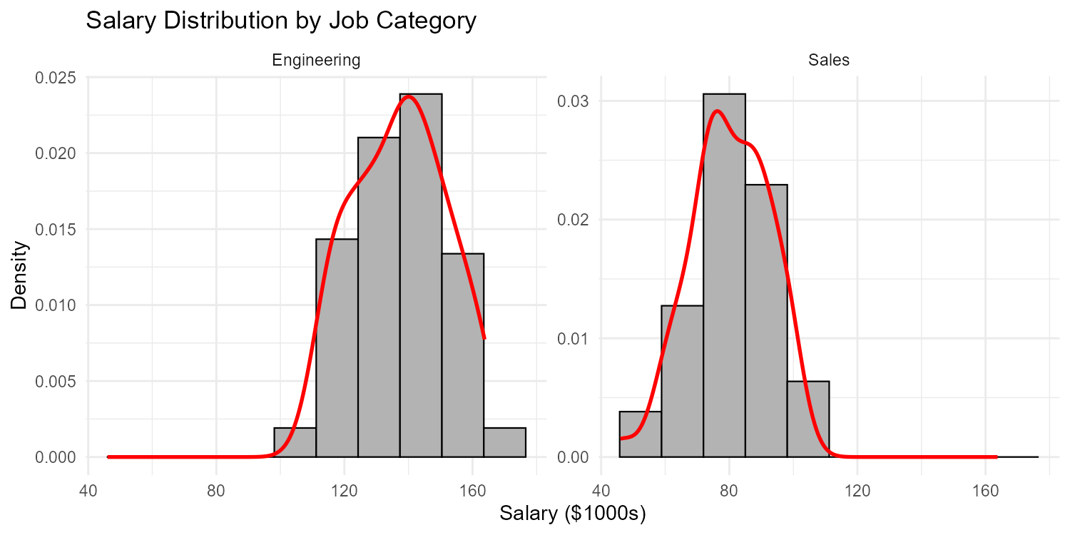
Fig. 2.32 Faceted histograms reveal the source of bimodality
Part (c): Conclusion About Combined Analysis
If bimodality disappears when separated by job category, then:
The combined data represents a mixture of two distinct populations
Analyzing the combined data obscures important differences between groups
Summary statistics (mean, median, standard deviation) for the combined data are misleading
Separate analyses should be conducted for each job category
Any comparisons or decisions should account for job category
Part (d): Other Variables to Investigate
If bimodality persists within job categories:
Years of experience or tenure
Education level (Bachelor’s vs. Master’s/PhD)
Performance ratings or job level/title within category
Geographic location or office
Gender (to check for pay equity issues)
Full-time vs. part-time status
Acquisition history (legacy employees vs. new hires)
Part (e): Why Average Salary Would Be Misleading
Reporting only the average salary would be misleading because:
No one earns the average: The mean falls in the “valley” between the two peaks where few employees actually earn that amount
Hides important structure: It obscures the fact that there are two distinct salary groups
Poor representation: Neither the high-salary group nor the low-salary group is well-represented by the average
Incorrect expectations: Job candidates might expect salaries near the mean when they should expect salaries near one of the peaks depending on their role
A more honest summary would report the median (or mean) salary separately for each major job category, or at minimum acknowledge the bimodal nature of the distribution.
Exercise 6: Shape and Statistical Measures
Understanding distribution shape helps us choose appropriate summary statistics. For each scenario, answer the questions about the relationship between shape and statistics.
A distribution is strongly right-skewed. Which is larger: the mean or the median? Why?
For a symmetric, unimodal distribution, what is the approximate relationship between the mean and median?
A quality engineer has data on product weights that is left-skewed with a few unusually light items. Which measure of center (mean or median) better represents the “typical” product weight? Why?
Two datasets have the same mean and standard deviation, but one is symmetric and one is right-skewed. Would you expect them to look similar? Explain.
A dataset has these summary statistics: Mean = 50, Median = 50, Mode = 50. What can you conclude about the shape of the distribution?
Another dataset has: Mean = 45, Median = 50, Mode = 55. What shape does this suggest?
Solution
Part (a): Right-Skewed Distribution
The mean is larger than the median.
Why: In a right-skewed distribution, the tail extends toward high values. These extreme high values pull the mean upward, while the median (the middle value) is resistant to extremes. The mean “chases” the tail.
Part (b): Symmetric Unimodal Distribution
The mean and median are approximately equal.
In a perfectly symmetric distribution, the mean equals the median exactly. In real data that is approximately symmetric, they will be very close to each other.
Part (c): Left-Skewed Product Weights
The median better represents the typical weight.
Why: The few unusually light items pull the mean downward, making it lower than what most products actually weigh. The median is resistant to these extreme values and better captures the center of the main body of data.
Rule of thumb: For skewed distributions, the median is usually the better measure of “typical.”
Part (d): Same Mean and SD, Different Shapes
No, they would NOT look similar.
The mean and standard deviation alone don’t capture the shape of a distribution. Two distributions can have identical means and standard deviations but very different appearances:
The symmetric one would be balanced around the mean
The right-skewed one would have most values below the mean with a long right tail
This illustrates why visualizing data with histograms is essential—summary statistics alone can be misleading.
Part (e): Mean = Median = Mode = 50
This suggests the distribution is symmetric and unimodal.
When all three measures of center coincide, the distribution is balanced around a single central value. This is characteristic of symmetric distributions like the normal distribution.
Note: This doesn’t guarantee perfect symmetry, but it’s a strong indication.
Part (f): Mean = 45, Median = 50, Mode = 55
This suggests a left-skewed (negatively skewed) distribution.
The ordering Mean < Median < Mode indicates:
The mean is pulled left by low values in the left tail
The median is in the middle
The mode (peak) is on the right side
This pattern is characteristic of left-skewed distributions where the tail extends toward lower values.
2.4.7. Additional Practice Problems
True/False Questions (1 point each)
A bimodal distribution always indicates that data was collected from two different populations.
Ⓣ or Ⓕ
In a right-skewed distribution, the mean is typically greater than the median.
Ⓣ or Ⓕ
Any observation that falls outside the 1.5 × IQR fences should automatically be removed from the dataset.
Ⓣ or Ⓕ
A histogram that appears multimodal might actually be unimodal if too many bins were used.
Ⓣ or Ⓕ
The presence of outliers always indicates errors in data collection.
Ⓣ or Ⓕ
For a perfectly symmetric distribution, the mean equals the median.
Ⓣ or Ⓕ
Multiple Choice Questions (2 points each)
A histogram of home prices in a city shows a long tail extending toward high values, with most homes clustered at lower prices. This distribution is:
Ⓐ Left-skewed (negatively skewed)
Ⓑ Right-skewed (positively skewed)
Ⓒ Symmetric
Ⓓ Bimodal
An engineer analyzes failure times for electronic components and finds the distribution is right-skewed. Which measure of center would BEST represent the typical failure time?
Ⓐ Mean
Ⓑ Median
Ⓒ Mode
Ⓓ Standard deviation
A dataset has Mean = 72, Median = 68, and a single mode. What is the most likely shape of this distribution?
Ⓐ Symmetric
Ⓑ Left-skewed
Ⓒ Right-skewed
Ⓓ Bimodal
Which of the following is the BEST reason to investigate (but not automatically remove) an outlier?
Ⓐ It makes the standard deviation larger
Ⓑ It may represent a valid but unusual observation that provides insight
Ⓒ It changes the median
Ⓓ It makes the histogram look asymmetric
Answers to Practice Problems
True/False Answers:
False — Bimodality can have many causes: two populations, artifact of bin selection, natural phenomena with two states, etc. It doesn’t always mean two populations.
True — In right-skewed distributions, the tail of high values pulls the mean upward while the median remains resistant. Thus mean > median.
False — Outliers should be investigated, not automatically removed. They may represent valid observations, important anomalies, or genuine features of the data. Removal requires justification (e.g., known data entry error).
True — Using too many bins can create artificial peaks due to sampling variability, making a unimodal distribution appear multimodal. This is why appropriate bin selection is important.
False — Outliers can represent errors, but they can also be valid unusual observations, important discoveries, or natural extreme values. Their presence doesn’t automatically indicate errors.
True — By definition, a perfectly symmetric distribution has its mean and median at the same location (the center of symmetry).
Multiple Choice Answers:
Ⓑ — A long tail toward high values with most data clustered at lower values describes right-skewed (positively skewed). This is typical for home prices, incomes, and other economic data.
Ⓑ — For skewed distributions, the median is the better measure of center because it is resistant to extreme values. The mean would be pulled toward the long right tail and overestimate the typical failure time.
Ⓒ — When Mean > Median, the distribution is right-skewed. The high values in the right tail pull the mean upward while the median remains closer to the bulk of the data.
Ⓑ — Outliers should be investigated because they may represent valid but unusual observations that provide insight. They might reveal equipment problems, special cases, or important phenomena that deserve attention rather than deletion.