Slides 📊
2.2. Tools for Categorical (Qualitative) Data
Numbers alone cannot convey how popular a department is, how balanced a survey sample appears, or whether two demographic variables interact. In this lesson, you will learn two plots— pie charts and bar graphs—that turn categorical tallies into instant insights.
Road Map 🧭
Build frequency tables for categorical variables using three different metrics: frequency, relative frequency, and percentage.
Visualize a frequency table with pie charts and bar graphs. Learn when one is preferred over the other.
2.2.1. The distribution of a categorical variable
The first stage of understanding the distribution of a categorical variable is to construct a table listing every category together with its count. We will use the famous 1973 UC Berkeley Graduate Admissions data set for illustration. This data set is available by default on RStudio. Run:
# Load required packages

# If not installed already, install the package first by running
# install.packages("(package_name)")
# e.g. if ggplot2 is not installed, run
# install.packages("ggplot2")

library(ggplot2)
library(dplyr)
library(scales)

# Load built‑in data
data("UCBAdmissions")
df <- as.data.frame(UCBAdmissions)  %>% arrange(Dept, desc(Gender))

View(df)
Important Note
Each code block must be run AFTER any previously presented code blocks in the same section. If you want to copy and paste the whole code as a single chunk, go to the appendix at the bottom of the page.
The first rows will look like following:
Row |
Admit |
Gender |
Dept |
Freq |
|---|---|---|---|---|
1 |
Admitted |
Male |
A |
512 |
2 |
Rejected |
Male |
A |
313 |
3 |
Admitted |
Female |
A |
89 |
4 |
Rejected |
Female |
A |
19 |
5 |
Admitted |
Male |
B |
353 |
\(\vdots\) |
\(\vdots\) |
\(\vdots\) |
\(\vdots\) |
\(\vdots\) |
The combination of the first three columns shows the distinct categories that an observation can belong to. In this dataset, there are
two admission statuses (“Admitted” and “Rejected”),
two genders (“Male” and “Female”), and
six departments (“A” through “F”).
Therefore, the dataset has a total of \(2 * 2 * 6 = 24\) different categories. These categories are also called classes or labels.
The frequencies in the right most column of Table 2.1 show the counts for each category. However, frequencies alone make it difficult to assess the relative size. For example:
Does the class of [“Admitted”, “Male”, “Dept A”] take up a large proportion out of the entire data set?
Is the class of [“Rejected”, “Female”, “Dept A”] one of the smallest?
For an objective picture, we must take the total count into consideration. We use two new metrics for this purpose:
Relative frequency (proportion): The fraction of the count out of the total, computed by
Percentage: The relative frequency multiplied by 100%, computed by
Using the new metrics, let us create a full frequency table.
#Create the column of relative frequency
df$Rel_Freq <- df$Freq / sum(df$Freq)
#Create the column of percentage
df$Perc <- df$Rel_Freq * 100
View(df)
Now we see an extended table:
Row |
Admit |
Gender |
Dept |
Freq |
Rel_Freq |
Perc |
|---|---|---|---|---|---|---|
1 |
Admitted |
Male |
A |
512 |
0.113 |
11.3 |
2 |
Rejected |
Male |
A |
313 |
0.069 |
6.9 |
\(\vdots\) |
\(\vdots\) |
\(\vdots\) |
\(\vdots\) |
\(\vdots\) |
\(\vdots\) |
\(\vdots\) |
It is also possible to create extended frequency tables for various combinations of the three individual categorical variables. Let’s try creating a table displaying the counts of admitted students, categorized by departments.
# Take the subset of the data which only involves "Admitted" category.
admitted <- df[df$Admit == "Admitted", ]

# Frequency table of admitted student by department
df_by_dept <- admitted %>% group_by(Dept) %>% summarise(Freq=sum(Freq))
df_by_dept$Rel_Freq <- df_by_dept$Freq / sum(df_by_dept$Freq)
df_by_dept$Perc <- df_by_dept$Rel_Freq * 100
Admitted Applicants by Department |
|||
|---|---|---|---|
Department Label |
Frequency |
Relative Frequency |
Percentage |
A |
601 |
0.342 |
34.2 |
B |
370 |
0.211 |
21.1 |
C |
322 |
0.183 |
18.3 |
D |
269 |
0.153 |
15.3 |
E |
147 |
0.0838 |
8.38 |
F |
46 |
0.0262 |
2.62 |
Note that relative frequencies always fall between 0 and 1 and sum to 1. Likewise, the percentages always range from 0 to 100 and sum to 100. They provide a standardized representation of the counts and allow comparisons between different variables that share the same list of categories, even if their totals differ.
2.2.2. Pie charts
A pie chart represents a categorical variable as a sliced circle, where the slices are sized proportionally to the counts, relative frequencies, or percentages. Note that the outcome will be visually identical regardless of the chosen metric.
Pie charts are best when you need to emphasize that the categories make up a complete whole, and if your main goal is to compare the relative sizes of the labels within a single dataset.
Let us draw the pie charts of the admission status variable, for each gender. We begin by creating the corresponding extended frequency tables:
# Only the code for the female case is shown for conciseness. Try creating
# the code for the other case using this as a template.

# Take the subset of the data which only involves the "Female" category.
female <- df[df$Gender == "Female", ]

# Frequency table of admitted student by department
admit_female <- female %>% group_by(Admit) %>% summarise(Freq=sum(Freq))
admit_female$Rel_Freq <- admit_female$Freq / sum(admit_female$Freq)
admit_female$Perc <- admit_female$Rel_Freq * 100
Admission for Female Applicants |
|||
|---|---|---|---|
Label |
Frequency |
Relative Frequency |
Percentage |
Admitted |
557 |
0.304 |
30.4 |
Rejected |
1278 |
0.696 |
69.6 |
Admission for Male Applicants |
|||
|---|---|---|---|
Label |
Frequency |
Relative Frequency |
Percentage |
Admitted |
1198 |
0.445 |
44.5 |
Rejected |
1493 |
0.555 |
55.5 |
Using the tables above, create pie charts:
#Pie chart for female applicants
ggplot(admit_female, aes(x = "", y = Freq, fill = Admit)) +
  geom_bar(stat = "identity", width = 1, colour = "black", size = 1.25) +
  coord_polar(theta = "y", start = 0) +
  geom_text(aes(label = percent(Rel_Freq)),
            position = position_stack(vjust = 0.5), size=5)+
  theme_void()+
  ggtitle("Acceptance Rate of Female Applicants")
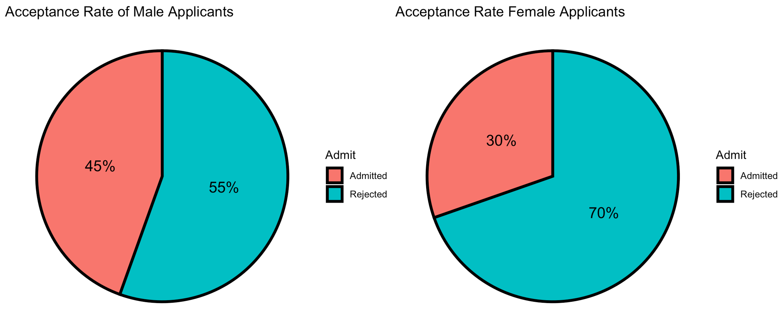
Fig. 2.3 1973 UC Berkeley graduate admissions, by gender
Pie charts are effective for an intuitive presentation of the variable composition, especially when there are only few categories or when the imbalance among the proportions needs to be emphasized.
The pie charts in Fig. 2.3 display the distributions of graduate admissions for female and male applicants at UC Berkeley in 1973. They seem to suggest that there was a significant difference in the likelihood of acceptance between genders. We now proceed to the next section to explore this from another perspective.
2.2.3. Bar graphs
A bar graph draws one bar per category with the height proportional to its frequency. Bars may represent counts, relative counts, or percentages.
Bar graphs offer several advantages over pie charts:
Pie charts lose their simplicity when there are more than a few categories. In contrast, bar graphs handle many categories more effectively.
They allow exact comparisons of relative sizes, especially when frequencies are similar.
When observations can belong to multiple categories, it is incorrect to suggest that the frequencies form a whole - since their total may exceed 100%. In such cases, bar graphs are more appropriate, as they do not imply that the parts sum to a whole.
To demonstrate the strength of bar graphs in handling many categories, let us plot Table 2.1, which contains 24 different categories.
df$Dept_Gender <- paste(df$Dept, df$Gender, sep="-")

ggplot(df, aes(x = Dept_Gender, y = Freq, fill = Admit)) +
geom_bar(stat = "identity", position="dodge", width=0.7) +
theme_minimal() +
labs(title = "Dodged bar graph of frequencies",
     x = "Department-Gender",
     y = "Frequency") +
theme(axis.text.x = element_text(angle = 45, hjust = 1, size = 10))
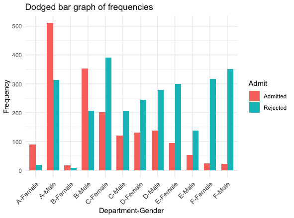
Fig. 2.4 Bar graph of frequencies, UC Berkeley data set
Unlike our first impression through the pie charts (Fig. 2.3), we begin to suspect that the acceptance rates are comparable between the two genders within a department.
To dig deeper into our suspicion, let us draw another bar graph, where each bar has a height corresponding to the relative frequency of an admission result within a single department, for a single gender. In addition, we will stack the bars so that the composition of “Accepted” vs “Rejected” is emphasized within each Department-Gender category.
Dept_Gender_total <- as.vector((df %>% group_by(Dept_Gender) %>% summarise(Sum=sum(Freq)))$Sum)
df$Dept_Gender_total <- rep(Dept_Gender_total, each=2)
df$Dept_Gender_Rel_Freq <- df$Freq/df$Dept_Gender_total


ggplot(df, aes(x = Dept_Gender, y = Dept_Gender_Rel_Freq, fill = Admit)) +
  geom_bar(stat = "identity", position="stack", width=0.5) +
  theme_minimal() +
  labs(title = "Stacked bar graph of relative frequencies by Dept and Gender",
      x = "Department-Gender",
      y = "Relative Frequency") +
  theme(axis.text.x = element_text(angle = 45, hjust = 1, size = 10))
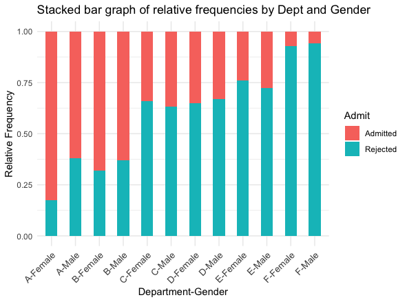
Fig. 2.5 Bar graph of relative frequencies of “Accepted” vs “Rejected” by Dept-Gender, UC Berkeley data set
Our suspicion is confirmed. Indeed, the two genders have comparable acceptance rates within departments. In four of the six departments, the rate is actually higher for female students!
We covered two key techniques in drawing a bar graph through the UC Berkeley example.
Dodging bars side‑by‑side lets us compare groups across categories (Fig. 2.4).
Stacking bars emphasizes composition within each category (Fig. 2.5).
Remark - What’s behind the contradiction?
The pie charts and the bar graphs appear to convey conflicting messages, even though they are based on the same data set. This discrepancy arises because certain departments had a disproportionately large number of applicants—most of whom were male.
This highlights the importance of examining a data set carefully at multiple levels of categorization before drawing conclusions. In fact, this situation illustrates a well-known and frequently occurring statistical phenomenon called Simpson’s Paradox.
Feel free to explore this fascinating topic further on your own!
2.2.4. Pie Chart or Bar Graph?
Choosing between pie charts and bar graphs depends on your data and the story you want to tell:
Bar graphs handle many categories comfortably; a pie chart with more than five slices becomes hard to read.
Exact comparisons across categories are easier in a bar graph because the common baseline (zero) guides the eye.
Bar graphs work well when observations can belong to multiple categories.
If your takeaway is “X accounts for one‑third of the total,” a pie slice delivers that message immediately.
Pie charts emphasize the part-to-whole relationship and are ideal when your data represents 100% of something.
2.2.5. Bringing It All Together
Key Takeaways 📝
The distribution of a categorical variable is first organized into a table of categories (also called labels or classes) with their counts, proportions, or percentages.
Pie charts emphasize part of whole; bar graphs emphasize category comparisons.
Choose dodged or stacked bar graphs based on the message you want to convey. Dodged bar graphs allow precise comparison of heights; stacked bar graphs focuses on showing the composition within a category.
Examine categorical data from multiple perspectives to avoid misleading interpretations.
Appendix: All Code in One Stack
# Load required packages
# If not installed already, install the package first by running
# install.packages("(package_name)")
# e.g. if ggplot2 is not installed, run
# install.packages("ggplot2")

library(ggplot2)
library(tidyverse)
library(scales)

# Load built‑in data
data("UCBAdmissions")
df <- as.data.frame(UCBAdmissions) %>% arrange(Dept, desc(Gender))

#View(df)

###########
#Create the column of relative frequency
df$Rel_Freq <- df$Freq / sum(df$Freq)
#Create the column of percentage
df$Perc <- df$Rel_Freq * 100
View(df)

###########
# Take the subset of the data which only involves "Admitted" category.
admitted <- df[df$Admit == "Admitted", ]

# Frequency table of admitted student by department
df_by_dept <- admitted %>% group_by(Dept) %>% summarise(Freq=sum(Freq))
df_by_dept$Rel_Freq <- df_by_dept$Freq / sum(df_by_dept$Freq)
df_by_dept$Perc <- df_by_dept$Rel_Freq * 100

###########
# Only the code for the female case is shown for conciseness. Try creating
# the code for the other case using this as a template.

# Take the subset of the data which only involves "Female" category.
female <- df[df$Gender == "Female", ]

# Frequency table of admitted student by department
admit_female <- female %>% group_by(Admit) %>% summarise(Freq=sum(Freq))
admit_female$Rel_Freq <- admit_female$Freq / sum(admit_female$Freq)
admit_female$Perc <- admit_female$Rel_Freq * 100

###########
#Pie chart for female applicants
ggplot(admit_female, aes(x = "", y = Freq, fill = Admit)) +
  geom_bar(stat = "identity", width = 1, colour = "black", size = 1.25) +
  coord_polar(theta = "y", start = 0) +
  geom_text(aes(label = percent(Rel_Freq)),
            position = position_stack(vjust = 0.5), size=5)+
  theme_void()+
  ggtitle("Acceptance Rate of Female Applicants")

############
# Bar graph of frequencies
df$Dept_Gender <- paste(df$Dept, df$Gender, sep="-")

ggplot(df, aes(x = Dept_Gender, y = Freq, fill = Admit)) +
geom_bar(stat = "identity", position="dodge", width=0.7) +
theme_minimal() +
labs(title = "Dodged bar graph of frequencies",
     x = "Department-Gender",
     y = "Frequency") +
theme(axis.text.x = element_text(angle = 45, hjust = 1, size = 10))

#################
# Stacked bar graph of relative frequencies
Dept_Gender_total <- as.vector((df %>% group_by(Dept_Gender) %>% summarise(Sum=sum(Freq)))$Sum)
df$Dept_Gender_total <- rep(Dept_Gender_total, each=2)
df$Dept_Gender_Rel_Freq <- df$Freq/df$Dept_Gender_total


ggplot(df, aes(x = Dept_Gender, y = Dept_Gender_Rel_Freq, fill = Admit)) +
  geom_bar(stat = "identity", position="stack", width=0.5) +
  theme_minimal() +
  labs(title = "Stacked bar graph of relative frequencies by Dept and Gender",
      x = "Department-Gender",
      y = "Relative Frequency") +
  theme(axis.text.x = element_text(angle = 45, hjust = 1, size = 10))
2.2.6. Exercises
These exercises build your skills in summarizing and visualizing categorical data using frequency tables, pie charts, and bar graphs.
Exercise 1: Frequency Tables and Calculations
A software company tracks bug reports by severity level. Over the past month, their bug tracking system recorded the following:
Severity Level |
Frequency |
|---|---|
Critical |
12 |
High |
45 |
Medium |
78 |
Low |
115 |
What is the total number of bug reports?
Calculate the relative frequency for each severity level. Verify that your relative frequencies sum to 1.
Calculate the percentage for each severity level. Verify that your percentages sum to 100%.
What proportion of all bugs are classified as “High” or “Critical”? Express your answer as both a relative frequency and a percentage.
A manager claims that “fewer than one in four bugs are serious (High or Critical).” Is this claim supported by the data?
Solution
Part (a): Total
Total = 12 + 45 + 78 + 115 = 250 bug reports
Part (b): Relative Frequencies
Severity |
Frequency |
Relative Frequency |
|---|---|---|
Critical |
12 |
12/250 = 0.048 |
High |
45 |
45/250 = 0.180 |
Medium |
78 |
78/250 = 0.312 |
Low |
115 |
115/250 = 0.460 |
Total |
250 |
1.000 ✓ |
Part (c): Percentages
Severity |
Frequency |
Percentage |
|---|---|---|
Critical |
12 |
4.8% |
High |
45 |
18.0% |
Medium |
78 |
31.2% |
Low |
115 |
46.0% |
Total |
250 |
100.0% ✓ |
Part (d): High or Critical Combined
Frequency of High or Critical = 12 + 45 = 57
Relative frequency = 57/250 = 0.228
Percentage = 22.8%
Part (e): Evaluating the Claim
The manager claims “fewer than one in four” (i.e., < 25%) are serious.
Since 22.8% < 25%, the claim is supported by the data. Indeed, fewer than one in four bugs are classified as High or Critical.
Exercise 2: Interpreting Pie Charts
A mechanical engineering firm surveyed 400 engineers about their preferred CAD software. The results are displayed in the pie chart below:
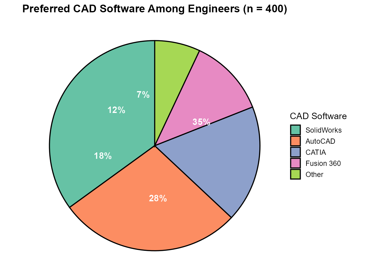
Fig. 2.6 Preferred CAD software among 400 engineers
CAD Software |
Percentage |
|---|---|
SolidWorks |
35% |
AutoCAD |
28% |
CATIA |
18% |
Fusion 360 |
12% |
Other |
7% |
How many engineers preferred SolidWorks?
How many engineers preferred either AutoCAD or CATIA?
A pie chart was chosen for this visualization. List two reasons why a pie chart is appropriate here.
If the survey allowed engineers to select multiple preferred software packages (not just one), would a pie chart still be appropriate? Explain.
The firm wants to compare CAD preferences across three different offices. Would you recommend three separate pie charts or a grouped bar graph? Justify your choice.
Solution
Part (a): SolidWorks Count
35% of 400 = 0.35 × 400 = 140 engineers
Part (b): AutoCAD or CATIA
(28% + 18%) of 400 = 46% of 400 = 0.46 × 400 = 184 engineers
Part (c): Why Pie Chart is Appropriate
Two valid reasons:
The data represents a complete whole: Every engineer chose exactly one option, so the categories sum to 100%. Pie charts excel at showing part-to-whole relationships.
Few categories: With only 5 categories, the pie chart remains readable. Pie charts become cluttered with more than 5-6 slices.
Other valid reasons: The goal is to show relative proportions; each slice represents a mutually exclusive category.
Part (d): Multiple Selections
No, a pie chart would NOT be appropriate. If engineers could select multiple packages, the percentages would sum to more than 100% (e.g., 35% + 28% + 18% + … might equal 150% if many selected two options).
Pie charts imply that slices represent parts of a single whole. When categories are not mutually exclusive, a bar graph should be used instead, as it does not imply that the bars must sum to 100%.
Part (e): Comparing Across Offices
A grouped (dodged) bar graph would be better than three separate pie charts for several reasons:
Direct comparison: Bar graphs with a common baseline make it easy to compare the same category across offices (e.g., “Which office uses SolidWorks most?”)
Aligned categories: Side-by-side bars allow immediate visual comparison; with separate pie charts, the eye must jump between charts and compare slice sizes at different angles
Scalability: If a fourth office is added later, another set of bars is straightforward; adding a fourth pie chart makes comparison increasingly difficult
Exercise 3: Interpreting Bar Graphs
A data center monitors server incidents by type across three shifts. The following stacked bar graph shows the results:
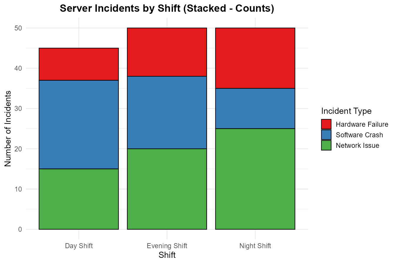
Fig. 2.7 Server incidents by shift (stacked bar graph)
Incident Type |
Day Shift |
Evening Shift |
Night Shift |
|---|---|---|---|
Hardware Failure |
8 |
12 |
15 |
Software Crash |
22 |
18 |
10 |
Network Issue |
15 |
20 |
25 |
Total |
45 |
50 |
50 |
Which shift had the most total incidents?
Looking at the composition within each shift, which incident type is most common during the Day Shift? During the Night Shift?
Calculate the percentage of Night Shift incidents that were Network Issues.
A manager wants to know: “Is Hardware Failure more common at night than during the day?” Can you answer this using counts alone, or do you need percentages? Explain and provide the answer.
If this data were displayed as a dodged bar graph instead of stacked, what comparison would become easier? What comparison would become harder?
Solution
Part (a): Most Total Incidents
Day Shift: 45 incidents
Evening Shift: 50 incidents
Night Shift: 50 incidents
Evening and Night Shifts are tied with 50 incidents each.
Part (b): Most Common Incident Type
Day Shift: Software Crash (22 out of 45 = 48.9%) is most common
Night Shift: Network Issue (25 out of 50 = 50%) is most common
Part (c): Night Shift Network Issues Percentage
Network Issues on Night Shift = 25 Total Night Shift incidents = 50
Percentage = (25/50) × 100% = 50%
Part (d): Hardware Failure Comparison
Percentages are needed because the total incidents differ between shifts (45 vs 50). Raw counts can be misleading.
Day Shift Hardware Failures: 8/45 = 17.8%
Night Shift Hardware Failures: 15/50 = 30.0%
Yes, Hardware Failure is more common at night (30.0% vs 17.8%)—nearly twice the rate.
Using counts alone (8 vs 15) would suggest night has more, but the totals are different. The percentage confirms the pattern holds even after accounting for different totals.
Part (e): Dodged vs Stacked Trade-offs
For comparison, here is the same data displayed as a dodged bar graph:
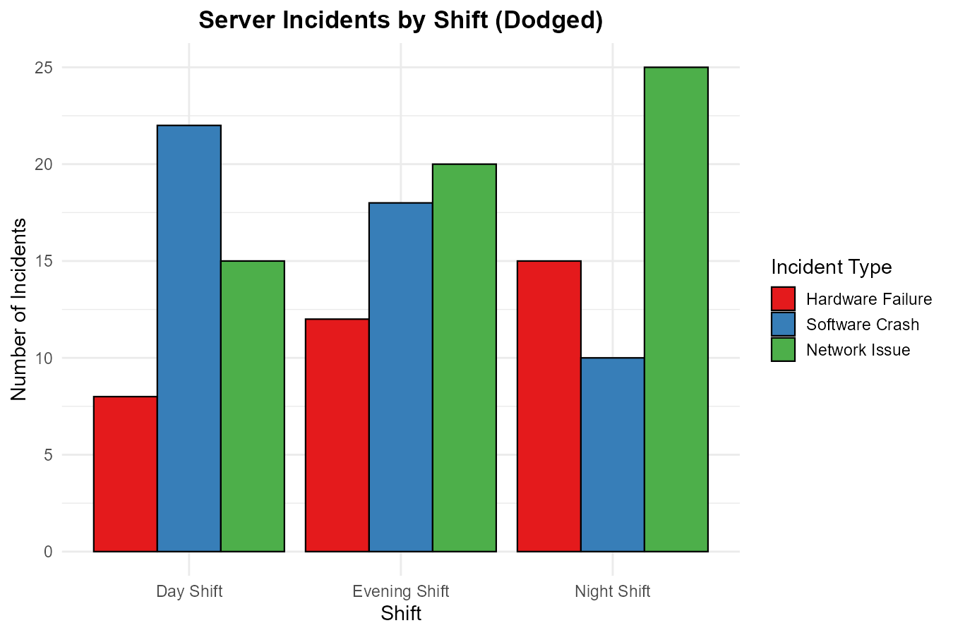
Fig. 2.8 Server incidents by shift (dodged bar graph)
Easier with dodged bars:
Comparing the same incident type across shifts (e.g., “How does Hardware Failure compare across all three shifts?”)
The common baseline (zero) makes height comparisons precise
Harder with dodged bars:
Seeing the total incidents per shift at a glance
Understanding the composition/proportion of incident types within each shift
Stacked bars make it immediately clear that Software dominates Day Shift while Network dominates Night Shift
Exercise 4: Choosing the Right Visualization
For each scenario below, determine whether a pie chart or bar graph would be more appropriate. If bar graph, specify whether stacked or dodged would be better. Justify your choice.
Scenario A: Showing the market share of five smartphone manufacturers, where the goal is to emphasize that Samsung holds nearly one-third of the global market.
Scenario B: Comparing customer satisfaction ratings (Very Satisfied, Satisfied, Neutral, Dissatisfied, Very Dissatisfied) across four different product lines.
Scenario C: Displaying the programming languages known by developers at a tech company, where developers can list multiple languages.
Scenario D: Showing how a project’s budget is allocated across 12 different expense categories.
Scenario E: Showing the composition of pass/fail rates within each of 6 quality inspection stations to identify which stations have the highest failure rates.
Solution
Scenario A: Smartphone Market Share
Pie chart is appropriate.
The data represents a complete whole (100% of market)
Few categories (5 manufacturers)
The stated goal is to emphasize “one-third”—pie charts excel at communicating “X accounts for one-third of the total”
Part-to-whole relationship is the focus
Scenario B: Satisfaction Across Product Lines
Dodged bar graph is appropriate.
Need to compare the same rating level across 4 different products
Bar graphs allow precise comparison using a common baseline
Four separate pie charts would make cross-product comparison difficult
5 rating categories × 4 products = 20 bars, manageable in dodged format
Scenario C: Programming Languages (Multiple Selection)
Bar graph is required (pie chart is inappropriate).
Developers can select multiple languages, so percentages will sum to more than 100%
Pie charts require mutually exclusive categories that sum to a whole
A simple bar graph showing the count or percentage for each language works well
No stacking or dodging needed if just showing one dimension
Scenario D: Budget Across 12 Categories
Bar graph is better than pie chart.
12 categories is too many for a readable pie chart (guideline: ≤5-6 slices)
Bar graphs handle many categories comfortably
Could be a simple bar graph (no stacking/dodging needed with single budget)
However, if the goal is strictly to show part-of-whole for a single budget, a treemap might be considered as an alternative
Scenario E: Pass/Fail Composition by Station
Stacked bar graph is appropriate.
Goal is to see composition (pass vs fail) within each station
Stacked bars emphasize the proportion of each component within categories
All bars would reach the same height (100%), making failure rate proportions immediately visible
Alternative: Could use stacked bars showing percentages, so each station’s bar reaches 100%
Exercise 5: Simpson’s Paradox Awareness
A pharmaceutical company tests a new drug at two hospitals. The results are:
Hospital A:
Treatment |
Recovered |
Not Recovered |
Recovery Rate |
|---|---|---|---|
New Drug |
200 |
800 |
20% |
Standard |
10 |
90 |
10% |
Hospital B:
Treatment |
Recovered |
Not Recovered |
Recovery Rate |
|---|---|---|---|
New Drug |
15 |
5 |
75% |
Standard |
400 |
200 |
67% |
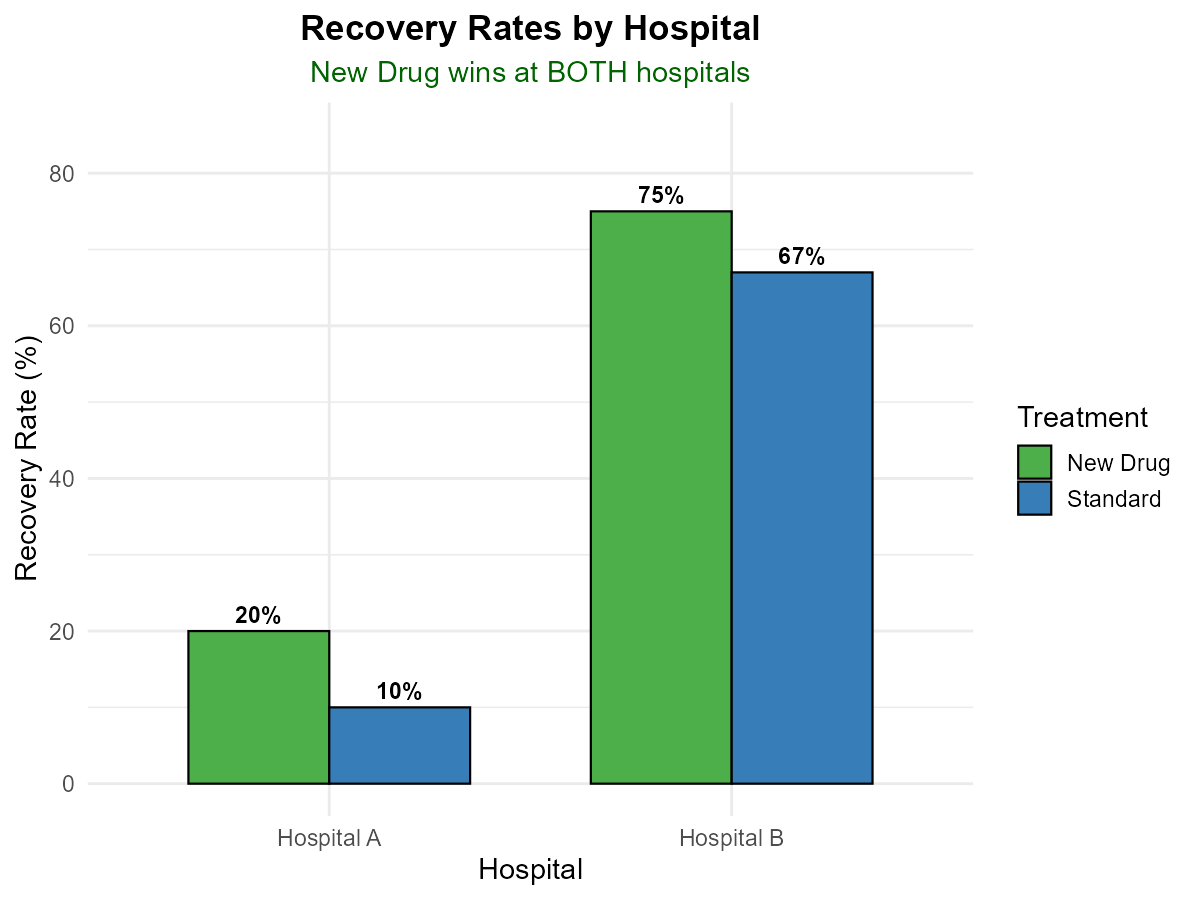
Fig. 2.9 Recovery rates by hospital — New Drug wins at both!
At Hospital A, which treatment has a higher recovery rate?
At Hospital B, which treatment has a higher recovery rate?
Combine the data from both hospitals. Calculate the overall recovery rate for the New Drug and for the Standard treatment.
Based on your answer to (c), which treatment appears better when looking at the combined data?
This is an example of Simpson’s Paradox. The New Drug has a higher recovery rate at both hospitals, yet appears worse overall. In your own words, explain why this happens. What is the confounding factor?
Solution
Part (a): Hospital A
New Drug: 20% recovery rate
Standard: 10% recovery rate
New Drug is better at Hospital A (20% > 10%)
Part (b): Hospital B
New Drug: 75% recovery rate
Standard: 67% recovery rate
New Drug is better at Hospital B (75% > 67%)
Part (c): Combined Data
New Drug (combined):
Recovered: 200 + 15 = 215
Total patients: (200 + 800) + (15 + 5) = 1000 + 20 = 1020
Recovery Rate: 215/1020 = 21.1%
Standard (combined):
Recovered: 10 + 400 = 410
Total patients: (10 + 90) + (400 + 200) = 100 + 600 = 700
Recovery Rate: 410/700 = 58.6%
Part (d): Which Appears Better Overall?
Looking at combined data: Standard (58.6%) > New Drug (21.1%)
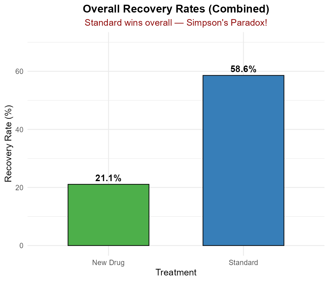
Fig. 2.10 Overall recovery rates — Standard wins when combined!
Standard appears better overall—even though New Drug won at both hospitals!
Part (e): Explanation of Simpson’s Paradox
This paradox occurs because of unequal distribution of patients across hospitals with very different baseline recovery rates.
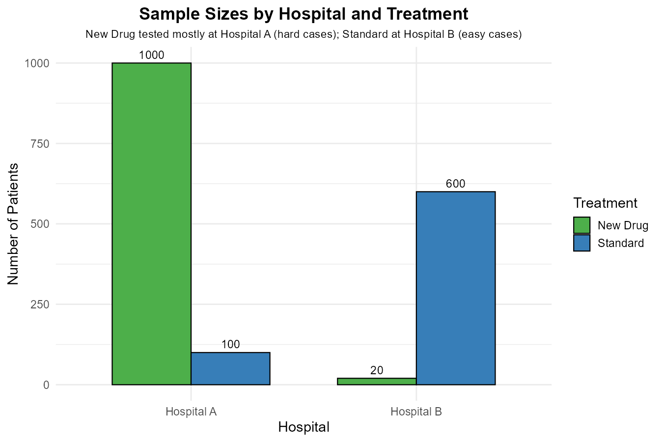
Fig. 2.11 Sample sizes reveal the confounding factor
Key observations:
Hospital A has a very low overall recovery rate (severe cases)
Hospital B has a high overall recovery rate (mild cases)
Most New Drug patients (1000 of 1020) were at Hospital A (the “hard” hospital)
Most Standard patients (600 of 700) were at Hospital B (the “easy” hospital)
The confounding factor is patient severity/hospital assignment. The New Drug was primarily tested on difficult cases (Hospital A), while Standard was primarily used on easier cases (Hospital B).
When we aggregate, we’re not comparing like with like—we’re comparing a treatment used mostly on severe cases against one used mostly on mild cases. This masks the fact that when compared fairly within the same hospital, New Drug outperforms Standard every time.
The lesson: Always examine data at multiple levels of categorization before drawing conclusions. Aggregated data can reverse patterns visible in subgroups.
Exercise 6: Creating and Interpreting Frequency Tables
A quality control team inspects circuit boards and categorizes defects. The inspection results for 500 boards are:
320 boards had no defects
95 boards had cosmetic defects only
60 boards had functional defects only
25 boards had both cosmetic and functional defects
Create a complete frequency table with columns for: Category, Frequency, Relative Frequency, and Percentage.
What percentage of boards had at least one defect (of any type)?
If you wanted to visualize the proportion of defect-free vs defective boards, would you use a pie chart or bar graph? Why?
If you wanted to compare defect rates across three different manufacturing plants, what type of visualization would you recommend?
The team wants to track whether the defect rate is improving over time (monthly data for 12 months). Suggest an appropriate visualization and explain your choice.
Solution
Part (a): Complete Frequency Table
Category |
Frequency |
Relative Frequency |
Percentage |
|---|---|---|---|
No defects |
320 |
0.640 |
64.0% |
Cosmetic only |
95 |
0.190 |
19.0% |
Functional only |
60 |
0.120 |
12.0% |
Both defects |
25 |
0.050 |
5.0% |
Total |
500 |
1.000 |
100.0% |
Part (b): Boards with At Least One Defect
Boards with at least one defect = 95 + 60 + 25 = 180
Percentage = 180/500 × 100% = 36.0%
(Alternatively: 100% - 64% = 36%)
Part (c): Defect-Free vs Defective Visualization
Pie chart would be appropriate because:
Only 2 categories (defect-free vs defective) if simplified, or 4 categories as recorded
Data represents a complete whole (all 500 boards)
Goal is to show part-to-whole relationship
Simple message: “About two-thirds of boards are defect-free”
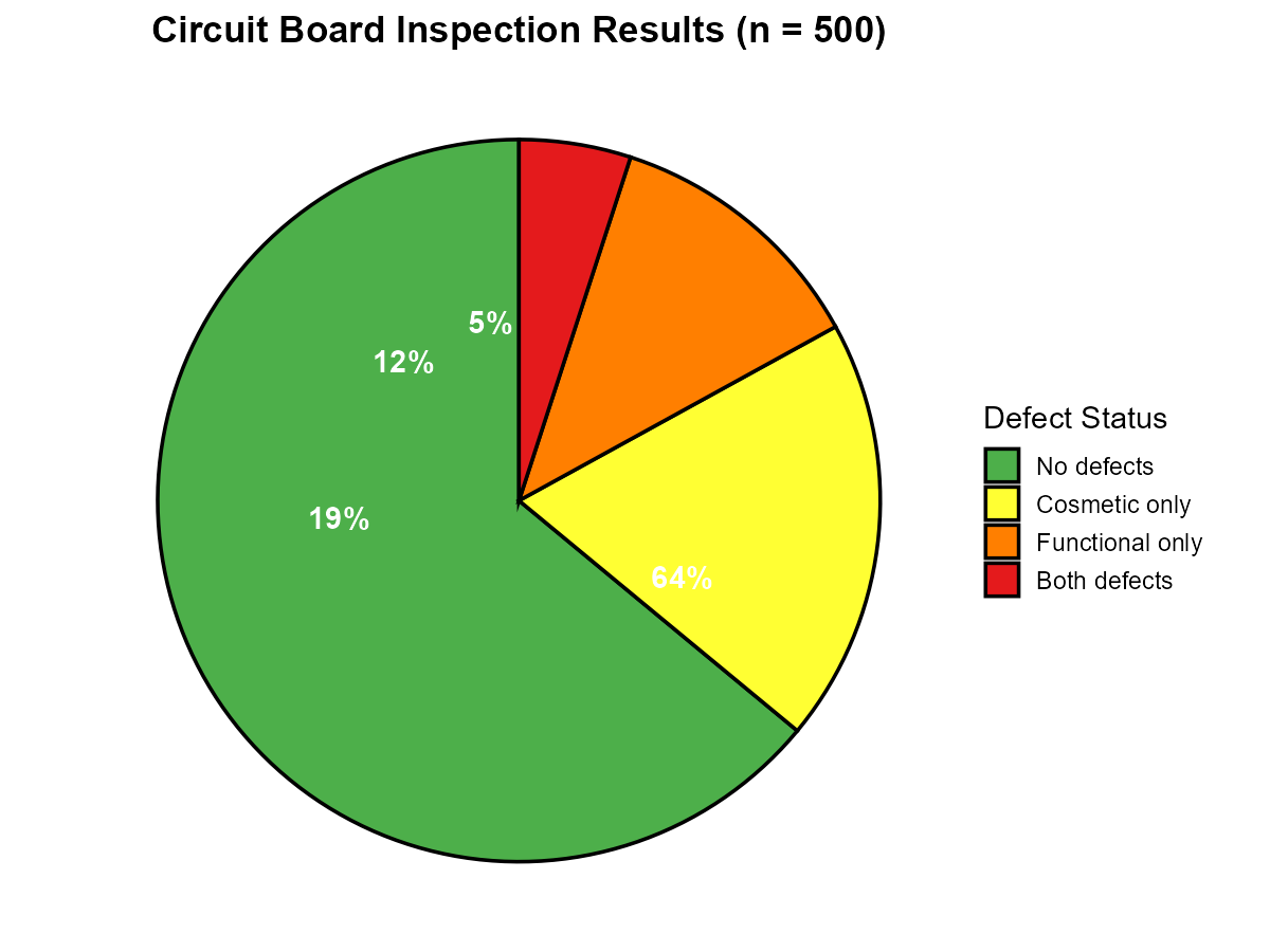
Fig. 2.12 Circuit board inspection results
A bar graph would also work, but a pie chart effectively communicates the proportion at a glance for this small number of categories.
Part (d): Comparing Across Plants
Grouped (dodged) or stacked bar graph would be best.
Need to compare the same defect category across 3 plants
Dodged: Better if the goal is to compare raw counts or rates of specific defect types across plants
Stacked (with percentages): Better if the goal is to show the composition of defect types within each plant while allowing comparison
Three separate pie charts would be harder to compare directly.
Part (e): Tracking Over Time (12 Months)
Line graph would be most appropriate for tracking trends over time.
Time is the x-axis (12 months)
Defect rate (percentage) is the y-axis
Line graph shows trends, patterns, and changes over time clearly
Could have multiple lines if tracking different defect types separately
A bar graph (with one bar per month) could work but is less effective for showing trends. Pie charts are not suitable for time series data.
2.2.7. Additional Practice Problems
True/False Questions (1 point each)
In a frequency table, the relative frequencies must always sum to 1, and the percentages must always sum to 100%.
Ⓣ or Ⓕ
A pie chart is appropriate when observations can belong to multiple categories simultaneously.
Ⓣ or Ⓕ
A stacked bar graph makes it easier to compare the exact height of a specific category across different groups than a dodged bar graph.
Ⓣ or Ⓕ
If a categorical variable has 15 different categories, a bar graph would generally be preferred over a pie chart for visualization.
Ⓣ or Ⓕ
The relative frequency of a category is calculated by dividing the category’s frequency by 100.
Ⓣ or Ⓕ
Simpson’s Paradox refers to situations where a trend observed in subgroups reverses or disappears when the data is aggregated.
Ⓣ or Ⓕ
Multiple Choice Questions (2 points each)
A survey asks 200 customers to rate their satisfaction as “Satisfied” or “Dissatisfied.” The results show 140 satisfied and 60 dissatisfied. What is the relative frequency of “Dissatisfied”?
Ⓐ 0.30
Ⓑ 0.60
Ⓒ 30
Ⓓ 60
Which of the following scenarios is LEAST appropriate for a pie chart?
Ⓐ Showing the breakdown of a company’s revenue by product category (4 categories)
Ⓑ Displaying the proportion of students in each major at a small college (5 majors)
Ⓒ Visualizing which social media platforms users have accounts on, where users can select multiple platforms
Ⓓ Illustrating how a household budget is divided among rent, food, utilities, and savings
A researcher wants to compare the distribution of customer complaints across 5 product categories for 3 different regions. Which visualization would be MOST appropriate?
Ⓐ Three separate pie charts, one for each region
Ⓑ A single pie chart combining all regions
Ⓒ A dodged bar graph with product category on the x-axis and separate bars for each region
Ⓓ A histogram of complaint frequencies
In a stacked bar graph showing employee distribution by department (Engineering, Sales, Marketing) across three office locations, what does the total height of each bar represent?
Ⓐ The number of employees in the largest department at that location
Ⓑ The total number of employees at that location
Ⓒ The average number of employees per department
Ⓓ The percentage of employees in Engineering
Answers to Practice Problems
True/False Answers:
True — By definition, relative frequency = frequency/total, so summing all relative frequencies gives total/total = 1. Similarly, percentages = relative frequencies × 100, so they sum to 100%.
False — Pie charts require mutually exclusive categories that sum to a whole. If observations can belong to multiple categories, percentages may exceed 100%, making pie charts misleading. Use a bar graph instead.
False — Stacked bar graphs make it harder to compare exact heights of interior segments (non-baseline categories) because they don’t share a common baseline. Dodged bar graphs, with all bars starting at zero, make exact comparisons easier.
True — Pie charts become difficult to read with more than 5-6 slices. With 15 categories, a bar graph handles the many categories much more effectively.
False — Relative frequency is calculated by dividing the category’s frequency by the total count, not by 100. To get percentage, you multiply relative frequency by 100.
True — Simpson’s Paradox occurs when a trend present in subgroups reverses or disappears when data is aggregated. The UC Berkeley admissions example and Exercise 5 demonstrate this phenomenon.
Multiple Choice Answers:
Ⓐ — Relative frequency = 60/200 = 0.30. Note that Ⓒ (30) is the percentage (30%), not the relative frequency.
Ⓒ — When users can select multiple platforms, the percentages will sum to more than 100%. Pie charts require mutually exclusive categories forming a complete whole. All other options represent proper part-to-whole scenarios.
Ⓒ — A dodged bar graph allows direct comparison of the same product category across all three regions using a common baseline. Three separate pie charts make cross-region comparison difficult; a single combined pie chart loses regional information; histograms are for continuous numerical data, not categorical.
Ⓑ — In a stacked bar graph, the total height of each bar represents the sum of all segments—in this case, the total number of employees at that location (Engineering + Sales + Marketing).