Slides 📊
3.5. Choosing the Right Measure & Comparing Measures Across Data Sets
Now that we’ve explored different measures of central tendency and spread, we need to determine which measures are most appropriate for different types of data. The effectiveness of each measure depends on the distribution shape and the presence of outliers.
Road Map 🧭
Understand what it means for a measure to be resistant.
Examine how skewness affects different measures of center and spread.
Learn which measures to choose when the data is skewed or outliers are present.
Understand why non-resistant measures are often favored over the resistant ones.
Explore standardization for comparing observations across different datasets.
See how side-by-side boxplots can compare distributions across groups.
3.5.1. Resistant and Non-Resistant Measures
One of the most important considerations when choosing summary statistics is whether they are resistant to extreme values. This is because under their presence, certain measures lose their representative power for the data set.
A resistant measure is one that is not strongly affected by extreme values.
A non-resistant measure is a measure that is significantly influenced by them.
Skewed distributions provide an excellent way to understand the concept of resistance. Let’s examine what happens to our measures of center and spread when data is skewed.
Effect of Skewness on Numerical Summary Measures
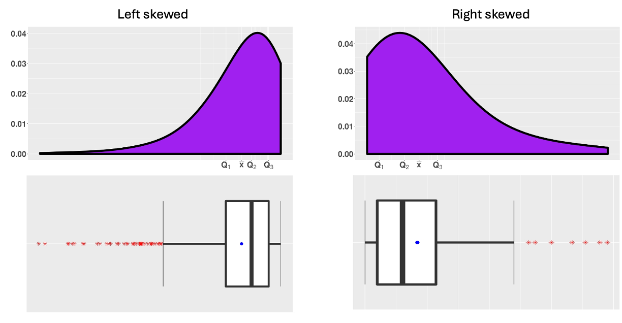
Fig. 3.10 Skewed distributions
Observation 1: Sample mean is pulled towards the tail
In Fig. 3.10, notice how the sample means (solid dots) are pulled in the direction of the tail, while the medians remain firmly in the middle of the ordered data.
Observation 2: Many points in the tail are marked as explicit points
When data is skewed, box plots often flag many points as “explicit” in the direction of the tail. However, these flagged points don’t necessarily represent true outliers. They may simply be part of the natural tail behavior of the distribution.
Recall that real outliers typically show a clear gap from the rest of the data. These points should be investigated more thoroughly to determine if they are real outliers, but it is evident that many explicit points on Fig. 3.10 are not.
3.5.2. Choosing the Right Pair of Measures
Sample Mean vs. Sample Median
As we can see from the skewed distributions in Fig. 3.10,
The sample mean (\(\bar{x}\)) is non-resistant. This is because it gives equal weight to each observation, including the extreme values.
The sample median (\(\tilde{x}\)) is resistant because it depends only on the order (ranks) of most of the data, not the exact values.
Sample Variance (Standard Deviation) vs. IQR
Similarly, the measures of spread also differ in their resistance to outliers.
The sample variance (\(s^2\)) and sample standard deviation (\(s\)) are non-resistant because
their computation depends on the sample mean, which is already non-resistant.
their computation involves squaring the distances between data points and the sample mean, which amplifies the effect of extreme values.
The interquartile range (IQR) is resistant because it excludes the extreme values from computation by only considering the middle 50% of the data.
Why Use Non-Resistant Measures At All?
\(\bar{x}\) and \(s\) (or \(s^2\)) are still favored over \(\tilde{x}\) and IQR when skewness and outliers are not a concern, because they carry important theoretical properties related to normality. These properties will form the foundation of many inference methods we develop later in the semester.
Summary
Property of data distribution |
Resistance required? |
Measure of center |
Measure of variability |
|---|---|---|---|
Skewed or has outliers |
Yes |
Sample median |
IQR |
Reasonably symmetric and has no outliers |
No |
Sample mean |
Sample variance (sd) |
3.5.3. Comparing Measures Across Data Sets
A. Side-by-Side Box Plots for Group Comparisons
When comparing a quantitative variable across categories, side-by-side box plots provide an excellent visualization tool.
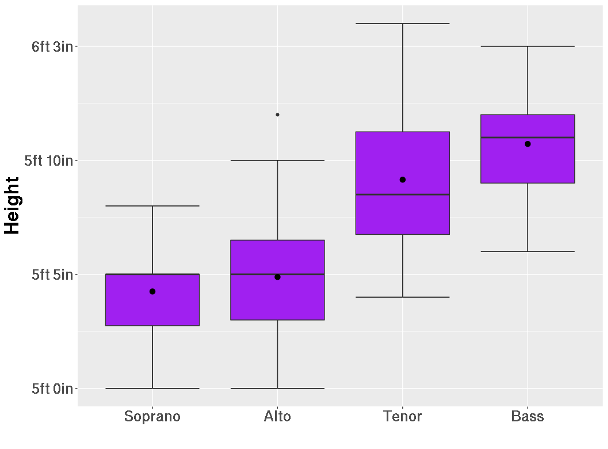
Fig. 3.11 Heights of singers in the New York Choral Society (1979) by voice type
This example shows the heights of singers in the New York Choral Society, categorized by voice type (soprano, alto, tenor, and bass). Some key observations are:
Singers with lower voice ranges tend to be taller.
There is a significant overlap in heights between tenors and basses, and between sopranos and altos.
Each voice type shows a different distribution shape of heights. For example, the distribution is negatively skewed for the soprano singers, while it is fairly symmetric for the altos except for a single outlier.
B. Standardization: Comparing Apples to Oranges
Often, we need to compare observations from different variables that use different scales or units. Standardization allows us to convert values to a common scale, making direct comparisons possible.
Suppose we have a data set \(x_1, x_2, \cdots, x_n\), with a sample mean \(\bar{x}\) and sample standard deviation \(s\). Then for each \(x_i\), its standardized value \(z_i\) is calculated as:
The standardized values tell us how many standard deviations the data points are above or below the mean:
Positive \(z_i\) indicates that \(x_i\) is above the sample mean.
Negative \(z_i\) indicates that \(x_i\) is below the sample mean.
\(z_i=0\) indicates that \(x_i\) is equal to the sample mean.
\(z_i = -2.25\) means the observation \(x_i\) is 2.25 standard deviations below the sample mean.
Properties and Uses of Standardized Data
After standardization, the new data set \(z_1, z_2, \cdots, z_n\) always has a sample mean of 0 and a sample standard deviation of 1 (this can be verified through a few algebraic steps). In other words, standardization adjusts any data set so that each value is measured relative to a common center and scale. This leads to several important properties:
Since they are unitless (the original units cancel out in the calculation), they provide an immediate sense of distance. For example, a data point with \(z=-3\) is most likely very far from the central mass of the data.
They allow for direct comparison of observations from different distributions.
3.5.4. Bringing It All Together
Key Takeaways 📝
Resistant measures (median, IQR) are not strongly affected by outliers and skewness and should be used when data is skewed or contains outliers.
Non-resistant measures (mean, standard deviation) are influenced by extreme values but have better statistical properties for symmetric distributions without outliers.
The sample mean is always pulled in the direction of the tail in skewed distributions, while the sample median remains representative of the center.
Side-by-side box plots allow us to compare distributions of a quantitative variable across categories of a categorical variable.
Standardized observations enable comparisons across different distributions.
3.5.5. Exercises
These exercises build your skills in selecting appropriate summary measures based on distribution shape and comparing observations across different datasets using standardization.
Exercise 1: Identifying Resistant vs. Non-Resistant Measures
For each measure below, identify whether it is resistant or non-resistant to extreme values. Briefly explain why.
Sample mean (\(\bar{x}\))
Sample median (\(\tilde{x}\))
Sample standard deviation (\(s\))
Interquartile range (IQR)
Sample range
Sample mode (\(M\))
Solution
Part (a): Sample Mean — Non-resistant
The sample mean gives equal weight to every observation in its calculation:
A single extreme value contributes directly to the sum and can significantly shift the mean away from the center of the main body of data.
Part (b): Sample Median — Resistant
The median depends only on the position (rank) of the middle value(s), not the actual magnitudes. Changing an extreme value to something even more extreme doesn’t change which value is in the middle position.
Part (c): Sample Standard Deviation — Non-resistant
The standard deviation is doubly affected by extreme values:
It depends on the sample mean (which is already non-resistant)
It squares the deviations from the mean, amplifying the effect of extreme values
Part (d): IQR — Resistant
The IQR = Q₃ − Q₁ uses only the 25th and 75th percentiles. Extreme values in the tails (below Q₁ or above Q₃) don’t affect these quartile positions, making IQR resistant.
Part (e): Sample Range — Non-resistant
The range = Max − Min depends entirely on the two most extreme values. A single outlier directly changes the range, making it highly non-resistant.
Part (f): Sample Mode — Resistant
The mode is the most frequently occurring value. Adding or changing a single extreme value typically doesn’t change which value occurs most often (unless that extreme value already was the mode).
Exercise 2: Choosing Appropriate Measures
For each scenario, determine whether you should use (mean, standard deviation) or (median, IQR) as your summary measures. Justify your choice.
Heights of adult women in a large random sample (known to follow a normal distribution).
Home sale prices in a city where most homes cost between $200K–$400K but a few luxury homes sold for over $2 million.
Exam scores for a well-designed test where scores are roughly symmetric and range from 55 to 95.
Time spent on a website per visit, where most visits are 2-5 minutes but some users stay over an hour.
Battery life measurements for smartphones from a quality-controlled manufacturing process with tight tolerances.
Annual income for residents of a small town that includes both minimum-wage workers and a few multimillionaires.
Solution
Part (a): Heights of Adult Women — Mean and Standard Deviation
Heights are known to follow a normal distribution, which is:
Symmetric
Has no outliers (by definition)
Use (mean, SD) because the distribution satisfies the conditions for non-resistant measures, and these measures have better theoretical properties for normal data.
Part (b): Home Sale Prices — Median and IQR
Home prices are typically right-skewed, with a few luxury homes creating a long upper tail. The $2M+ homes would:
Pull the mean far above the typical home price
Inflate the standard deviation
Use (median, IQR) to better represent what a “typical” home costs.
Part (c): Exam Scores — Mean and Standard Deviation
The distribution is described as “roughly symmetric” with a reasonable range. With no outliers or strong skewness:
Mean and median will be similar
SD will not be inflated by extremes
Use (mean, SD) for the better theoretical properties.
Part (d): Website Visit Duration — Median and IQR
Time data is often right-skewed, with most visits short but occasional very long visits. The hour-long visits would:
Pull the mean up significantly
Not represent typical user behavior
Use (median, IQR) to capture typical visit duration.
Part (e): Battery Life (Quality-Controlled) — Mean and Standard Deviation
Quality-controlled manufacturing typically produces:
Measurements tightly clustered around the target
Approximately symmetric distributions
Few if any outliers
Use (mean, SD). These are standard for quality control and process monitoring.
Part (f): Annual Income — Median and IQR
Income distributions are notoriously right-skewed. The presence of multimillionaires would:
Dramatically inflate the mean
Make mean unrepresentative of typical residents
Use (median, IQR). This is why economists report median household income rather than mean.
Exercise 3: Effect of Skewness on Measures
A dataset of employee response times (in seconds) to IT help desk tickets has the following summary statistics:
Mean: 45.2 seconds
Median: 32.0 seconds
Standard Deviation: 38.5 seconds
IQR: 22.0 seconds
Based on the relationship between mean and median, what is the likely shape of this distribution?
Which direction is the distribution skewed? Explain how you know.
A manager wants to report “typical response time” to stakeholders. Which measure should they use? Why?
If the goal is to identify employees who are unusually slow to respond, would you use mean + 2SD or Q₃ + 1.5×IQR as a cutoff? Explain your reasoning.
If the five slowest response times (all over 150 seconds) were removed from the dataset, which measures would change more dramatically: (mean, SD) or (median, IQR)?
Solution
Part (a): Shape of Distribution
The distribution is likely right-skewed (positively skewed).
Evidence: Mean (45.2) > Median (32.0)
When the mean is pulled above the median, there are high values in the right tail dragging the mean upward.
Part (b): Direction of Skewness
The distribution is right-skewed (skewed toward higher values).
The mean is pulled in the direction of the tail. Since Mean > Median, the tail extends toward high response times. This makes sense contextually: most tickets are resolved quickly, but some complex issues take much longer.
Part (c): Typical Response Time
The manager should report the median (32.0 seconds).
Reasons:
The median better represents what a “typical” ticket experiences
The mean (45.2 seconds) is inflated by the slow outliers and doesn’t represent most responses
50% of tickets are resolved faster than 32 seconds; the mean would overestimate typical wait time
Part (d): Identifying Unusually Slow Responses
Use Q₃ + 1.5×IQR rather than Mean + 2SD.
Reasons:
The distribution is right-skewed, so Mean + 2SD would be based on already-inflated values
For skewed data, the 1.5×IQR rule is more appropriate because it’s based on resistant measures
Mean + 2SD assumes approximate normality, which doesn’t apply here
Calculation: Upper fence = Q₃ + 1.5(22) = Q₃ + 33 seconds (we’d need Q₃ to complete)
Part (e): Effect of Removing Extreme Values
(Mean, SD) would change more dramatically.
Reasons:
Mean directly includes all values; removing the five highest will decrease it noticeably
SD includes squared deviations; removing extreme values will substantially reduce it
Median might not change at all (depends on how many observations there are)
IQR would likely be unaffected since it only depends on Q₁ and Q₃, which are in the middle of the data
This illustrates why (median, IQR) are preferred for skewed data—they’re stable even when extreme values are present or removed.
Exercise 4: Standardization Calculations
A student takes three different standardized tests:
Test |
Student’s Score |
Class Mean |
Class SD |
|---|---|---|---|
Statistics |
78 |
72 |
8 |
Chemistry |
85 |
80 |
10 |
Psychology |
92 |
88 |
4 |
Calculate the z-score for each test.
On which test did the student perform best relative to their peers?
On which test did the student perform worst relative to their peers?
The student says “I scored highest in Psychology, so that’s my best subject.” Why might this conclusion be misleading?
If a z-score of 1.5 or higher earns an “A” in each class, in which classes would this student earn an “A”?
Solution
Part (a): Z-Score Calculations
Formula: \(z = \frac{x - \bar{x}}{s}\)
Statistics:
Chemistry:
Psychology:
Part (b): Best Relative Performance
Psychology (z = 1.00) — The student performed best relative to peers.
A z-score of 1.00 means the student scored 1 full standard deviation above the class mean, which is the highest relative standing among the three tests.
Part (c): Worst Relative Performance
Chemistry (z = 0.50) — The student performed worst relative to peers.
Despite scoring 85 (a seemingly good raw score), the student was only 0.5 standard deviations above the class mean, indicating a less impressive relative standing.
Part (d): Why Raw Scores Are Misleading
The conclusion “I scored highest in Psychology, so that’s my best subject” is misleading because:
Different scales: The tests may have different difficulty levels and scoring ranges
Different class performance: The Psychology class had a higher mean (88), so reaching 92 required less relative excellence
Different variability: Psychology had a smaller SD (4), meaning scores were tightly clustered; standing out required less absolute difference
Proper comparison: Z-scores account for both the average performance AND the spread of scores in each class
Interestingly, Psychology is still the best relative performance in this case, but not because of the raw score—it’s because the student was a full standard deviation above a class that had little variability.
Part (e): Classes with “A” Grade (z ≥ 1.5)
None of the classes would earn an “A” by this criterion.
Statistics: z = 0.75 < 1.5 ✗
Chemistry: z = 0.50 < 1.5 ✗
Psychology: z = 1.00 < 1.5 ✗
To earn an “A” in Statistics, the student would need: \(72 + 1.5(8) = 84\) or higher.
To earn an “A” in Chemistry, the student would need: \(80 + 1.5(10) = 95\) or higher.
To earn an “A” in Psychology, the student would need: \(88 + 1.5(4) = 94\) or higher.
Exercise 5: Interpreting Z-Scores in Context
The fuel efficiency (mpg) of vehicles in a large fleet has a mean of 28 mpg and a standard deviation of 6 mpg.
A new hybrid vehicle gets 40 mpg. Calculate its z-score and interpret it.
An older truck gets 16 mpg. Calculate its z-score and interpret it.
The fleet manager wants to identify “exceptionally efficient” vehicles as those with z-scores above 2.0. What is the minimum mpg required?
The manager also wants to flag “inefficient” vehicles with z-scores below −1.5 for maintenance review. What is the maximum mpg that would be flagged?
A vehicle has a z-score of 0. What does this tell you about its fuel efficiency?
Is it possible for a vehicle in this fleet to have a z-score of −5? What would this mean, and is it likely?
Solution
Part (a): Hybrid Vehicle (40 mpg)
Interpretation: The hybrid’s fuel efficiency is exactly 2 standard deviations above the fleet mean. This is an exceptionally efficient vehicle—better than the vast majority of the fleet.
Part (b): Older Truck (16 mpg)
Interpretation: The truck’s fuel efficiency is 2 standard deviations below the fleet mean. This is one of the least efficient vehicles in the fleet.
Part (c): Minimum MPG for “Exceptionally Efficient” (z > 2.0)
Solve for x when z = 2.0:
Vehicles with more than 40 mpg would be classified as exceptionally efficient.
Part (d): Maximum MPG for “Inefficient” Flag (z < −1.5)
Solve for x when z = −1.5:
Vehicles with less than 19 mpg would be flagged for maintenance review.
Part (e): Z-Score of 0
A z-score of 0 means the vehicle’s fuel efficiency equals exactly the fleet mean.
\(z = 0\) → \(x = \bar{x} = 28\) mpg
This vehicle has perfectly average fuel efficiency for the fleet—neither above nor below the mean.
Part (f): Z-Score of −5
A z-score of −5 would mean:
This is not possible since fuel efficiency cannot be negative.
In general, z-scores of magnitude 5 are extremely rare in real data. For approximately normal distributions, virtually all observations fall within 3 standard deviations of the mean. A z-score of −5 would indicate either:
A data entry error
An observation from a completely different population
A measurement that’s physically impossible (as in this case)
Exercise 6: Comparing Across Groups with Box Plots
A company compares customer satisfaction scores (1-100 scale) across three store locations. The side-by-side box plots are shown below.
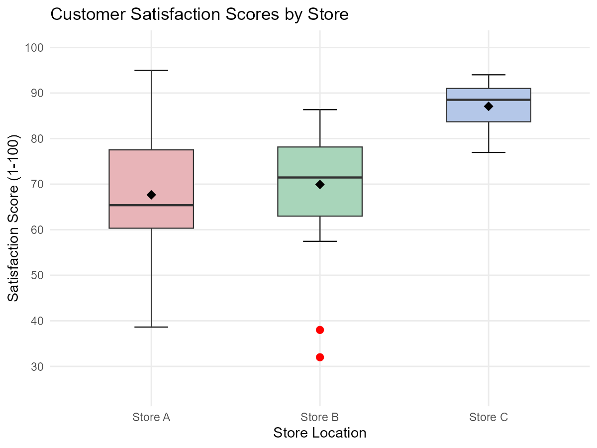
Fig. 3.12 Customer satisfaction scores by store location
Based on the box plots:
Which store has the highest median satisfaction score?
Which store shows the most variability in satisfaction scores (based on IQR)?
Store B shows two explicit points on the low end. Should these customers be ignored in the analysis? Explain.
Store C appears to have a longer lower whisker than upper whisker. What does this suggest about the shape of Store C’s distribution?
A regional manager wants to identify the “most consistently satisfying” store. Which would you recommend based on both central tendency and spread?
If you could only examine one summary statistic for each store, would you prefer the mean or median for this comparison? Why?
Solution
Part (a): Highest Median
Store C has the highest median satisfaction score.
The median is shown by the line inside each box. Store C’s median line is positioned highest on the scale.
Part (b): Most Variability (IQR)
Store A shows the most variability.
The IQR is represented by the height of the box (Q₃ − Q₁). Store A has the tallest box, indicating the largest spread in the middle 50% of scores.
Part (c): Should Explicit Points Be Ignored?
No, they should not be ignored.
Reasons:
These represent real customer experiences
They may indicate specific issues worth investigating (service failures, product problems)
Ignoring them could mask genuine problems at Store B
They should be investigated to understand WHY these customers were dissatisfied
However, when reporting “typical” satisfaction, it may be appropriate to note them separately: “While median satisfaction is 75, two customers reported scores below 40, warranting investigation.”
Part (d): Store C’s Distribution Shape
The longer lower whisker suggests left-skewness (negative skewness) in Store C’s distribution.
This means:
Most customers give high scores (scores cluster near the upper end)
A few customers give lower scores, creating the left tail
The distribution is “compressed” at the top and stretched at the bottom
This is often a good sign—it suggests most customers are highly satisfied with few exceptions.
Part (e): Most Consistently Satisfying Store
Store C would be recommended as the most consistently satisfying.
Reasoning:
Highest median: Best typical customer experience
Smallest IQR: Most consistent scores (smallest box)
No explicit points: No extremely dissatisfied customers flagged
The left-skew indicates most customers are highly satisfied
Store C delivers both high and consistent satisfaction—the ideal combination.
Part (f): Mean vs Median for Comparison
Median would be preferred for this comparison.
Reasons:
Store B has explicit points on the low end, which would drag down its mean
Store C appears left-skewed, where mean would be lower than median
Customer satisfaction data often has outliers (very unhappy customers)
Median better represents the “typical” customer experience
For comparing “what most customers experience,” median is more appropriate
Additionally, since we’re already using box plots (which display medians prominently), consistency suggests using median for the summary statistic.
3.5.6. Additional Practice Problems
True/False Questions (1 point each)
The sample mean is resistant to extreme values.
Ⓣ or Ⓕ
For a right-skewed distribution, the mean is typically greater than the median.
Ⓣ or Ⓕ
A z-score of −2.5 indicates the observation is 2.5 standard deviations above the mean.
Ⓣ or Ⓕ
The IQR is non-resistant because it depends on the sample mean.
Ⓣ or Ⓕ
After standardizing a dataset, the new mean is 0 and the new standard deviation is 1.
Ⓣ or Ⓕ
For symmetric distributions without outliers, the mean and median will be approximately equal.
Ⓣ or Ⓕ
Multiple Choice Questions (2 points each)
A dataset has Mean = 100 and Median = 120. This distribution is most likely:
Ⓐ Right-skewed (positively skewed)
Ⓑ Left-skewed (negatively skewed)
Ⓒ Symmetric
Ⓓ Bimodal
A student scores 75 on a test where the class mean is 70 and the standard deviation is 10. The student’s z-score is:
Ⓐ 0.5
Ⓑ 5.0
Ⓒ 7.5
Ⓓ −0.5
For heavily skewed data with several outliers, which pair of summary measures is most appropriate?
Ⓐ Mean and standard deviation
Ⓑ Mean and IQR
Ⓒ Median and standard deviation
Ⓓ Median and IQR
An observation has a z-score of 0. This means the observation:
Ⓐ Is an outlier
Ⓑ Equals the sample mean
Ⓒ Equals the sample median
Ⓓ Has zero variability
Answers to Practice Problems
True/False Answers:
False — The sample mean is non-resistant. It gives equal weight to all observations, so extreme values directly affect it.
True — In right-skewed distributions, the long tail of high values pulls the mean above the median.
False — A z-score of −2.5 indicates the observation is 2.5 standard deviations below the mean (negative indicates below).
False — The IQR is resistant because it depends only on Q₁ and Q₃, not the mean. Extreme values don’t affect the quartiles.
True — By definition, standardization transforms data to have mean = 0 and standard deviation = 1.
True — In symmetric distributions, the mean and median coincide at the center. Without outliers to pull the mean, they remain approximately equal.
Multiple Choice Answers:
Ⓑ — When Mean < Median (100 < 120), the distribution is left-skewed. Low values in the left tail pull the mean down.
Ⓐ — \(z = \frac{75 - 70}{10} = \frac{5}{10} = 0.5\)
Ⓓ — For skewed data with outliers, median and IQR are most appropriate because both are resistant measures that won’t be distorted by extreme values.
Ⓑ — A z-score of 0 means \(\frac{x - \bar{x}}{s} = 0\), which implies \(x = \bar{x}\). The observation equals the sample mean.