Slides 📊
3.4. Measures of Variability - Interquartile Range and Five-Number Summary
While the sample variance and standard deviation provide useful measures of spread, they can be heavily influenced by extreme values. In situations where data is skewed or contains unusual observations, we need measures that are less sensitive to individual points. This is where the interquartile range (IQR) and five-number summary come into play—measures that focus only on the middle portion of the data.
Road Map 🧭
Understand quartiles and percentiles as ways to divide ordered data.
Calculate the interquartile range (IQR) as a robust measure of spread.
Identify explicit points using the upper and lower fences.
Create and interpret modified box plots.
Distinguish between explicit points and real outliers.
3.4.1. Preliminaries: Percentiles and Quartiles
Sample Percentiles
For a number \(p\) between 0 and 100, the \(p\)-th sample percentile of a variable is the value such that \(p\%\) of observations are less than or equal to that value. For example:
The 10th percentile is a value such that 10% of all observations are less than or equal to it.
The 99th percentile is a value such that 99% of all observations are less than or equal to it.
Sample Quartiles
Sample quartiles are three special percentiles which divide the data into four equally sized parts, each containing approximately 25% of the data points. They consist of
\(Q_1\) (first quartile): The 25th percentile
\(Q_2\) (second quartile): The 50th percentile. This is also the sample median.
\(Q_3\) (third quartile): The 75th percentile
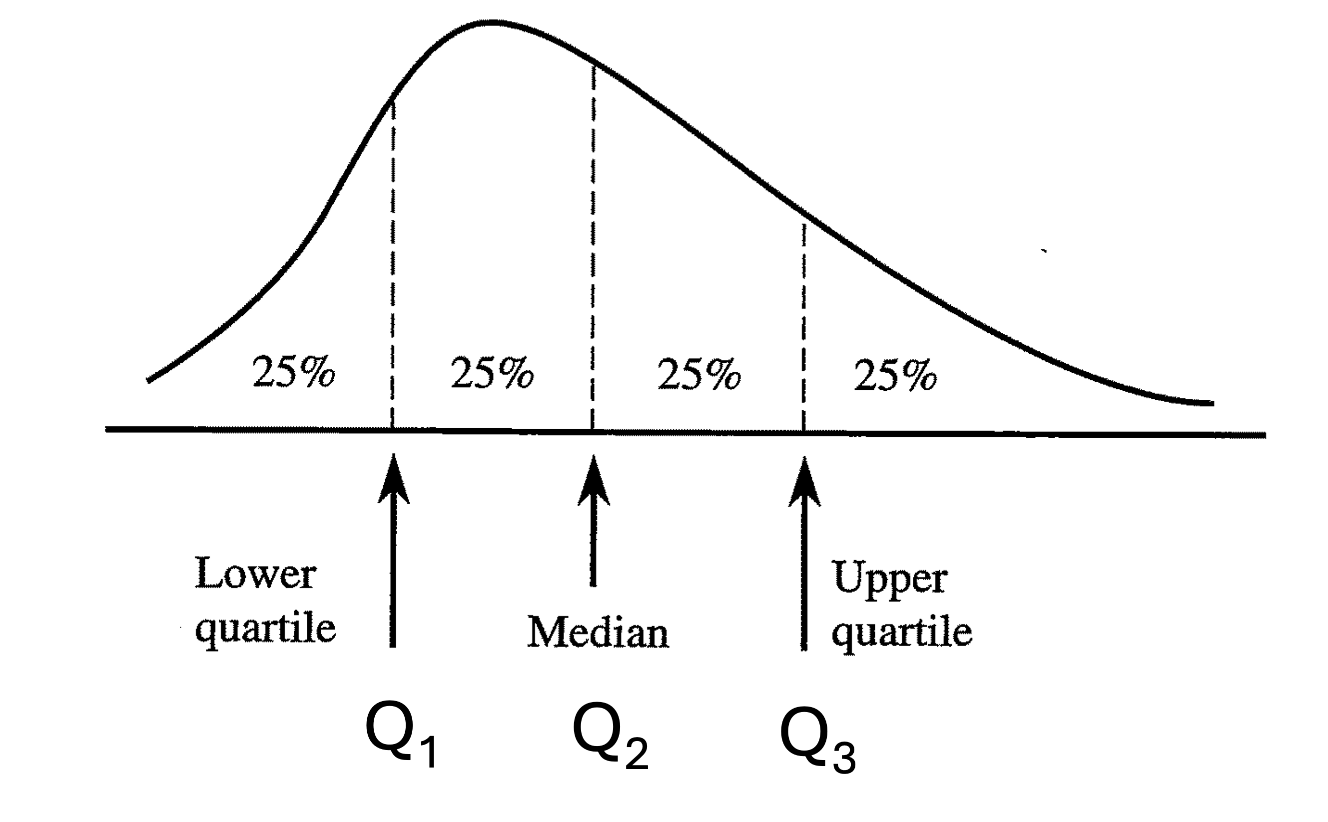
Fig. 3.4 A distribution divided into four equal parts by the quartiles
Calculating Sample Quartiles
Sample quartiles can be found by “computing three different medians.” The specific steps are as follows:
Compute the sample median of the whole data set. This is the second quartile, or \(Q_2\).
The data is now divided into two equally sized subsets, from the minimum to the median, then from the median to the maximum. Include the median in both subsets if it is on a data point. Compute the sample median of the first subset. This is the first quartile, \(Q_1\), for the whole data.
Likewise, compute the median for the second subset. This is the third quartile, \(Q_3\), for the whole data.
Example 💡: Computing the Sample Quartiles
The table below displays the time to promotion, in months, for 19 randomly sampled software engineers at an IT firm. Compute the sample quartiles, both by hand and using R.
7 |
12 |
14 |
14 |
14 |
18 |
21 |
22 |
23 |
24 |
25 |
34 |
34 |
37 |
47 |
49 |
64 |
100 |
150 |
Calculating the sample quartiles by hand
\(n=19\). The sample median of the data set is the 10th smallest value. \(Q_2 = 24\).
Let us now consider the first half of the data, from 7 to 24. There are 10 (even) data points in the subset. Therefore, we take the average between the 5th and the 6th data points as the subset’s sample median. \(Q_1 = \frac{14+18}{2} = 16\).
Repeating Step 2 for the second subset (24 to 150), we find \(Q_3 = \frac{37+47}{2} = 42\).
Confirm that the four sections created by \(Q_1, Q_2\) and \(Q_3\) are equally sized.
Warning
Quantile definitions: R’s quantile() uses the Hyndman and Fan type 7 method by default, which is not the same as the simple “median of halves” hand calculation shown above. For all homework and assessments, you must use R’s approach with :code:`type = 7` (the default), and your answers should match R’s output.
Calculating the sample quartiles in R
In R, the quantile() function is used to calculate percentiles (quantiles are simply percentiles on a 0-1 scale instead of 0-100.) By default, it returns the five-number summary (minimum, Q₁, median, Q₃, maximum):
# Example dataset
x <- c(7, 12, 14, 14, 14, 18, 21, 22, 23, 24, 25, 34, 34, 37, 47, 49, 64, 100, 150)

# Get quartiles (five-number summary)
quantile(x)

# Output:
#    0%   25%   50%   75%  100%
#   7.0  16.0  24.0  42.0 150.0
To access quartiles, you can use the following syntax:
# Get Q1 (25th percentile)
quantile(x)["25%"]

# Get Q3 (75th percentile)
quantile(x)["75%"]
You can also request specific percentiles other than the default:
# Calculate the 10th, 20th, 30th percentiles
quantile(x, probs = c(0.1, 0.2, 0.3))
Brief discussion: quantile methods in R
R provides nine quantile definitions. They differ only in how they place the percentile between sorted data values.
Two families. Types 1–3 are stepwise choices that pick actual data points, with different tie handling. Types 4–9 use linear interpolation between data points.
Textbook “median of halves.” This is Tukey’s hinges, used by
fivenum()and by base and ggplot boxplots. It often matches the hand method you may know, but not always.R default.
quantile(..., type = 7)is the default. It interpolates to give smooth percentiles and is standard in R and S/S-PLUS.Other common choices. Type 6 is popular in hydrology, type 8 targets median-unbiasedness across distributions, and type 9 targets normal-theory unbiasedness.
Practical impact. Differences can be noticeable for small samples or skewed data. For large n the methods tend to agree.
Course policy. For homework and assessments use
quantile(x)and report answers that match R’s default.
3.4.2. The Interquartile Range (IQR)
The interquartile range (IQR) represents the spread of the data using the width of the middle 50%. It is calculated as the difference between the third quartile (\(Q_3\)) and the first quartile (\(Q_1\)):
Example 💡: Calculating the IQR
For the number of months to promotion data, compute the IQR.
From the previous example, \(Q_3 = 42\) and \(Q_1 = 16\). Then
This tells us that the middle 50% of the data spans 26 months, giving us a sense of how spread out the typical cases are.
R provides a built-in function to calculate the IQR.
# Calculate IQR
IQR(x)

# Alternative calculation
q <- quantile(x)
q["75%"] - q["25%"]
3.4.3. Five-Number Summary
The five-number summary provides a concise overview of a dataset’s distribution by reporting the sample quartiles, together with the data’s minimum and maximum. This summary gives a comprehensive picture of the center (\(Q_2\)), spread (\(Q_1\) and \(Q_3\)), and extremes (min and max) of the data.
See the first code block of Example 💡: Computing the Sample Quartiles for an instance of a five-number summary.
3.4.4. Identifying Explicit Points with Fences
One important application of the IQR is to identify potential outliers or explicit points in the data. We use what’s called the IQR rules to establish “fences” beyond which observations are flagged for further inspection.
Inner fences are computed using the 1.5 IQR rule:
Lower inner fence = \(Q_1 - 1.5 IQR\)
Upper inner fence = \(Q_3 + 1.5 IQR\)
Outer fences are computed using the 3 IQR rule:
Lower outer fence = \(Q_1 - 3 IQR\)
Upper outer fence = \(Q_3 + 3 IQR\)
Points that fall between the inner and outer fences are considered mild explicit points, while those beyond the outer fences are considered extreme explicit points.
Example 💡: Identifying the Explicit Points
For the number of months to promotion data, identify the inner and outer fences, and identify any mild and extreme explicit points.
7 |
12 |
14 |
14 |
14 |
18 |
21 |
22 |
23 |
24 |
25 |
34 |
34 |
37 |
47 |
49 |
64 |
100 |
150 |
From the previous example, IQR = 26.
Lower inner fence: \(16 - (1.5)(26) = -23\)
Upper inner fence: \(42 + (1.5)(26) = 81\)
Lower outer fence: \(16 - (3)(26) = -62\)
Upper outer fence: \(42 + (3)(26) = 120\)
Since the value 100 exceeds the upper inner fence (81) but falls below the upper outer fence (120), it is classified as a mild explicit point. The value 150 exceeds the upper outer fence (120), making it an extreme explicit point. There are no lower explicit points in the data.
3.4.5. Modified Box Plots
A modified box plot is a visual representation of the five-number summary and the explicit points identified by the 1.5 IQR rule. It consists of
A box that spans from Q₁ to Q₃, representing the middle 50% of the data,
A line inside the box marking the median (Q₂),
Whiskers extending from the box to the most extreme data points that are not classified as explicit points, and
Explicit points as dots beyond the whiskers.
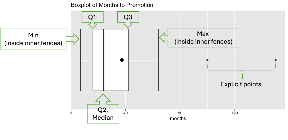
Fig. 3.5 A modified box plot with labeled components
The dot inside the box represents the sample mean of the data. While it is not a formal component of a box plot, we often include it for a more comprehensive view of the data distribution.
Why do we call it modified?
The box plots introduced in this course are a modified version of the basic form, which does not account for explicit points. You are not expected to know or use the basic version. Whenever we refer to a box plot, we always mean the modified version.
Example 💡: Creating a Modified Box Plot
For the number of months to promotion data set, draw a modified box plot both by hand and using R. Then interpret the data’s distribution.
Drawing a modified box plot by hand
Draw a horizontal or vertical axis that covers the full range of the data.
Draw a line through Q₁ and Q₃ and draw a box which uses them as its two sides.
Draw a line across the box at the median (Q₂).
Draw whiskers from the box to the most extreme data points that are NOT beyond the inner fences.
Plot individual points for observations beyond the inner fences.
Drawing a modified box plot using R
# Import the graphing package
library(ggplot2)

# Create data vector
promotion <- c(7, 12, 14, 14, 14, 18, 21, 22, 23, 24, 25, 34, 34, 37, 47, 49, 64, 100, 150)

# Change format to data frame
promotion_df <- data.frame(months=promotion)

# Graph
ggplot(promotion_df, aes(y="", x=months)) +  # flip x and y to make the plot vertical
   stat_boxplot(geom="errorbar") + #formats the whiskers
   geom_boxplot() +
   ggtitle("Boxplot of Months to Promotion") +
   stat_summary(fun = mean, col = "black", geom = "point", size = 3)
The code above returns Fig. 3.5.
3.4.6. Reading box plots beyond the five number summary
Skewness
While box plots offer a less detailed view of the data distribution than histograms, they are effective for quickly identifying skewness. Let us compare the histograms and the box plots drawn for the same data sets:
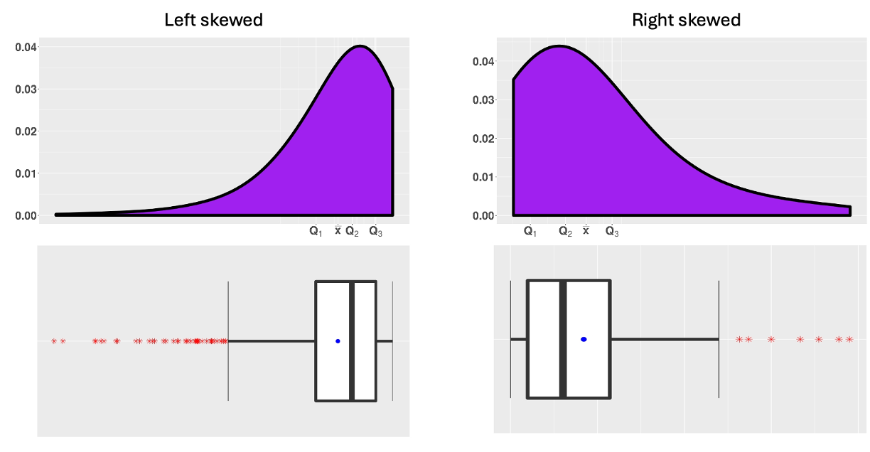
Fig. 3.6 Histograms and box plots of skewed data sets
Recall that each of the four sections defined by the sample quartiles contains approximately the same number of data points. Therefore, if one whisker is much longer than the box or the other whisker, it suggests that the data is more spread out in that section of the distribution.
Limitations
Box plots are efficient for identifying symmetry or skewness, but they are limited in the level of detail they provide on the shape of the distribution. Most importantly, we cannot
determine whether the data is normal (bell-shaped), or
identify the number of modes in the data
through a box plot. See the examples below—each with a distinct distribution, yet producing very similar box plots.
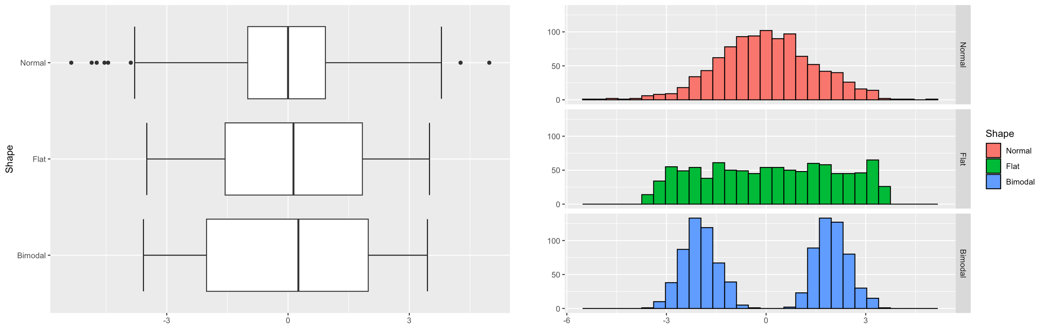
Fig. 3.7 Box plots of different symmetric distributions
To gain a detailed understanding of the shape of the data distribution, we must use more refined graphical tools such as histograms.
Explicit Points vs. Real Outliers
When interpreting a modified box plot, it’s crucial to understand that not all explicit points are real outliers.
Explicit points are observations flagged by statistical criteria like the 1.5 IQR rule. They are points that mathematically deviate from the pattern established by the majority of the data.
Real outliers are explicit points that, upon investigation, truly deviate from the underlying pattern of the data. They may represent errors, anomalies, or genuinely unusual cases.
When a data distribution is strongly skewed, for example, values on the longer tail may be identified as explicit points by the 1.5 IQR rule, although they are simply conforming to the underlying distribution. See Fig. 3.6.
When a data point is flagged as explicit, it should be inspected more carefully to determine if:
it represents an error in measurement, recording, or data entry,
it is an observation from a different population or process,
or very far from the main body of the box plot to be considered part of the same distribution.
In these cases, the explicit points are considered true outliers.
Example💡: Interpreting a box plot
Interpret the box plot of the number of months to promotion data.
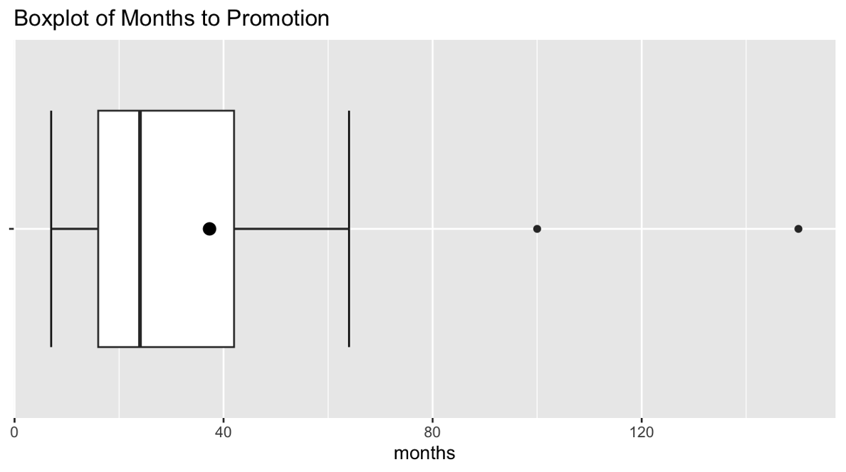
The middle 50% of engineers were promoted between 16 and 42 months after hiring.
The median time to promotion was 24 months.
Two engineers (100 and 150 months) are identified as explicit points.
Since the right half of the data is more spread out than the left half (longer right whisker, greater distance between Q2 and Q3 than Q1 and Q2), the data set is right-skewed.
The two explicit points are very far from the main body of the plot with gaps larger than the IQR itself, so we must investigate the possibility of them being real outliers. They might represent engineers who:
Were hired with specialized skills not requiring management roles.
Chose to remain in technical roles longer.
Faced unusual circumstances affecting their promotion timeline.
Were erroneously included in the dataset.
3.4.7. Bringing It All Together
Key Takeaways 📝
Sample quartiles divide the data into four equal parts.
The interquartile range (IQR) measures the spread of the middle 50% of the data.
The five-number summary provides a robust overview of the data distribution.
Use the 1.5 × IQR rule to identify explicit points that may be potential outliers.
Not all explicit points are real outliers - investigate them thoroughly before drawing conclusions.
Modified box plots visualize the five-number summary and highlight explicit points.
In the next section, we’ll discuss how to choose the most appropriate measures of center and spread for different types of data distributions.
3.4.8. Exercises
These exercises build your skills in calculating and interpreting quartiles, the interquartile range (IQR), five-number summaries, and modified box plots.
Exercise 1: Calculating Quartiles and IQR
A network engineer measures the latency (in milliseconds) for 15 data packets:
Find the five-number summary (Min, Q₁, Q₂, Q₃, Max).
Calculate the interquartile range (IQR).
Interpret the IQR in context: “The middle 50% of packet latencies span ___ milliseconds.”
Verify your calculations using R.
What percentage of packets had latencies between Q₁ and Q₃?
Solution
Part (a): Five-Number Summary
The data is already sorted with \(n = 15\).
Step 1: Find Q₂ (median)
Since n = 15 is odd, Q₂ is the \(\frac{15+1}{2} = 8\)th value.
\(Q_2 = 27\) ms
Step 2: Find Q₁
Consider the lower half: {12, 15, 18, 19, 22, 24, 25, 27} (8 values, including the median)
Q₁ is the median of this subset: average of 4th and 5th values.
\(Q_1 = \frac{19 + 22}{2} = 20.5\) ms
Step 3: Find Q₃
Consider the upper half: {27, 29, 31, 34, 38, 42, 48, 55} (8 values, including the median)
Q₃ is the median of this subset: average of 4th and 5th values.
\(Q_3 = \frac{34 + 38}{2} = 36\) ms
Five-Number Summary:
Minimum: 12 ms
Q₁: 20.5 ms
Q₂ (Median): 27 ms
Q₃: 36 ms
Maximum: 55 ms
Part (b): Interquartile Range
Part (c): Interpretation
“The middle 50% of packet latencies span 15.5 milliseconds.”
This means the typical variation in latency (excluding the fastest and slowest 25% of packets) is about 15.5 ms.
Part (d): R Verification
latency <- c(12, 15, 18, 19, 22, 24, 25, 27, 29, 31, 34, 38, 42, 48, 55)

# Five-number summary
quantile(latency)
#   0%  25%  50%  75% 100%
# 12.0 20.5 27.0 36.0 55.0

# IQR
IQR(latency)  # Returns 15.5
Part (e): Percentage Between Q₁ and Q₃
By definition, 50% of the data falls between Q₁ and Q₃. This is the interquartile range—the “middle half” of the data.
Exercise 2: Identifying Explicit Points
A quality control engineer measures the tensile strength (in MPa) of 20 steel samples:
Calculate Q₁, Q₃, and the IQR.
Calculate the inner fences (using the 1.5 × IQR rule).
Calculate the outer fences (using the 3 × IQR rule).
Identify any mild explicit points and extreme explicit points.
If you removed the explicit points and recalculated, would the fences change? Explain why this could create problems.
Solution
Part (a): Quartiles and IQR
Data is sorted with \(n = 20\).
Q₂ (median): Average of 10th and 11th values = \(\frac{452 + 455}{2} = 453.5\) MPa
Q₁: Median of lower half {415, 422, 428, 431, 435, 438, 441, 445, 448, 452}
Average of 5th and 6th values = \(\frac{435 + 438}{2} = 436.5\) MPa
Q₃: Median of upper half {455, 458, 462, 468, 472, 478, 485, 495, 520, 580}
Average of 5th and 6th values = \(\frac{472 + 478}{2} = 475\) MPa
IQR = Q₃ − Q₁ = 475 − 436.5 = 38.5 MPa
Part (b): Inner Fences (1.5 × IQR)
Part (c): Outer Fences (3 × IQR)
Part (d): Identifying Explicit Points
Check each value against the fences:
Mild explicit points: Values between inner and outer fences
580 MPa: Above upper inner fence (532.75) but below upper outer fence (590.5) → Mild explicit point
Extreme explicit points: Values beyond outer fences
None (580 < 590.5 and all values > 321)
520 MPa is below 532.75, so it is NOT an explicit point
Summary: One mild explicit point (580 MPa), no extreme explicit points.
Part (e): Removing Explicit Points and Recalculating
Yes, the fences would change if we removed 580 and recalculated.
Why this is problematic:
Moving target: After removing 580, the new Q₃ and IQR would decrease, potentially flagging 520 as a new explicit point
Iterative deletion: This could lead to repeatedly removing points, shrinking the dataset artificially
Data manipulation: Systematically removing explicit points without justification biases the analysis
Loss of information: Extreme values may represent real phenomena worth studying
Best practice: Calculate fences once using the original data, then investigate flagged points rather than automatically removing them.
Exercise 3: Interpreting Box Plots
The box plots below compare response times (in seconds) for two different web servers.
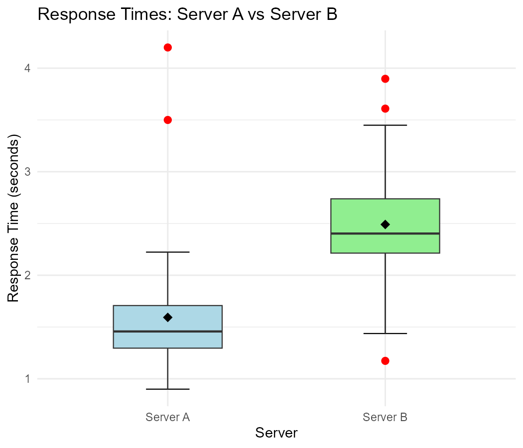
Fig. 3.8 Response times for Server A and Server B
For each server, estimate the five-number summary from the box plot.
Which server has a higher median response time?
Which server shows more variability in response times? Justify using the IQR.
Server A shows two explicit points. Are these necessarily errors that should be removed? Explain.
Based on the box plots, which server appears to have a right-skewed distribution? How can you tell?
A manager wants to choose the server with more consistent performance. Which would you recommend and why?
Solution
Part (a): Estimated Five-Number Summaries
Note: Exact values will depend on the figure; these are representative estimates.
Server A:
Min (lower whisker): ~0.8 sec
Q₁: ~1.2 sec
Q₂ (median): ~1.5 sec
Q₃: ~2.0 sec
Max (excluding explicit points): ~2.8 sec
Explicit points: ~3.5 sec and ~4.2 sec
Server B:
Min: ~1.0 sec
Q₁: ~1.8 sec
Q₂ (median): ~2.5 sec
Q₃: ~3.2 sec
Max: ~4.0 sec
No explicit points
Part (b): Higher Median
Server B has a higher median response time (~2.5 sec vs ~1.5 sec).
Part (c): More Variability
Server B shows more variability.
Server A IQR ≈ 2.0 − 1.2 = 0.8 sec
Server B IQR ≈ 3.2 − 1.8 = 1.4 sec
Server B’s IQR is nearly twice as large, indicating the middle 50% of its response times are more spread out.
Part (d): Are Explicit Points Errors?
Not necessarily. The explicit points on Server A could represent:
Legitimate slow responses: Heavy load periods, complex queries, or network congestion
Real system behavior: Occasional garbage collection or resource contention
Edge cases: Valid but unusual requests
These points should be investigated rather than automatically removed. They may reveal important system behavior under stress.
Part (e): Skewness
Server A appears right-skewed:
The right whisker is longer than the left whisker
The distance from Q₂ to Q₃ is greater than Q₁ to Q₂
There are explicit points on the high end only
Server B appears approximately symmetric or slightly right-skewed:
The box and whiskers are more balanced
No explicit points flagged
Part (f): Recommendation
Recommend Server A for more consistent performance.
Reasoning:
Server A has a smaller IQR (0.8 vs 1.4 sec), meaning more consistent typical performance
Server A has a lower median (1.5 vs 2.5 sec), meaning faster typical responses
The explicit points on Server A are rare occurrences and can be monitored
For most requests, Server A provides faster, more predictable response times
Caveat: If the explicit points on Server A occur frequently or during critical operations, this recommendation might change.
Exercise 4: Creating and Interpreting Box Plots
A pharmaceutical researcher measures the time (in hours) for a drug to take effect in 25 patients:
effect_time <- c(1.2, 1.5, 1.8, 2.0, 2.1, 2.3, 2.4, 2.5, 2.6, 2.7,
                 2.8, 2.9, 3.0, 3.1, 3.2, 3.4, 3.5, 3.7, 3.9, 4.2,
                 4.5, 5.0, 5.8, 8.5, 12.0)
Calculate the five-number summary and IQR.
Determine the inner fences and identify any explicit points.
Write R code to create a modified box plot with whisker caps and a mean point.
Describe the shape of the distribution based on the box plot.
Two patients had effect times of 8.5 and 12.0 hours. The researcher suspects these might be non-responders or patients who didn’t follow dosing instructions. Should these values be excluded from the analysis? Discuss.
Solution
Part (a): Five-Number Summary and IQR
Using R:
effect_time <- c(1.2, 1.5, 1.8, 2.0, 2.1, 2.3, 2.4, 2.5, 2.6, 2.7,
                 2.8, 2.9, 3.0, 3.1, 3.2, 3.4, 3.5, 3.7, 3.9, 4.2,
                 4.5, 5.0, 5.8, 8.5, 12.0)

quantile(effect_time)
#    0%   25%   50%   75%  100%
#  1.20  2.40  3.00  3.90 12.00

IQR(effect_time)  # 1.5
Five-Number Summary:
Min: 1.2 hours
Q₁: 2.4 hours
Q₂: 3.0 hours
Q₃: 3.9 hours
Max: 12.0 hours
IQR = 3.9 − 2.4 = 1.5 hours
Part (b): Inner Fences and Explicit Points
Explicit points (values above 6.15):
8.5 hours — Check against outer fence: 3.9 + 3(1.5) = 8.4, so 8.5 > 8.4 is an Extreme explicit point
12.0 hours — 12.0 > 8.4 is an Extreme explicit point
Part (c): R Code for Box Plot
library(ggplot2)

effect_df <- data.frame(time = effect_time)

ggplot(effect_df, aes(x = "", y = time)) +
  stat_boxplot(geom = "errorbar", width = 0.2) +  # Whisker caps
  geom_boxplot(fill = "lightblue", width = 0.4) +
  stat_summary(fun = mean, geom = "point",
               color = "black", size = 3) +  # Mean point
  ggtitle("Drug Effect Time Distribution") +
  ylab("Time to Effect (hours)") +
  xlab("") +
  theme_minimal()
Part (d): Shape of Distribution
The distribution is right-skewed (positively skewed):
The upper whisker is much longer than the lower whisker
The distance from Q₂ to Q₃ (0.9 hours) is greater than Q₁ to Q₂ (0.6 hours)
There are explicit points only on the upper end
The mean would be greater than the median due to the high values
This pattern is common for time-to-effect data: most patients respond within a typical range, but some take much longer.
Part (e): Should Explicit Points Be Excluded?
This requires careful consideration:
Arguments for exclusion:
If investigation confirms non-compliance (missed doses, wrong timing)
If the patients are genuinely non-responders (different population)
If there was a data recording error
Arguments against exclusion:
These may represent real variation in drug response
Some patients naturally metabolize drugs more slowly
Excluding them could underestimate variability and mislead clinical expectations
Regulatory agencies require reporting all patient outcomes
Recommendation:
Investigate the specific circumstances for these two patients
Report results both ways: full dataset and with exclusions (sensitivity analysis)
Document any exclusions with clear justification
Never exclude solely because values are statistical outliers
If the 8.5 and 12.0 hour patients had legitimate reasons for slow response (e.g., genetic factors, concurrent medications), they should remain in the analysis as they represent real patient outcomes.
Exercise 5: Comparing Box Plots Across Groups
A manufacturing company produces ball bearings at three different facilities. The diameters (in mm) of samples from each facility are summarized below:
Facility |
Min |
Q₁ |
Median |
Q₃ |
Max |
Explicit Points |
|---|---|---|---|---|---|---|
A |
9.92 |
9.97 |
10.00 |
10.03 |
10.08 |
None |
B |
9.85 |
9.94 |
10.01 |
10.06 |
10.12 |
10.25 |
C |
9.88 |
9.96 |
9.99 |
10.04 |
10.15 |
None |
The target diameter is 10.00 mm.
Calculate the IQR for each facility.
Which facility produces the most consistent bearings? Which produces the least consistent?
Facility B has an explicit point at 10.25 mm. Calculate whether this would be classified as a mild or extreme explicit point.
Which facility is best centered on the target of 10.00 mm?
If you could only choose one facility based on this data, which would you recommend for high-precision applications? Justify your answer.
Solution
Part (a): IQR for Each Facility
Facility A: IQR = 10.03 − 9.97 = 0.06 mm
Facility B: IQR = 10.06 − 9.94 = 0.12 mm
Facility C: IQR = 10.04 − 9.96 = 0.08 mm
Part (b): Consistency Comparison
Most consistent: Facility A (smallest IQR = 0.06 mm)
Least consistent: Facility B (largest IQR = 0.12 mm)
Facility A’s middle 50% of bearings vary by only 0.06 mm, while Facility B’s vary by twice that amount (0.12 mm).
Part (c): Classification of Facility B’s Explicit Point
For Facility B:
Q₁ = 9.94, Q₃ = 10.06, IQR = 0.12
Inner fences:
Upper inner fence = 10.06 + 1.5(0.12) = 10.06 + 0.18 = 10.24 mm
Outer fences:
Upper outer fence = 10.06 + 3(0.12) = 10.06 + 0.36 = 10.42 mm
Since 10.25 > 10.24 (upper inner fence) but 10.25 < 10.42 (upper outer fence):
10.25 mm is a mild explicit point.
Part (d): Best Centered on Target
Target = 10.00 mm. Compare medians:
Facility A: Median = 10.00 mm (exactly on target)
Facility B: Median = 10.01 mm (0.01 mm above)
Facility C: Median = 9.99 mm (0.01 mm below)
Facility A is best centered, with its median exactly at the target.
Part (e): Recommendation for High-Precision Applications
Recommend Facility A.
Justification:
Smallest IQR (0.06 mm): Most consistent production
Median exactly on target (10.00 mm): Best centered
No explicit points: No anomalous measurements
Tightest range (9.92 to 10.08 = 0.16 mm): Even extreme values are close to target
For high-precision applications, consistency is crucial. Facility A provides both the best accuracy (centered on target) and precision (low variability).
Facility C would be a reasonable second choice (IQR = 0.08, median only 0.01 mm off target), but Facility B should be avoided for precision work due to its high variability and explicit points.
Exercise 6: Explicit Points vs. Real Outliers
A data analyst examines daily sales data (in thousands of dollars) for a retail store over 60 days. The modified box plot shows several explicit points on the high end.
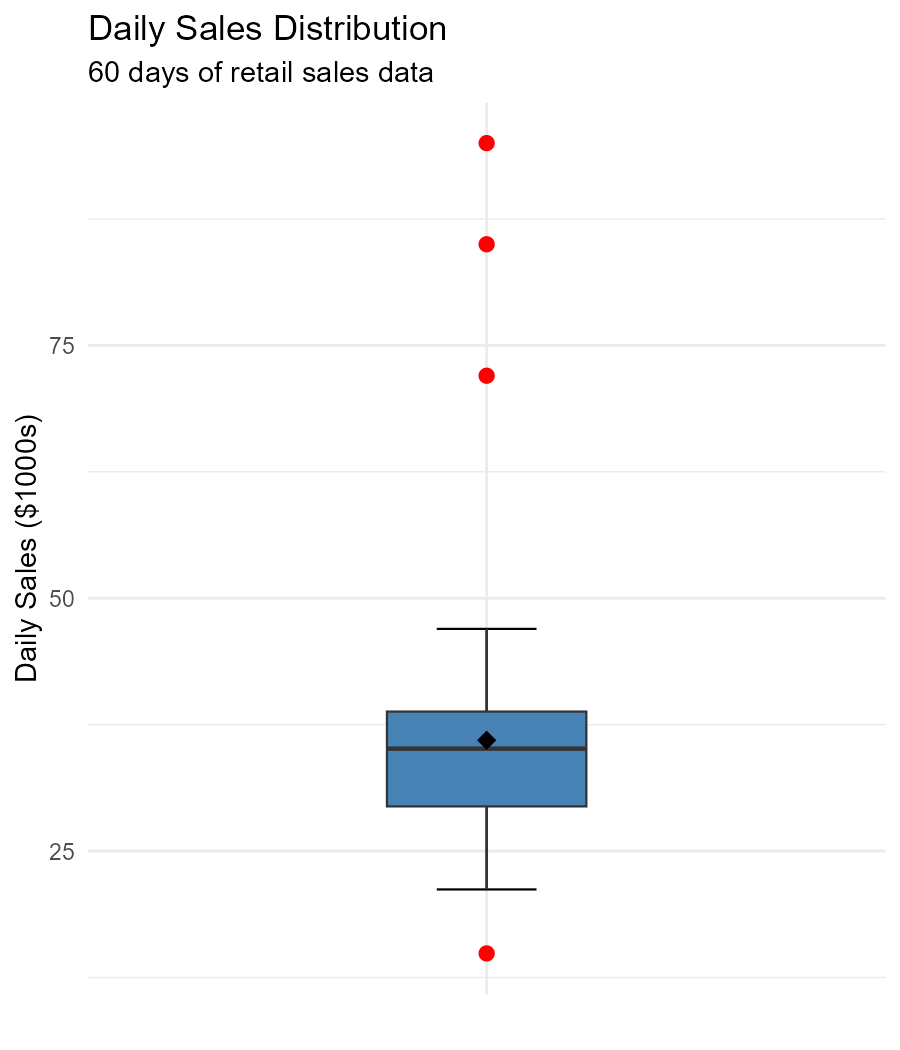
Fig. 3.9 Daily sales showing explicit points at high values
The five-number summary is: Min = $12K, Q₁ = $25K, Median = $32K, Q₃ = $42K, Max = $95K.
Three values are flagged as explicit points: $72K, $85K, and $95K.
Verify that these three values are correctly identified as explicit points using the 1.5 × IQR rule.
The store manager explains that the $72K day was Black Friday, the $85K day was the week before Christmas, and the $95K day was a special promotion event. Are these real outliers or expected behavior? Explain.
If these explicit points are removed, the new median becomes $30K and the new Q₃ becomes $38K. Discuss whether removing them is appropriate.
How would you recommend presenting this sales data in a report? Should you report the summary statistics with or without these high-sales days?
The analyst notices that the distribution appears right-skewed. Is this expected for retail sales data? Why or why not?
Solution
Part (a): Verifying Explicit Points
Given: Q₁ = $25K, Q₃ = $42K
IQR = 42 − 25 = $17K
Upper inner fence = Q₃ + 1.5 × IQR = 42 + 1.5(17) = 42 + 25.5 = $67.5K
Upper outer fence = Q₃ + 3 × IQR = 42 + 3(17) = 42 + 51 = $93K
Classification:
$72K: Above $67.5K (inner fence), below $93K (outer fence) → Mild explicit point ✓
$85K: Above $67.5K, below $93K → Mild explicit point ✓
$95K: Above $93K (outer fence) → Extreme explicit point ✓
All three are correctly identified.
Part (b): Real Outliers or Expected Behavior?
These are NOT real outliers—they are expected behavior.
Black Friday ($72K): Known annual shopping event with predictably high sales
Week before Christmas ($85K): Peak retail season, expected to be high
Special promotion ($95K): Planned event with anticipated sales surge
These represent legitimate business events, not errors or anomalies. They are:
Predictable and recurring (holidays occur every year)
Explainable by known factors
Part of the natural retail sales cycle
Important for business planning and revenue projections
The 1.5 × IQR rule flagged them because they deviate from “typical” days, but “typical” isn’t the full picture for seasonal businesses.
Part (c): Should They Be Removed?
No, removing them would be inappropriate.
Reasons:
They represent real revenue: The store actually earned this money
They affect annual totals: Removing them understates true business performance
They’re predictable: Not random errors but expected events
Misleading summaries: Reporting median of $30K instead of $32K misrepresents typical performance by ignoring important sales days
Business planning: These days may contribute 15-20% of annual revenue—critical for staffing, inventory, and cash flow planning
Part (d): Reporting Recommendations
Report both perspectives:
Overall summary (including high-sales days): - Median: $32K - IQR: $17K - Note: “Distribution includes seasonal peaks”
“Typical day” summary (excluding known events): - Median: $30K - IQR: lower value - Note: “Represents non-promotional days”
Separate the special events: - “Black Friday: $72K” - “Holiday week: $85K” - “Promotions average: $95K”
Visualize appropriately: - Show box plot with explicit points labeled by event type - Consider separate box plots for “regular days” vs “special events”
This approach provides a complete picture without hiding important revenue sources.
Part (e): Is Right-Skewness Expected?
Yes, right-skewness is expected for retail sales data.
Reasons:
Natural floor: Sales can’t go below $0, but there’s no upper limit
Typical clustering: Most days have “normal” sales in a moderate range
Occasional spikes: Holidays, promotions, and special events create a long right tail
Economic pattern: Consumer spending follows this pattern across most retail contexts
This is why retail businesses often report median sales rather than mean—the mean would be inflated by high-sales days and may not represent a “typical” day well.
3.4.9. Additional Practice Problems
True/False Questions (1 point each)
The interquartile range (IQR) measures the spread of the entire dataset.
Ⓣ or Ⓕ
Q₂ is another name for the sample median.
Ⓣ or Ⓕ
All explicit points identified by the 1.5 × IQR rule are errors that should be removed.
Ⓣ or Ⓕ
In a modified box plot, the whiskers always extend to the minimum and maximum values.
Ⓣ or Ⓕ
If a distribution is right-skewed, the right whisker of its box plot will typically be longer than the left whisker.
Ⓣ or Ⓕ
The five-number summary includes the mean.
Ⓣ or Ⓕ
Multiple Choice Questions (2 points each)
For a dataset with Q₁ = 20 and Q₃ = 50, what is the upper inner fence?
Ⓐ 65
Ⓑ 80
Ⓒ 95
Ⓓ 140
A value falls above the upper inner fence but below the upper outer fence. This value is classified as:
Ⓐ A normal observation
Ⓑ A mild explicit point
Ⓒ An extreme explicit point
Ⓓ An error that must be removed
Two box plots have the same median, but Box Plot A has a much larger IQR than Box Plot B. Which statement is correct?
Ⓐ Dataset A has a larger range
Ⓑ Dataset A has more variability in the middle 50% of observations
Ⓒ Dataset A has more explicit points
Ⓓ Dataset A has a larger mean
Which of the following CANNOT be determined from a box plot alone?
Ⓐ Whether the distribution is skewed
Ⓑ The approximate IQR
Ⓒ Whether explicit points exist
Ⓓ Whether the distribution is bimodal
Answers to Practice Problems
True/False Answers:
False — The IQR measures the spread of the middle 50% of the data, not the entire dataset.
True — Q₂ (the second quartile) is the 50th percentile, which is the definition of the median.
False — Explicit points should be investigated, not automatically removed. They may be legitimate unusual values, not errors.
False — In a modified box plot, whiskers extend to the most extreme values that are NOT explicit points. Explicit points are shown as individual dots beyond the whiskers.
True — In a right-skewed distribution, values extend further to the right, making the right whisker longer. There may also be explicit points on the right side.
False — The five-number summary includes: Minimum, Q₁, Median (Q₂), Q₃, and Maximum. The mean is NOT part of the five-number summary (though it’s often added to box plots as a reference point).
Multiple Choice Answers:
Ⓒ — IQR = Q₃ − Q₁ = 50 − 20 = 30. Upper inner fence = Q₃ + 1.5 × IQR = 50 + 1.5(30) = 50 + 45 = 95.
Ⓑ — Values between the inner and outer fences are classified as mild explicit points. Values beyond the outer fences are extreme explicit points.
Ⓑ — The IQR specifically measures the spread of the middle 50% of observations. A larger IQR means more variability in the middle 50%. The other options cannot be determined from IQR alone.
Ⓓ — Box plots show quartiles and explicit points but cannot reveal modality (whether data is unimodal, bimodal, etc.). The same box plot could represent very different distributional shapes. A histogram is needed to identify modes.