Slides 📊
2.3. Tools for Numerical (Quantitative) Data
Numerical data offers richer visualization possibilities than categorical data because it contains information about the distances between values. We are now interested in the overall shape of the distribution, where the numbers are clustered, and how far they spread. A histogram answers all three at a glance.
Road Map 🧭
Visualize numerical variables with histograms.
Understand the impact of choosing different numbers of classes/bins for a histogram.
Recognize the difference between a bar graph and a histogram.
2.3.1. Building Your First Histogram
A histogram first divides the number line spanning the range of a variable into adjacent intervals of equal width. Over each interval, a bar is drawn whose height equals the count (or relative frequency) of the datapoints belonging to the interval. Each interval is called a bin, and it is up to the user to select how many bins are used in a histogram.
Let us begin our exploration of histograms with a simple example based on
a built-in data set in R, InsectSprays. First import the data set by running:
library(ggplot2)
data(InsectSprays)
View(InsectSprays)
The code will open a separate window of the complete table. The first few rows are:
(index) |
count |
spray |
|---|---|---|
1 |
10 |
A |
2 |
7 |
A |
\(\vdots\) |
\(\vdots\) |
\(\vdots\) |
This data set reports the insect counts in agricultural experimental units treated with six different insecticides. There are 72 rows in the data set.
Use ggplot2 to print a histogram:
# rule of thumb: max(round(sqrt(n)) + 2,5) bins
n_obs  <- nrow(InsectSprays) #72
n_bins <- max(round(sqrt(n_obs)) + 2,5)

ggplot(InsectSprays, aes(x = count)) +
  geom_histogram(bins = n_bins, colour = "black", fill = "skyblue", linewidth = 1.2) +
  labs(title = "Distribution of insect counts (Beall, 1942)",
       x = "Number of insects", y = "Frequency")
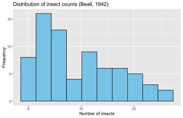
Fig. 2.13 Histogram of InsectSprays dataset
We make a number of observations:
Each bar represents the number of observations falling within a range of insect counts.
This histogram uses 10 bins. This means that the histogram divided the data’s range into 10 intervals of equal length.
The histogram does a good job of describing the overall distribution of the data, while not being overly detailed.
2.3.2. Determining the Number of Bins
How Does the Bin Count Change a Histogram?
Although we are free to choose any number of bins for a histogram,
this choice significantly affects the quality of data representation.
To illustrate this impact, we plot the same data set
four times using different bin counts. The data used in this example can be
downloaded here: furnace.csv (if a new
browser tab opens instead, press Ctrl/Cmd+S to save the file).
library(ggplot2)
furnace <- read.csv("furnace.csv")   # replace "furnace.csv" with your file location

for (bins in c(6, 10, 15, 30)) {
  p <- ggplot(furnace, aes(Consumption)) +
    geom_histogram(bins = bins, colour = "black", fill = "darkgreen") +
    labs(title = paste(bins, "bins"), x = "BTU", y = "Frequency")
  print(p)
}
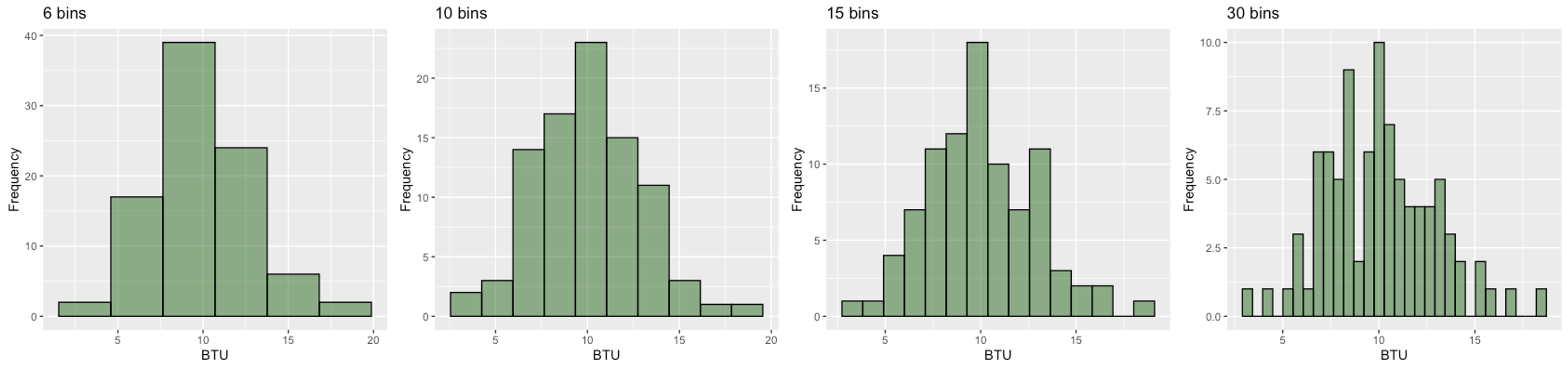
Fig. 2.14 Furnace BTU histograms with different numbers of bins
We observe a clear trend in Fig. 2.14:
6 bins: Oversimplifies the data, hiding important features
10 bins: Balances detail and clarity, revealing the general, slightly right-skewed shape
15 bins: Shows more granular structure and begins to display some potentially random fluctuation
30 bins: Too detailed, resulting in a jagged appearance dominated by sampling variability
In this case, ten to fifteen bins reveal the overall trend without drowning the eye in high-frequency jitter.
The Rule of Thumb
Bin count is a Goldilocks choice: if fewer than necessary, the histogram hides detail, and if too many, it is difficult to observe trends due to noise. In the meantime, the is no single correct choice. We usually test a few candidate values in a reasonable range, then make a final choice based on how the resulting histograms look.
The rule of thumb for a starting point (not the final correct answer) is as follows:
Find how many rows there are in the data set. Denote the row count with \(n\).
Compute
\[b = \operatorname{max}(\operatorname{round}(\sqrt{n})+ 2,5).\]Here, \(\operatorname{round}(\cdot)\) denotes rounding to the nearest integer.
If \(b > 30\), start your test with a value between \(20\) and \(30\). That is, a number of bins over the \(20-30\) range is often too high, even if the data set is fairly large.
If \(b \leq 30\), start your tests at \(b\).
Find the “best-looking” histogram among your candidates. You may use the furnace example (Fig. 2.14) as a guideline.
Example 💡: Do the Previous Examples Follow the Rule of Thumb?
The InsectSprays data set has \(n=72\) rows. By the rule of thumb, \(b=\operatorname{max}(\operatorname{round}(\sqrt{72})+2,5) = 10\), which is exactly how many bins were used in Fig. 2.13.
There are \(n=90\) observations in the furnace dataset (Fig. 2.14). This gives \(b=\operatorname{max}(\operatorname{round}(\sqrt{90}) + 2,5) = 11\). This result agrees with our previous conclusion that using 10 or 15 bins best represent the data.
2.3.3. Enhancing Histograms – Density & Normal Overlay
Normality
We will learn in later chapters that normality is a desirable characteristic in a data set which allows us to use a range of useful theoretical tools. Normality is usually characterized by a bell-shape in the data distribution: unimodal, symmetric, and with tails that taper off at an appropriate rate.
Assessing Normality
Whenever we graph a histogram, it is one of our interests to read how normal the data is. For this purpose, we use two additional assisting tools.
A smooth curve outlining the data’s shape, also called the kernel density (red)
A true normal curve that shares the same center and width as the data (blue)
library(ggplot2)
furnace <- read.csv("furnace.txt")   # replace with your path
xbar <- mean(furnace$Consumption)
s    <- sd(furnace$Consumption)
bins <- round(sqrt(nrow(furnace))) + 2

ggplot(furnace, aes(Consumption)) +
  geom_histogram(aes(y = after_stat(density)), bins = bins,
                fill = "lightblue", colour = "black") +
  geom_density(colour = "red",  linewidth = 1.2) +
  stat_function(fun = dnorm, args = list(mean = xbar, sd = s),
                colour = "blue", linewidth = 1.2) +
  labs(title = "Residential furnace energy consumption",
       y = "Density", x = "BTU")
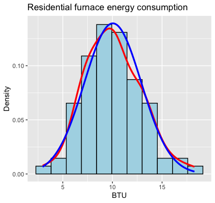
Fig. 2.15 Histogram with a kernel density (red) and a normal curve (blue)
Based on how close the two curves are, we assess whether the data is sufficiently normal or deviates from it. Although they are not part of a histogram by definition, we will always use them in this course, whenever a histogram is drawn.
2.3.4. Bar Graph or Histogram?
For discrete numerical data with few unique values, a bar graph may not present any major visual difference from a histogram. In some cases, the data can even be treated as an ordinal categorical data and displayed with a bar graph. Fig. 2.16 is one such example:
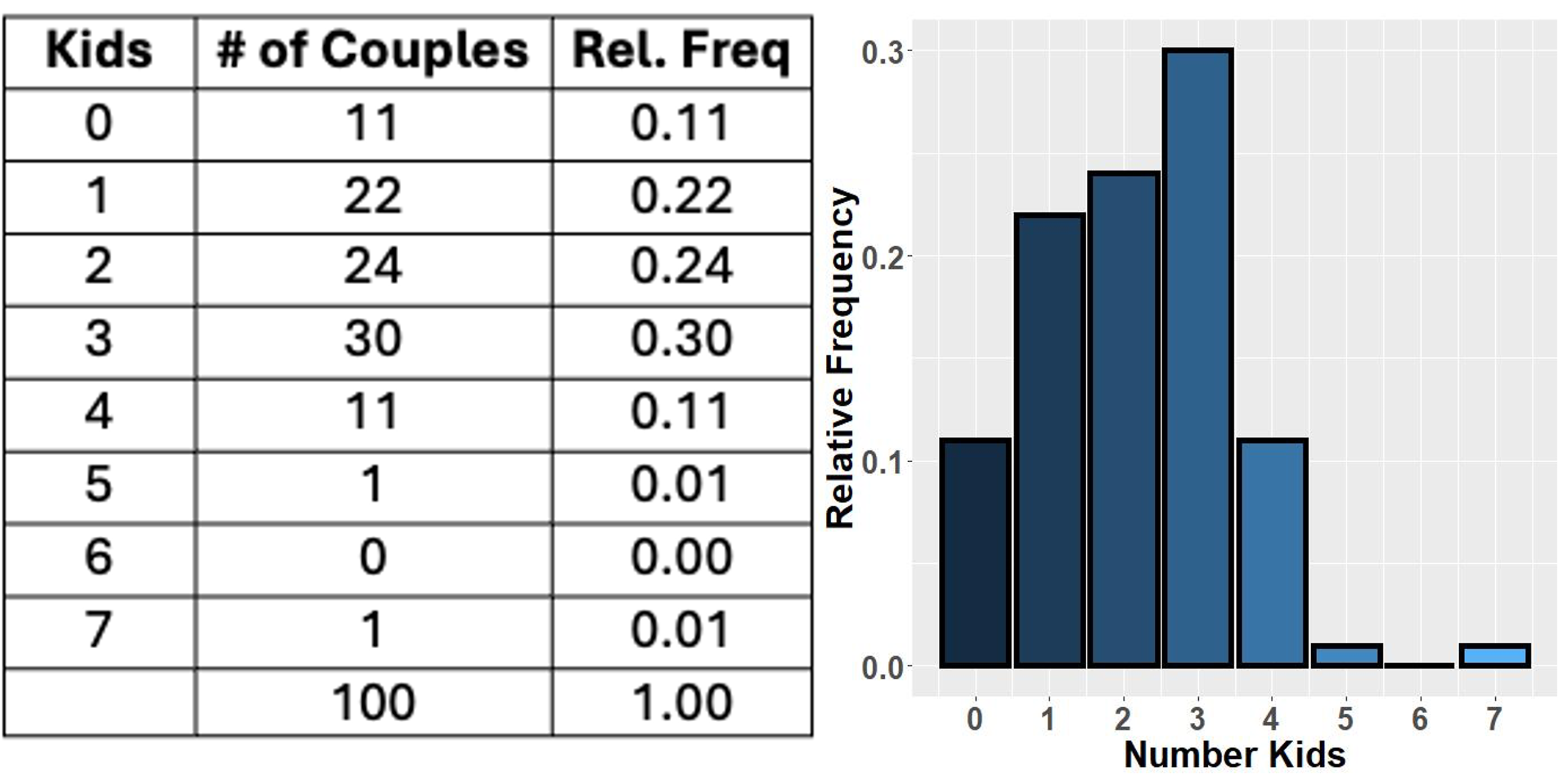
Fig. 2.16 Numerical variable with a small set of possible values and its bar graph
In general, however, bar graphs and histograms differ clearly in their usage and appearance.
Comparison of Bar Graphs and Histograms |
||
|---|---|---|
Feature |
Bar graphs |
Histograms |
Variable type |
Categorical variables; numerical variables with few possible values are sometimes converted to a categorical variable |
Numerical variables, especially with many different possible values |
Marks on \(x\)-axis |
All points contributing to a bar has the same value. The center of the bar is marked with this value. |
All points contributing to a bar belongs to the same interval but may have different values. Either,
|
Gaps between bars |
There are no in-between values among categories. There may be gaps between the bars to reflect this. |
The intervals are always adjacent. Gaps indicate absence of data points in the corresponding interval(s). |
2.3.5. Bringing It All Together
Key Takeaways 📝
Histograms turn numbers into a shape.
Use \(\max(\operatorname{round}(\sqrt{n})+2,\; 5)\) bins as a starting point, then adjust by eye.
Overlay a normal curve and a smooth trend line to easily assess deviation from normality.
2.3.6. Exercises
These exercises develop your skills in visualizing numerical data using histograms, selecting appropriate bin counts, and assessing normality.
Exercise 1: Determining the Number of Bins
For each dataset below, apply the rule of thumb to determine the starting point for the number of bins in a histogram.
Rule of Thumb Reminder:
If \(b > 30\), start testing with values in the 20-30 range.
A dataset of CPU temperatures with n = 49 observations.
A dataset of response times with n = 200 observations.
A dataset of tensile strength measurements with n = 25 observations.
A dataset of network latency values with n = 1000 observations.
A dataset of battery voltages with n = 16 observations.
For each dataset above, if your initial histogram looked too “jagged” (noisy), would you increase or decrease the number of bins? Why?
Solution
Part (a): n = 49
\(b = \max(\operatorname{round}(\sqrt{49}) + 2, 5) = \max(7 + 2, 5) = \max(9, 5) = \mathbf{9}\) bins
Part (b): n = 200
\(\sqrt{200} \approx 14.14\), so \(\operatorname{round}(\sqrt{200}) = 14\)
\(b = \max(14 + 2, 5) = \max(16, 5) = \mathbf{16}\) bins
Part (c): n = 25
\(b = \max(\operatorname{round}(\sqrt{25}) + 2, 5) = \max(5 + 2, 5) = \max(7, 5) = \mathbf{7}\) bins
Part (d): n = 1000
\(\sqrt{1000} \approx 31.62\), so \(\operatorname{round}(\sqrt{1000}) = 32\)
\(b = \max(32 + 2, 5) = \max(34, 5) = 34\)
Since \(b > 30\), we apply the guideline: start testing with 20-30 bins (e.g., start at 25).
Part (e): n = 16
\(b = \max(\operatorname{round}(\sqrt{16}) + 2, 5) = \max(4 + 2, 5) = \max(6, 5) = \mathbf{6}\) bins
Part (f): Adjusting for Jagged Histograms
If the histogram looks too jagged (noisy, with erratic up-and-down patterns), you should decrease the number of bins.
Reasoning:
Too many bins means each bin contains fewer observations
Small counts per bin are more susceptible to random variation
Wider bins (fewer bins) smooth out this noise by aggregating more data points
The goal is to reveal the overall shape/trend without being distracted by sampling variability
Exercise 2: Interpreting Histogram Shapes
A manufacturing engineer collects data on the thickness of semiconductor wafers (in micrometers). Four different histograms are created using different bin counts from the same dataset of n = 100 measurements.
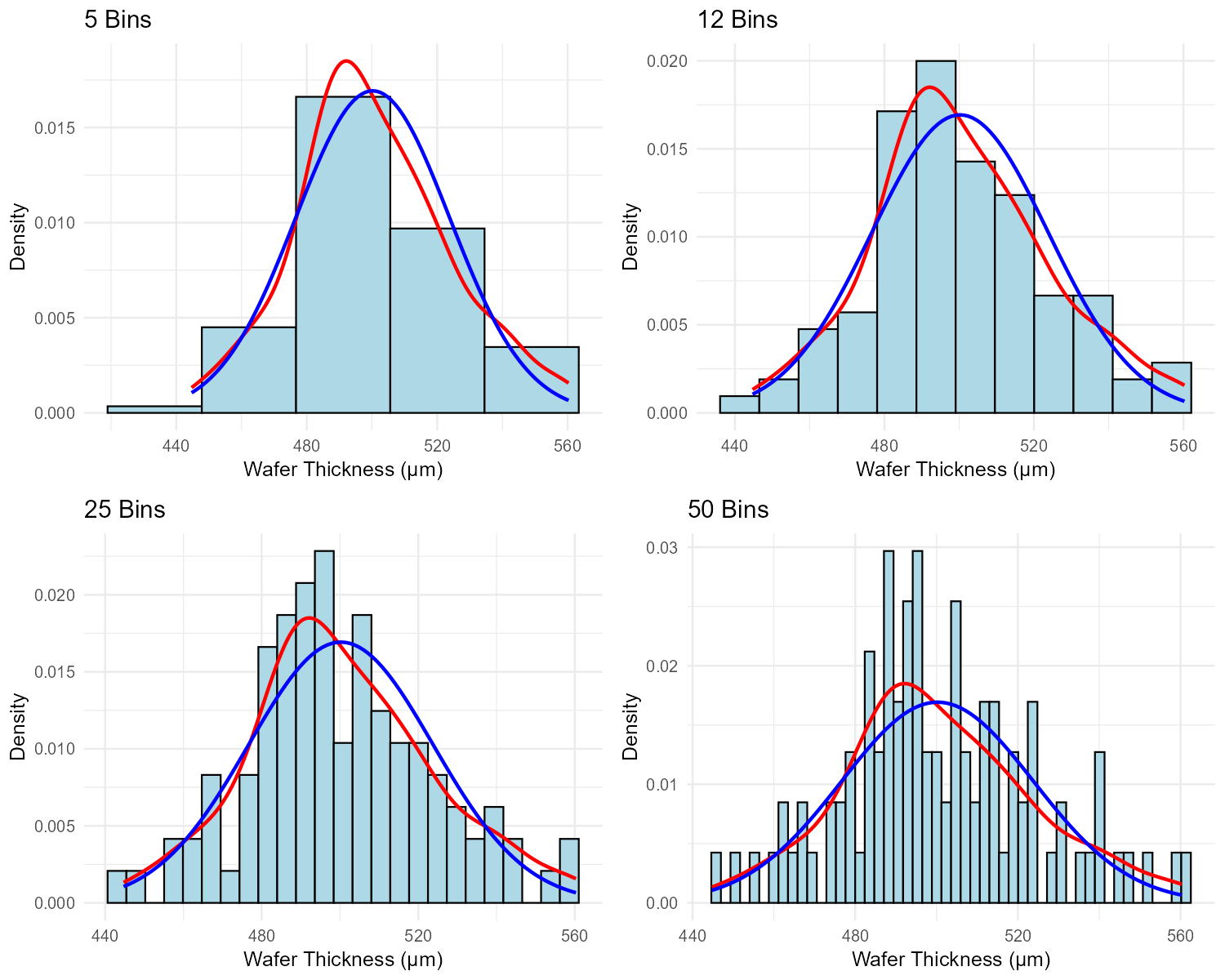
Fig. 2.17 Effect of bin count on histogram appearance (same data, different bins)
Bins |
Description |
|---|---|
5 |
Shows a single, very wide bar dominating the center with small bars on each end |
12 |
Shows a clear bell-shaped pattern, symmetric around 500 μm, with smooth transitions |
25 |
Shows a generally bell-shaped pattern but with noticeable irregularities and some empty bins |
50 |
Shows an extremely jagged pattern with many bars of height 0, 1, or 2; no clear overall shape |
Which bin count best represents the data? Justify your answer.
What does the rule of thumb suggest for n = 100?
The 5-bin histogram hides important information. What might we miss by using too few bins?
The 50-bin histogram shows many empty bins. Why is this problematic for understanding the distribution?
Based on the 12-bin description, what can you conclude about the normality of the wafer thickness data?
Solution
Part (a): Best Bin Count
12 bins best represents the data.
Justification:
Shows a clear, interpretable shape (bell-shaped, symmetric)
Smooth transitions between adjacent bins suggest genuine pattern, not noise
Neither oversimplified (like 5 bins) nor dominated by random variation (like 50 bins)
Reveals the center (~500 μm) and spread clearly
Part (b): Rule of Thumb for n = 100
\(b = \max(\operatorname{round}(\sqrt{100}) + 2, 5) = \max(10 + 2, 5) = \mathbf{12}\) bins
This matches the optimal choice from Part (a)!
Part (c): What Too Few Bins Hides
With only 5 bins, we might miss:
The symmetry of the distribution (hard to assess with so few bars)
Any secondary modes or unusual features in the distribution
The precise location of the center
The shape of the tails—whether they taper gradually or drop off sharply
Any outliers that might be present
The distribution might appear normal when it actually has skewness or other features.
Part (d): Problems with Many Empty Bins
Empty bins in a 50-bin histogram are problematic because:
They suggest gaps in the data that don’t truly exist—the underlying distribution is continuous
The jagged appearance is caused by sampling variability, not real features
It’s difficult to perceive the overall shape when the eye is distracted by noise
With n = 100 and 50 bins, the average count per bin is only 2—far too few for stable estimates
Part (e): Normality Assessment
Based on the 12-bin description (“clear bell-shaped pattern, symmetric around 500 μm, with smooth transitions”), the wafer thickness data appears to be approximately normal.
Evidence of normality:
Bell-shaped: Characteristic of normal distributions
Symmetric: Normal distributions are perfectly symmetric
Smooth transitions: Suggests the distribution follows a regular pattern without unusual features
A formal assessment would compare the histogram to a normal overlay curve.
Exercise 3: Histogram vs. Bar Graph
Determine whether a histogram or bar graph would be more appropriate for each variable. Justify your choice.
The number of cores in servers at a data center (1, 2, 4, 8, 16, 32, or 64 cores).
The execution time of a sorting algorithm measured in milliseconds (continuous range from 0.5 to 150 ms).
Customer satisfaction ratings (1, 2, 3, 4, or 5 stars).
The weight of packages processed by a shipping facility (ranging from 0.1 kg to 50 kg).
The number of defects found per circuit board (0, 1, 2, 3, … up to 12 in the dataset).
A quality engineer has data on the exact diameter of 500 ball bearings, measured to 0.001 mm precision. Should they use a histogram or bar graph? Explain.
Solution
Part (a): Server Cores
Bar graph is more appropriate.
Only 7 possible values (1, 2, 4, 8, 16, 32, 64)
The values are discrete and represent specific configurations
No meaningful “in-between” values exist (you can’t have 3 cores in this context)
The gaps between values are not uniform (jumps are powers of 2)
Part (b): Sorting Algorithm Execution Time
Histogram is appropriate.
Time is a continuous numerical variable
Many different possible values across a continuous range
We want to see the shape of the distribution (e.g., is it skewed? bimodal?)
Binning into intervals reveals patterns in the overall distribution
Part (c): Customer Satisfaction Ratings
Bar graph is more appropriate.
Only 5 possible values (1, 2, 3, 4, 5)
These are ordinal categories (the intervals between ratings may not be equal)
As discussed in Chapter 2.1, star ratings are typically treated as categorical ordinal
Each bar represents a specific rating level, not an interval
Part (d): Package Weight
Histogram is appropriate.
Weight is a continuous numerical variable
Wide range of possible values (0.1 to 50 kg)
We want to understand the distribution shape (e.g., are most packages light or heavy?)
Binning allows us to see patterns across the continuous range
Part (e): Defects per Circuit Board
Either could work, but context matters.
Bar graph: If we want to show the exact count at each defect level (0, 1, 2, …, 12)
Histogram: If we want to emphasize the overall shape of the distribution
With 13 possible values (0 through 12), this is borderline. A bar graph preserves exact information; a histogram would treat adjacent values as potentially groupable.
Recommendation: Use a bar graph if precision matters; use a histogram if visualizing the overall shape is more important.
Part (f): Ball Bearing Diameters
Histogram is the clear choice.
Diameter is a continuous measurement
With 0.001 mm precision and 500 bearings, there could be hundreds of unique values
A bar graph with hundreds of bars would be unreadable
Histograms bin the continuous values into manageable intervals
This reveals the distribution shape, center, and spread—essential for quality control
Exercise 4: Reading Histograms with Overlays
A biomedical engineer measures the response time of a blood glucose sensor (in seconds). The data for n = 64 measurements is provided below.
# Blood glucose sensor response times (seconds)
response_time <- c(2.8, 3.1, 3.2, 3.3, 3.4, 3.5, 3.5, 3.6, 3.6, 3.7,
                   3.7, 3.8, 3.8, 3.8, 3.9, 3.9, 3.9, 4.0, 4.0, 4.0,
                   4.0, 4.1, 4.1, 4.1, 4.1, 4.2, 4.2, 4.2, 4.3, 4.3,
                   4.3, 4.4, 4.4, 4.5, 4.5, 4.5, 4.6, 4.6, 4.7, 4.7,
                   4.8, 4.9, 5.0, 5.0, 5.1, 5.2, 5.3, 5.4, 5.5, 5.6,
                   5.7, 5.8, 5.9, 6.0, 6.1, 6.2, 6.3, 6.4, 6.5, 6.6,
                   6.7, 6.8, 6.9, 7.0)
sensor_data <- data.frame(response_time)
Create a histogram with the standard course format: density scaling, kernel density curve (red), and normal curve overlay (blue). Use the rule of thumb for the number of bins.
What is the approximate center (typical value) of the response times? What is the approximate range?
Does the data appear to follow a normal distribution? Explain by comparing the red and blue curves in your histogram.
In what way does the actual distribution differ from a normal distribution?
Why do we use
aes(y = after_stat(density))instead of just counting frequencies when adding these overlay curves?
Solution
Part (a): R Code for Histogram
library(ggplot2)

# Calculate summary statistics
xbar <- mean(sensor_data$response_time)
s <- sd(sensor_data$response_time)
bins <- max(round(sqrt(nrow(sensor_data))) + 2, 5)  # = 10

# Create histogram with overlays
ggplot(sensor_data, aes(x = response_time)) +
  geom_histogram(aes(y = after_stat(density)),
                 bins = bins, fill = "grey", col = "black") +
  geom_density(col = "red", linewidth = 1) +
  stat_function(fun = dnorm,
                args = list(mean = xbar, sd = s),
                col = "blue", linewidth = 1) +
  ggtitle("Blood Glucose Sensor Response Times") +
  xlab("Response Time (seconds)") +
  ylab("Density") +
  theme_minimal()
Number of bins: \(b = \max(\operatorname{round}(\sqrt{64}) + 2, 5) = \max(8 + 2, 5) = 10\)
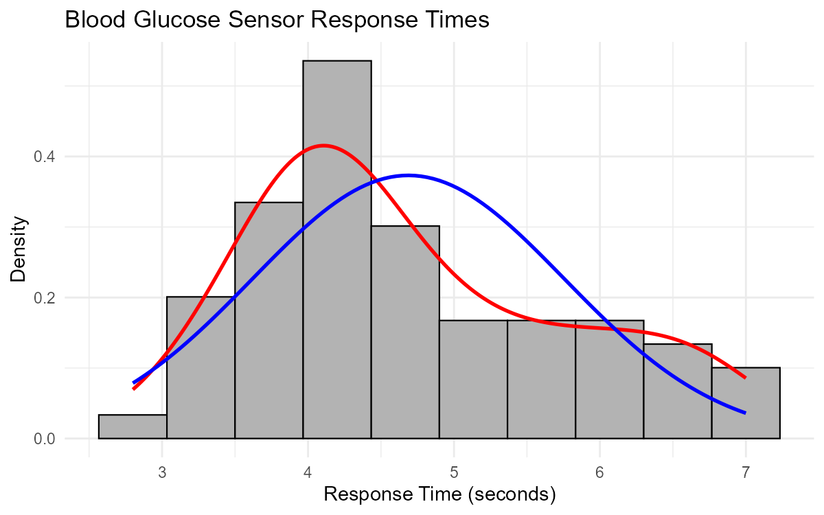
Fig. 2.18 Histogram of sensor response times showing right-skewed distribution
Part (b): Center and Range
Center: The approximate center is around 4.0-4.5 seconds (where the histogram bars are tallest). The calculated mean is approximately 4.7 seconds.
Range: The range is 7.0 - 2.8 = 4.2 seconds (from minimum to maximum value).
Part (c): Normality Assessment
No, the data does NOT appear to follow a normal distribution.
Evidence from comparing the curves:
The red curve (kernel density, actual data shape) is asymmetric—it peaks to the left of center and has a longer right tail
The blue curve (normal distribution) is symmetric
The two curves diverge noticeably, especially in the tails
The red curve extends further right than the blue curve would predict
If the data were normal, the red and blue curves would closely overlap.
Part (d): How the Distribution Differs from Normal
The distribution is right-skewed (positively skewed).
Specific differences:
Right tail is longer: The red curve shows more density in the 5.5-7.0 second range than the blue normal curve
Left tail is shorter: Fewer observations on the low end than a normal distribution would predict
Peak is shifted left: The mode (most frequent values) is around 4.0-4.2 seconds, while the mean is pulled higher (~4.7 seconds) by the right tail
Interpretation: While most sensors respond quickly (around 4 seconds), some have unusually long response times, creating the right-skewed pattern.
Part (e): Why Use Density Scaling
We use aes(y = after_stat(density)) to put the histogram on a density scale rather than a frequency (count) scale.
Reasons:
Overlay compatibility: The kernel density (red) and normal curve (blue) are probability density functions—their y-axis is density, not counts
Scale matching: If the histogram showed raw counts (e.g., bars with heights 5, 10, 15), the overlay curves would appear as flat lines near zero (densities are typically small numbers like 0.1, 0.3)
Comparability: Density scaling ensures the histogram bars and overlay curves use the same y-axis scale
Area interpretation: On a density scale, the total area under the histogram equals 1, matching probability density functions
Exercise 5: Constructing Histograms in R
A mechanical engineer tests the fuel efficiency (in miles per gallon) of 81 vehicles. Write R code to create a properly formatted histogram following course standards.
The data is stored in a data frame called vehicles with a column named mpg.
Calculate the appropriate starting number of bins using the rule of thumb.
Write the complete R code to create a histogram with:
Density scaling on the y-axis
A kernel density curve in red
A normal curve overlay in blue
Appropriate title and axis labels
The engineer runs your code and observes that the red curve has two distinct peaks (bimodal) while the blue curve has only one peak. What does this tell us about the data?
Suggest a possible explanation for why fuel efficiency data might be bimodal. How might the engineer investigate further?
Solution
Part (a): Number of Bins
\(n = 81\)
\(b = \max(\operatorname{round}(\sqrt{81}) + 2, 5) = \max(9 + 2, 5) = \max(11, 5) = \mathbf{11}\) bins
Part (b): Complete R Code
library(ggplot2)

# Calculate summary statistics
xbar <- mean(vehicles$mpg)
s <- sd(vehicles$mpg)
bins <- max(round(sqrt(nrow(vehicles))) + 2, 5)  # = 11

# Create histogram with overlays
ggplot(vehicles, aes(x = mpg)) +
  geom_histogram(aes(y = after_stat(density)),
                 bins = bins, fill = "grey", col = "black") +
  geom_density(col = "red", linewidth = 1) +
  stat_function(fun = dnorm,
                args = list(mean = xbar, sd = s),
                col = "blue", linewidth = 1) +
  ggtitle("Distribution of Vehicle Fuel Efficiency") +
  xlab("Fuel Efficiency (mpg)") +
  ylab("Density") +
  theme_minimal()
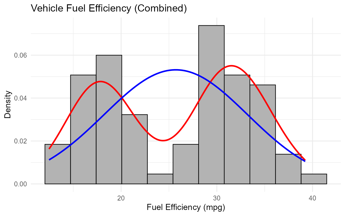
Fig. 2.19 Bimodal distribution reveals two subgroups in the data
Part (c): Interpretation of Bimodal Pattern
The bimodal pattern (two peaks in the red curve, one in the blue) tells us:
The data is NOT normally distributed
There appear to be two distinct subgroups in the data
The normal curve (blue) is a poor fit—it assumes one central tendency
Averaging across the two groups produces a misleading “middle” peak
The data likely comes from a mixture of two populations with different typical fuel efficiencies.
Part (d): Possible Explanation and Investigation
Possible explanations for bimodal fuel efficiency:
Vehicle type: One group might be sedans/compact cars (higher mpg), another might be trucks/SUVs (lower mpg)
Engine type: Hybrid/electric vehicles vs. traditional gasoline engines
Transmission: Manual vs. automatic
Model year: Older vs. newer vehicles with different efficiency standards
How to investigate:
Create faceted histograms by a categorical variable (e.g., vehicle type):
ggplot(vehicles, aes(x = mpg)) +
  geom_histogram(aes(y = after_stat(density)), bins = 11) +
  facet_wrap(~ vehicle_type)
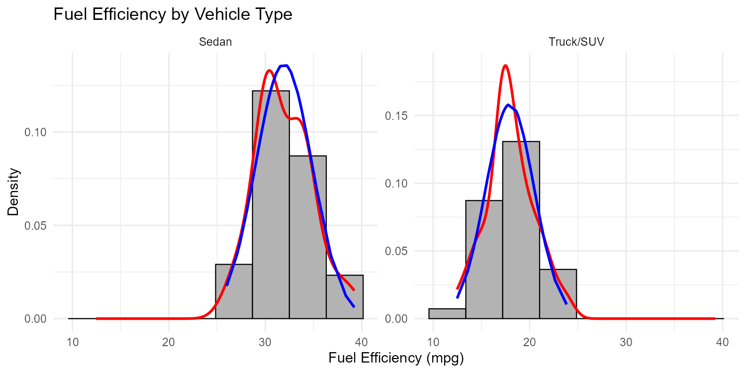
Fig. 2.20 Faceted histograms reveal the source of bimodality
Color-code the histogram by group to see if the modes correspond to different categories
If no categorical variable is recorded, consider whether the data should be separated before analysis
Exercise 6: Comprehensive Histogram Analysis
A quality control engineer at an aerospace company measures the tensile strength (in MPa) of 120 titanium alloy specimens. The data is provided below.
# Tensile strength measurements (MPa) - n = 120
tensile_strength <- c(
  867, 879, 885, 891, 893, 896, 899, 901, 903, 905,
  908, 910, 912, 914, 916, 917, 919, 920, 921, 923,
  924, 925, 927, 928, 929, 930, 931, 932, 933, 934,
  935, 936, 937, 938, 939, 940, 941, 941, 942, 943,
  944, 945, 945, 946, 947, 948, 948, 949, 950, 950,
  951, 951, 952, 952, 953, 954, 954, 955, 956, 957,
  957, 958, 959, 960, 960, 961, 962, 963, 964, 965,
  966, 967, 968, 969, 970, 971, 972, 973, 974, 975,
  976, 977, 978, 979, 980, 982, 983, 985, 986, 988,
  989, 991, 993, 995, 997, 999, 1001, 1003, 1006, 1008,
  1010, 1013, 1015, 1017, 1019, 1021, 1023, 1025, 1028, 1030,
  1033, 1036, 1038, 1040, 1042, 1044, 1046, 1048, 1050, 1052
)
titanium_data <- data.frame(tensile_strength)
Create a histogram following course standards (density scaling, red kernel density, blue normal overlay). Use the rule of thumb for bins. What do you observe about the agreement between the red and blue curves?
The engineer notices a few high values above 1040 MPa. Should these automatically be considered outliers? Explain.
Calculate the expected number of bins using the rule of thumb.
If the engineer wanted to determine whether the tensile strength meets the specification of μ = 950 MPa, what type of statistical analysis might be appropriate? (You’ll learn this in later chapters.)
The same engineer tests specimens from a second supplier and creates a faceted histogram (one panel per supplier). What would this visualization allow them to compare?
Solution
Part (a): Histogram and Normality Assessment
library(ggplot2)

# Calculate summary statistics
xbar <- mean(titanium_data$tensile_strength)
s <- sd(titanium_data$tensile_strength)
bins <- max(round(sqrt(nrow(titanium_data))) + 2, 5)  # = 13

# Create histogram with overlays
ggplot(titanium_data, aes(x = tensile_strength)) +
  geom_histogram(aes(y = after_stat(density)),
                 bins = bins, fill = "grey", col = "black") +
  geom_density(col = "red", linewidth = 1) +
  stat_function(fun = dnorm,
                args = list(mean = xbar, sd = s),
                col = "blue", linewidth = 1) +
  ggtitle("Titanium Alloy Tensile Strength") +
  xlab("Tensile Strength (MPa)") +
  ylab("Density") +
  theme_minimal()
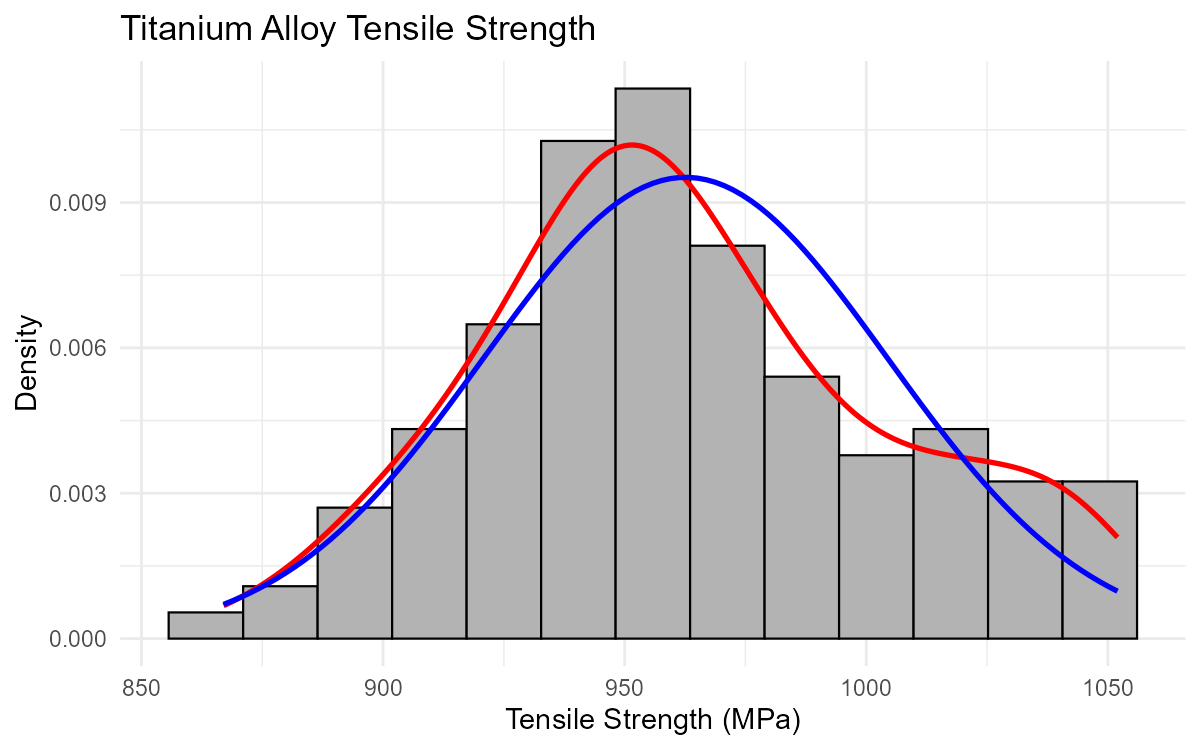
Fig. 2.21 Titanium tensile strength showing approximately normal distribution
Observation: The kernel density (red) and normal curve (blue) show reasonably close agreement, indicating the data is approximately normally distributed. Both curves are roughly symmetric and bell-shaped with similar centers around 950-960 MPa.
Part (b): Are the High Values Outliers?
Not automatically. The values above 1040 MPa should not be assumed to be outliers just because they are in the tail.
Reasons:
Normal distributions have tails—some extreme values are expected
With n = 120 observations, we expect some values to be 2+ standard deviations from the mean
The data was constructed to be approximately normal; extreme values are part of that distribution
To properly assess outliers:
Use formal methods like the 1.5×IQR rule (Chapter 2.4)
Check if values are more than 3 standard deviations from the mean
Investigate whether these specimens had unusual manufacturing conditions
Part (c): Expected Number of Bins
\(n = 120\)
\(\sqrt{120} \approx 10.95\), so \(\operatorname{round}(\sqrt{120}) = 11\)
\(b = \max(11 + 2, 5) = \max(13, 5) = \mathbf{13}\) bins
Part (d): Appropriate Statistical Analysis
To determine if the tensile strength meets the specification μ = 950 MPa, the engineer could use:
Confidence interval for the mean (Chapter 9): Construct an interval estimate for the true mean tensile strength and check if 950 MPa falls within it
Hypothesis test (Chapter 10): Test H₀: μ = 950 vs. Hₐ: μ ≠ 950
Since the data appears approximately normal, a one-sample t-test or t-confidence interval would be appropriate (assuming σ is unknown).
Part (e): Faceted Histogram Comparisons
A faceted histogram (one panel per supplier) would allow the engineer to compare:
Center: Do both suppliers produce specimens with similar average tensile strength?
Spread: Is one supplier more consistent (less variable) than the other?
Shape: Are both distributions approximately normal, or does one show skewness or bimodality?
Range: Do the specimens from both suppliers fall within acceptable limits?
Outliers: Does one supplier have more extreme values?
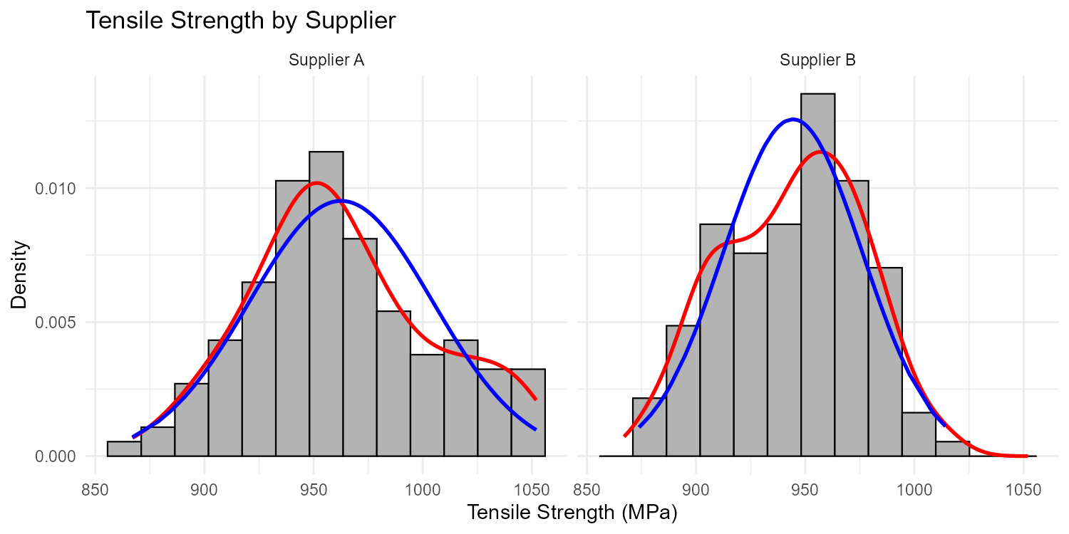
Fig. 2.22 Faceted histograms comparing two suppliers
This visual comparison would inform decisions about supplier quality and consistency before formal statistical tests are performed.
2.3.7. Additional Practice Problems
True/False Questions (1 point each)
A histogram groups data into intervals (bins), while a bar graph displays discrete categories.
Ⓣ or Ⓕ
If a histogram appears too smooth and oversimplified, the solution is to decrease the number of bins.
Ⓣ or Ⓕ
The rule of thumb for the number of bins in a histogram is \(\max(\operatorname{round}(\sqrt{n}) + 2, 5)\).
Ⓣ or Ⓕ
When assessing normality, we want the kernel density curve (red) and the normal curve (blue) to be as different as possible.
Ⓣ or Ⓕ
In a histogram, gaps between bars always indicate missing data in that range.
Ⓣ or Ⓕ
Using
aes(y = after_stat(density))in ggplot2 scales the histogram so that the total area of all bars equals 1.Ⓣ or Ⓕ
Multiple Choice Questions (2 points each)
A dataset has n = 400 observations. Using the rule of thumb, what is the starting point for the number of histogram bins?
Ⓐ 18
Ⓑ 20
Ⓒ 22
Ⓓ 25
An engineer creates a histogram with 50 bins for a dataset of 100 observations. The histogram appears very jagged with many bars of height 0 or 1. What should the engineer do?
Ⓐ Add more bins to show finer detail
Ⓑ Decrease the number of bins to reduce noise
Ⓒ Remove the outliers causing the jagged appearance
Ⓓ Switch to a pie chart for better visualization
In a histogram with kernel density (red) and normal curve (blue) overlays, the red curve is noticeably higher than the blue curve on the left side and lower on the right side. This indicates:
Ⓐ The data is approximately normal
Ⓑ The data is right-skewed (positively skewed)
Ⓒ The data is left-skewed (negatively skewed)
Ⓓ The wrong number of bins was used
Which of the following variables would be LEAST appropriate for a histogram?
Ⓐ The weight of packages at a shipping facility (ranging from 0.5 to 75 kg)
Ⓑ The number of bedrooms in houses (1, 2, 3, 4, or 5)
Ⓒ The duration of phone calls at a customer service center (ranging from 10 seconds to 45 minutes)
Ⓓ The temperature readings from a sensor over 24 hours (recorded every minute)
Answers to Practice Problems
True/False Answers:
True — Histograms bin continuous data into intervals; bar graphs display counts for discrete categories. This is a fundamental distinction between the two visualization types.
False — If a histogram appears too smooth/oversimplified, you should increase the number of bins to reveal more detail. Decreasing bins would make it even more simplified.
True — This is the rule of thumb presented in the chapter for determining a starting point for bin selection.
False — When assessing normality, we want the curves to be as similar as possible. Close agreement between the red (actual shape) and blue (theoretical normal) curves indicates the data is approximately normal.
False — In a histogram with bins covering a continuous range, gaps indicate no observations fell within that interval—not that data is “missing.” Unlike bar graphs where gaps may be stylistic, histogram gaps represent genuine absence of data in those ranges.
True — Density scaling ensures the histogram represents a probability density, where the total area under the histogram equals 1. This allows proper comparison with overlay density curves.
Multiple Choice Answers:
Ⓒ — \(\sqrt{400} = 20\), so \(b = \max(20 + 2, 5) = 22\) bins.
Ⓑ — With only 100 observations spread across 50 bins, each bin averages only 2 data points, leading to high sampling variability (jagged appearance). Reducing the number of bins will smooth out this noise and reveal the underlying distribution shape.
Ⓒ — When the red curve is higher on the LEFT and lower on the RIGHT compared to the symmetric blue normal curve, this indicates left-skew (negatively skewed). The distribution has a longer tail extending to the left. (If the pattern were reversed—higher on right, lower on left—it would be right-skewed.)
Ⓑ — The number of bedrooms has only 5 discrete possible values (1, 2, 3, 4, 5), making it better suited for a bar graph. The other options all represent continuous numerical variables with many possible values, ideal for histograms.