Slides 📊
13.4. Prediction and Robustness
We have now developed the complete foundation for simple linear regression: model fitting, assumption checking, and statistical inference for model parameters. This final chapter completes our regression toolkit by addressing two critical questions:
How do we make predictions with appropriate uncertainty quantification?
When can we trust our inference procedures despite violations of the normality assumption?
This chapter represents the culmination of our statistical journey through STAT 350, bringing together concepts from descriptive statistics, probability, sampling distributions, and inference into a comprehensive framework.
Road Map 🧭
Build awareness of the dangers of extrapolation.
Understand the difference between the two prediction tasks in regression: predicting the mean response versus predicting a single response.
Construct intervals for the both types of prediction and compare their shared characteristics and key differences.
Discuss how CLT makes certain linear regression inference tasks robust, but not all.
Organize all components of linear regression into a single workflow using a complete example.
13.4.1. The Danger of Extrapolation
One of the most important applications of linear regression is prediction—using the fitted model to estimate the response for a new explanatory input \(x^*\). However, a fitted model is reliable for prediction only if the explanatory value is “reasonable” for the model. To understand what counts as reasonable, we should first understand the difference between interpolation and extrapolation.
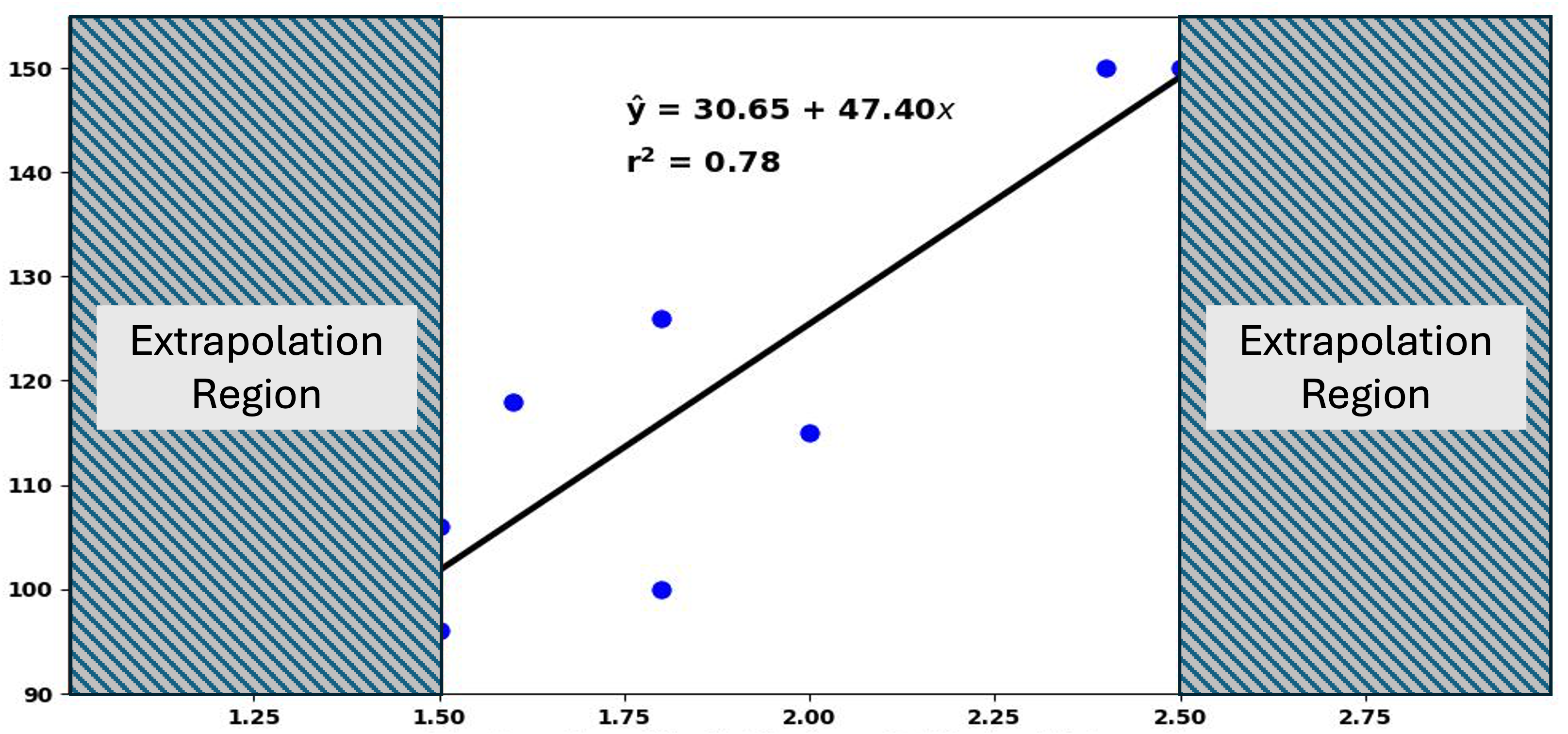
Fig. 13.32 Scatter plot with extrapolation regions marked
Interpolation involves making predictions for explanatory variable values that fall within the range of values used to create the regression line. These predictions are generally trustworthy because:
Our model has been “trained” on data within this range.
We have evidence that the linear relationship holds in this region.
Our model assumptions have been validated using data from this range.
Extrapolation involves using the regression line for prediction outside the observed range of the explanatory variable. This is risky because:
We have no evidence that the linear relationship continues outside this range.
Model assumptions may not hold in unobserved regions.
In essence, the only \(x^*\) values suitable for prediction are those within the observed range of \(X\). Extrapolation should be avoided whenever possible.
13.4.2. Two Types of Prediction and Their Distributional Foundation
Two Types of Prediction
Prediction in regression analysis involves finding a suitable response for a given explanatory value \(x^*\). This seemingly simple task, however, breaks down to two different questions depending on the target of estimation:
What is the average of all responses to the explanatory value \(x^*\)?
We call the average of all responses to an explanatory value \(x^*\) the mean response, and we answer this question by computing a confidence interval for the mean response.
What will be the value of one new response associated with the explanatory value \(x^*\)?
When our interest is in estimating a single response to a given explanatory value \(x^*\), we call our target the predicted response. We answer this question using a prediction interval.
The different types of prediction give rise to inferences with different characterizations of uncertainty. We begin by analyzing the distributional properties of the corresponding prediction estimators.
1. Distribution of the Mean Response Estimator
Mathematically, the true mean response can be written as:
For conciseness, let us assume that the value of \(x^*\) is clear from context and write \(\mu^* = E[Y|X=x^*]\).
The Mean Response Estimator
The logical choice for an estimator of the mean response is:
where the unknown regression parameters are replaced by their estimators, \(b_0\) and \(b_1\). Let us further analyze the distribution of \(\hat{\mu}^*\).
Expected Value of \(\hat{\mu}^*\)
The parameter estimators \(b_0\) and \(b_1\) are unbiased, which in turn makes the mean response also unbiased.
Variance of \(\hat{\mu}^*\)
Using the identity \(b_0 = \bar{Y} - b_1\bar{x}\),
Now using the expression of \(b_1\) as a linear combination of the responses (see Eq. (13.10)):
Using the independence of the \(Y_i\) terms:
Distribution of \(\hat{\mu}^*\) Under Normality
From Eq (13.11), it is evident that \(\hat{\mu}^*\) is a linear combination of the responses. Given that the normality assumption holds, therefore,
2. Distribution of the Single Response Estimator
Denoting the predicted response as \(Y^*\), its mathematical identity is:
where \(\varepsilon^* \sim N(0, \sigma^2)\) is a new error term, independent of the data used to fit the model. Replacing the unknown regression parameters with their estimators, we define the estimator of \(Y^*\) as:
Expected Value of \(\hat{Y}^*\)
The expected value is equal to the true mean response \(\mu^*\), which is also the expected value of \(\hat{\mu}^*\).
Variance of \(\hat{Y}^*\)
Since the new error term \(\varepsilon^*\) is independent of the data used to fit the regression:
From the first step of Eq. (13.12), we note that \(\hat{Y}^*\) accounts for two sources of variability:
Uncertainty in estimating the mean response with \(\hat{\mu}^*\)
Natural variability of individual observations around the mean response
Since \(\hat{Y}^*\) is essentially \(\hat{\mu}^*\) with an additional source of variability, its variance is always greater than the variance of the mean response estimator.
Distribution of \(\hat{Y}^*\) Under Normality
If both \(\hat{\mu}^*\) and \(\varepsilon^*\) are normally distributed, their sum \(\hat{Y}^*\) is also normal. Given that the normality assumption holds,
13.4.3. Confidence and Prediction Intervals
We are mainly concerned with two-sided intervals for prediction tasks. The intervals follow the standard form:
Since \(\sigma^2\) is unknown, the true standard errors are not available and must be estimated by replacing \(\sigma^2\) with \(s^2 = MSE\). This leads to \(t\)-based confidence intervals with \(df=n-2\).
1. Confidence Intervals for Mean Response
Interpretation: We are \((1-\alpha) \times 100\%\) confident that the true mean of all responses for explanatory value \(x^*\) lies within this interval.
2. Prediction Interval for Single Response
Interpretation: We are \((1-\alpha) \times 100\%\) confident that a new response with explanatory value \(x^*\) falls within this interval.
Despite its definition, \(\hat{y}^*\) cannot contain \(\varepsilon^*\) as part of its computational formula because \(\hat{y}^*\) must be a number, while \(\varepsilon^*\) is a random variable. In Eq (13.14), we can consider \(\varepsilon^*\) as replaced with its best point estimate, \(0\).
Confidence and Prediction Bands
By evaluating Equations (13.13) and (13.14) over a range of \(x^*\) values, we can construct and visualize the confidence band and the prediction band on a scatter plot:
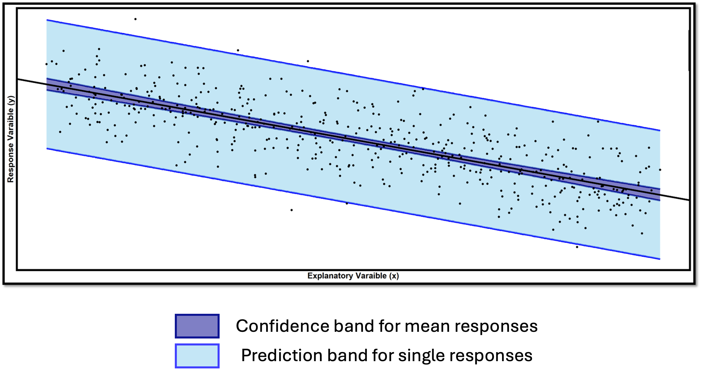
Fig. 13.33 Comparison of confidence band and prediction band
The confidence band provides the range of plausible values for the true mean response line \(\mu_{Y|X=x} = \beta_0 + \beta_1 x\) across the entire range of explanatory variable values.
The prediction band marks a plausible region for individual observations.
Key Observations
Prediction intervals (band) are always wider than confidence intervals (band) for the mean response.
Mathematically, this is due to due to the additional \(+1\) term in the standard error of the prediction interval.
Intuitively, a mean is always more stable than a single observation.
At \(x^* = \bar{x}\), the \(\frac{(x^* - \bar{x})^2}{S_{XX}}\) term becomes zero and the standard error formulas simplify significantly for both intervals. By consequence, the bands have a “bow-tie” or curved shape, narrowest at \((\bar{x}, \bar{y})\).
Points falling outside the prediction band suggest potential outliers or model inadequacy.
Important Considerations for Multiple Predictions
Constructing many intervals simultaneously leads to a concern about FWER, as we are aware from the multiple comparisons procedure for ANOVA. To address this issue,
Use more conservative confidence levels (e.g., 99% instead of 95%).
Apply multiple comparison corrections (beyond this course’s scope).
Understand that individual intervals have the stated coverage probability, but simultaneous coverage is lower.
13.4.4. Robustness to Normality Assumptions
What happens to the inference results of linear regression when the normality assumption is violated? This discussion mirrors our earlier discussions about robustness in single-sample and two-sample procedures, but regression also presents some unique considerations.
The Central Limit Theorem in Regression
Different inference procedures in the same regression context have varying sensitivity to normality violations. The key characteristic that distinguishes robust methods from non-robust ones is whether the central estimator is an average or involves a single observation. When the estimator is constructed through averaging a large enough number of responses, this mitigates the non-normality of individual outcomes and allows safer use of the associated inference methods.
1. Parameter Estimation (Robust)
Both estimators are weighted averages of the \(Y_i\)’s.
2. Mean Response Prediction (Robust)
This is also a weighted average of the \(Y_i\)’s.
3. Single Response Prediction (NOT Robust)
While \(\hat{\mu}^*\) benefits from CLT, the additional error term \(\varepsilon^*\) does not. This new error term represents a single draw from the error distribution, not an average.
Critical Limitation: If the error terms are not normally distributed, prediction intervals may have incorrect coverage rates. The intervals might be too wide, too narrow, or asymmetric, depending on the true error distribution.
Practical Implications for Real Data Analysis
Always verify the normality assumption using residual diagnostics.
For small samples (\(n < 20\)), normality is more critical for all procedures.
Normality violations are particularly problematic for prediction intervals.
Consider transformations if normality violations are severe.
Acknowledge limitations when reporting results with questionable normality.
13.4.5. Example of Complete Linear Regression Workflow
Example 💡: Cetane Number and Iodine Value
The cetane number is a critical property that specifies the ignition quality of fuel used in diesel engines. Determination of this number for biodiesel fuel is expensive and time-consuming. Researchers want to explore using a simple linear regression model to predict cetane number from the iodine value.
Variables:
Response (Y): Cetane Number (CN) - measures ignition quality
Explanatory (X): Iodine Value (IV) - the amount of iodine necessary to saturate a sample of 100 grams of oil
A sample of 14 different biodiesel fuels was collected, with both iodine value and cetane number measured for each fuel. Can iodine value be used to predict cetane number through a simple linear relationship?
Obs |
Iodine Value (IV) |
Cetane Number (CN) |
|---|---|---|
1 |
132.0 |
46.0 |
2 |
129.0 |
48.0 |
3 |
120.0 |
51.0 |
4 |
113.2 |
52.1 |
5 |
105.0 |
54.0 |
6 |
92.0 |
52.0 |
7 |
84.0 |
59.0 |
8 |
83.2 |
58.7 |
9 |
88.4 |
61.6 |
10 |
59.0 |
64.0 |
11 |
80.0 |
61.4 |
12 |
81.5 |
54.6 |
13 |
71.0 |
58.8 |
14 |
69.2 |
58.0 |
A. Exploratory Data Analysis
# Create the dataset
iodine_value <- c(132.0, 129.0, 120.0, 113.2, 105.0, 92.0, 84.0,
                  83.2, 88.4, 59.0, 80.0, 81.5, 71.0, 69.2)
cetane_number <- c(46.0, 48.0, 51.0, 52.1, 54.0, 52.0, 59.0,
                  58.7, 61.6, 64.0, 61.4, 54.6, 58.8, 58.0)

# Create data frame
cetane_data <- data.frame(
IodineValue = iodine_value,
CetaneNumber = cetane_number
)

# Initial scatter plot
library(ggplot2)
ggplot(cetane_data, aes(x = IodineValue, y = CetaneNumber)) +
geom_point(size = 3, color = "blue") +
geom_smooth(method = lm, formula = y~x, se = FALSE) +
labs(
   title = "Cetane Number vs Iodine Value",
   x = "Iodine Value (IV)",
   y = "Cetane Number (CN)"
) +
theme_minimal()
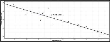
Fig. 13.34 Scatter plot of cetane number vs iodine value data
Negative linear trend visible
Points roughly follow a straight line pattern
No extreme outliers apparent
B. Model Fitting
# Fit the linear regression model
fit <- lm(CetaneNumber ~ IodineValue, data = cetane_data)

# Get basic summary
summary(fit)

# Extract coefficients
b0 <- fit$coefficients['(Intercept)']
b1 <- fit$coefficients['IodineValue']

# Display fitted equation
cat("Fitted equation: CN =", round(b0, 3), "+", round(b1, 3), "* IV")
\(b_0 = 75.212\): Cetane number is predicted to be \(75.212\) when iodine value is \(0\). This is not practically meaningful since \(IV = 0\) is outside our data range.
\(b_1 = -0.2094\): For each unit increase in iodine value, the cetane number decreases by an average of \(0.2094\) units
C. Comprehensive Assumption Checking
Before proceeding with inference, we must verify that our model assumptions are reasonable.
# Calculate residuals and fitted values
cetane_data$residuals <- fit$residuals
cetane_data$fitted <- fit$fitted.values

# Residual plot
ggplot(cetane_data, aes(x = IodineValue, y = residuals)) +
   geom_point(size = 3) +
   geom_hline(yintercept = 0, color = "black", lwd = 2, linetype = "dashed") +
   labs(
      title = "Residual Plot",
      x = "Iodine Value",
      y = "Residuals"
   ) +
   theme_minimal()


# Histogram of residuals
ggplot(cetane_data, aes(x = residuals)) +
   geom_histogram(aes(y = after_stat(density)), bins = 5,
                  fill = "lightblue", color = "black") +
   geom_density(color = "red", lwd = 1) +
   stat_function(
      fun = dnorm,
      args = list(
         mean = mean(cetane_data$residuals),
         sd   = sd(cetane_data$residuals)
      ),
      color = "blue",
      size  = 1
   ) +
   labs(title = "Histogram of Residuals with Normal Overlay")


xbar.resids <- mean(cetane_data$residuals)
s.resids <- sd(cetane_data$residuals)

# QQ plot
ggplot(cetane_data, aes(sample = residuals)) +
   stat_qq(size = 3) +
   geom_abline(slope = s.resids, intercept = xbar.resids, lwd = 1.5, color = "purple") +
   labs(title = "QQ Plot of Residuals")
Fig. 13.35 Residual plot of cetane number vs iodine value data
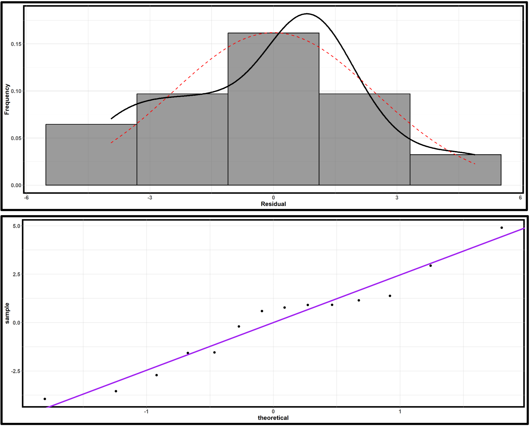
Fig. 13.36 Normality assessment plots of cetane number vs iodine value data; Upper: histogram of residuals; lower: QQ plot of residuals
Independence: This must be evaluated based on data collection procedures.
Linearity: The residual plot shows no obvious patterns or curvature, supporting the linearity assumption.
Constant Variance: The residual plot shows some regions where points cluster more tightly than others, but with only 14 observations, it’s difficult to definitively assess the assumption. The violations don’t appear severe enough to invalidate the analysis.
Normality: The histogram shows roughly symmetric distribution with no extreme outliers. The QQ plot shows some fluctuation but no systematic departures from linearity. The normality assumption appears reasonable, though drawing a definitive conclusion is challenging due to small sample size.
D. F-test for Model Utility
The hypothesis are:
\(H_0\): There is no linear association between iodine value and cetane number.
\(H_a\): There is a linear association between iodine value and cetane number.
summary(fit)
\(R^2 = 0.7906\)
\(f_{TS}=45.35\) with \(df_1=1\) and \(df_2=n-2=12\)
\(p\)-value \(=2.091e-05\)
With p-value < 0.001, we reject \(H_0\) at any reasonable significance level. There is strong evidence of a linear association between iodine value and cetane number.
E. Inference on the Slope Parameter
From summary(fit), we also obtain:
\(b_1=-0.20939\)
\(\widehat{SE}=0.03109\) for the slope estimate
\(t_{TS} = -6.734\)
\(p\)-value \(=2.09 \times 10^{-5}\)
A hypothesis test on \(H_a: \beta_1 \neq 0\) would yield the same conclusion as the model utility test.
95% Confidence Interval for Slope:
# Calculate confidence interval for slope
confint(fit, 'IodineValue', level = 0.95)

# output: (-0.277, -0.142)
We are 95% confident that each unit increase in iodine value is associated with a decrease in cetane number between 0.142 and 0.277 units.
F. Prediction Applications
Q1. What is the expected cetane number for a biodiesel fuel with iodine value of 75?
# Create new data for prediction
new_data <- data.frame(IodineValue = 75)

# Confidence interval for mean response
conf_interval <- predict(fit, newdata = new_data,
                        interval = "confidence", level = 0.99)
print(conf_interval)
Predicted mean cetane number: 59.51
99% Confidence interval: (57.74, 61.28)
We are 99% confident that the average cetane number for all biodiesel fuels with iodine value 75 is between 57.74 and 61.28.
Q2. What is the predicted response for a new biodiesel fuel with iodine value of 75?
# Prediction interval for individual response
pred_interval <- predict(fit, newdata = new_data,
                        interval = "prediction", level = 0.99)
print(pred_interval)
Predicted individual cetane number: 59.51
99% Prediction interval: (54.19, 64.83)
We are 99% confident that a new biodiesel fuel with iodine value 75 will have a cetane number between 54.19 and 64.83.
Creating Confidence and Prediction Bands:
# Generate confidence and prediction bands
conf_band <- predict(fit, interval = "confidence", level = 0.99)
pred_band <- predict(fit, interval = "prediction", level = 0.99)

# Comprehensive visualization
ggplot(cetane_data, aes(x = IodineValue, y = CetaneNumber)) +
# Prediction bands (outer)
geom_ribbon(aes(ymin = pred_band[,2], ymax = pred_band[,3]),
            fill = "lightblue", alpha = 0.3) +
# Confidence bands (inner)
geom_ribbon(aes(ymin = conf_band[,2], ymax = conf_band[,3]),
            fill = "darkblue", alpha = 0.5) +
# Data points
geom_point(size = 3, color = "black") +
# Regression line
geom_smooth(method = "lm", se = FALSE, color = "black", size = 1) +
labs(
   title = "Cetane Number Prediction Model",
   subtitle = "Dark blue: 99% Confidence bands, Light blue: 99% Prediction bands",
   x = "Iodine Value",
   y = "Cetane Number"
) +
theme_minimal()
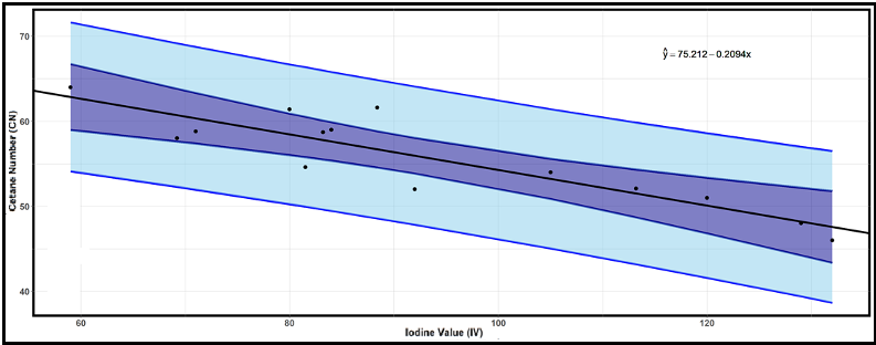
Fig. 13.37 Confidence and prediction bands for cetane number versus iodine value
G. Practical Conclusions and Limitations
There is compelling evidence (\(p < 0.001\)) of a negative linear association between iodine value and cetane number in biodiesel fuels. The model explains approximately 79% of the variation in cetane number, suggesting that iodine value is a useful predictor for this important fuel quality measure.
With only 14 observations, however, our conclusions should be considered preliminary. Larger studies would provide more definitive results. Some minor violations of the constant variance assumption were noted, which could affect the reliability of prediction intervals. Predictions should only be made within the range of observed iodine values (59-132). Extrapolation beyond this range is not justified.
13.4.6. Bringing It All Together
Key Takeaways 📝
Interpolation is safe, extrapolation is dangerous. Predictions should only be made within the range of observed explanatory variable values used to fit the model.
Confidence intervals for mean response estimate average behavior, while prediction intervals for individual observations account for additional uncertainty from new error terms. For this reason, prediction intervals are always wider than confidence intervals for means response.
The Central Limit Theorem provides robustness for estimators that involve averaging, but individual predictions are not robust to normality violations.
13.4.7. Exercises
Exercise 1: Confidence Interval vs. Prediction Interval
A manufacturing engineer has developed a regression model relating machine runtime (hours) to production output (units): \(\hat{y} = 120 + 85x\).
For \(x^* = 8\) hours:
What is the point prediction for production output?
Explain the difference between:
A confidence interval for the mean response at \(x^* = 8\)
A prediction interval for an individual response at \(x^* = 8\)
Which interval will always be wider? Explain why mathematically.
Solution
Part (a): Point prediction
\(\hat{y} = 120 + 85(8) = 120 + 680 = 800\) units
Part (b): Difference between intervals
CI for mean response: Estimates the average production output across ALL 8-hour runs. The uncertainty comes only from estimating the regression line (where is the true line?).
PI for individual: Predicts the output for a single 8-hour run. The uncertainty includes both:
Regression line estimation (same as CI)
Random variation of individual observations around the true line
Part (c): Which is wider?
The prediction interval is always wider because of the mathematical structure:
The extra “+1” in the PI formula accounts for individual variation (\(\sigma^2\)), which is always positive.
Exercise 2: Computing Prediction Intervals
Using the production output regression from Exercise 1 with the following additional information:
\(n = 20\)
\(\bar{x} = 6.5\) hours
\(MSE = 2500\)
\(S_{XX} = 180\)
For \(x^* = 8\) hours:
Calculate \(SE_{\hat{\mu}^*}\) (standard error for mean response).
Construct a 95% confidence interval for the mean production output when runtime is 8 hours.
Calculate \(SE_{\hat{Y}^*}\) (standard error for individual prediction).
Construct a 95% prediction interval for the production output of a single run lasting 8 hours.
Compare the widths of the two intervals. What explains the difference?
Solution
Part (a): SE for mean response
Part (b): 95% CI for mean response
\(df = n - 2 = 18\), \(t_{0.025, 18} = 2.101\)
95% CI: (773.74, 826.26) units
We are 95% confident that the average production for all 8-hour runs is between 774 and 826 units.
Part (c): SE for individual prediction
Part (d): 95% PI for individual
95% PI: (691.71, 908.29) units
We are 95% confident that a single 8-hour run will produce between 692 and 908 units.
Part (e): Width comparison
CI width = 2 × 26.26 = 52.5 units
PI width = 2 × 108.29 = 216.6 units
The PI is 4.1 times wider than the CI. The difference is due to the “+1” term in the PI variance formula, which accounts for individual variation around the regression line.
Exercise 3: Extrapolation Warning
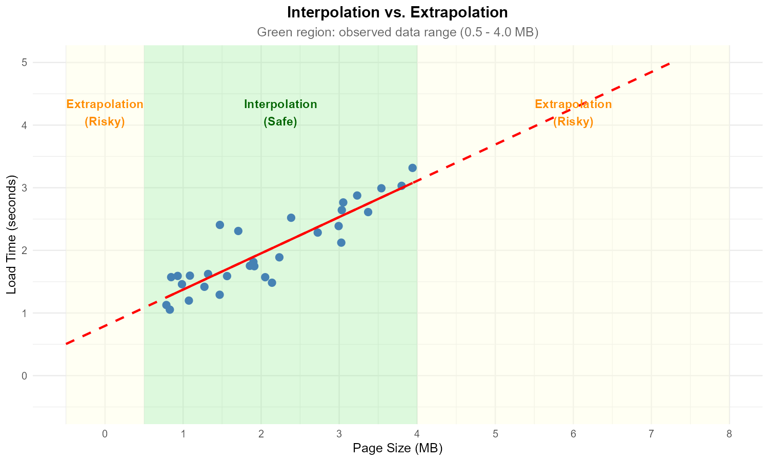
Fig. 13.38 Scatter plot with regression line and extrapolation regions
A data analyst developed a regression model predicting website load time (Y, seconds) from page size (X, MB) using data where X ranged from 0.5 to 4.0 MB.
The fitted model is \(\hat{y} = 0.8 + 0.6x\).
For a 2.5 MB page, calculate the predicted load time. Is this interpolation or extrapolation?
For a 7.0 MB page, calculate the predicted load time. Is this interpolation or extrapolation?
Why should the analyst be cautious about the prediction in part (b)?
The model predicts \(\hat{y} = -0.4\) seconds for \(x = -2\). What does this impossible prediction tell us about extrapolation?
Solution
Part (a): Prediction at x = 2.5
\(\hat{y} = 0.8 + 0.6(2.5) = 0.8 + 1.5 = 2.3\) seconds
This is interpolation because 2.5 MB is within the observed range of 0.5 to 4.0 MB.
Part (b): Prediction at x = 7.0
\(\hat{y} = 0.8 + 0.6(7.0) = 0.8 + 4.2 = 5.0\) seconds
This is extrapolation because 7.0 MB is outside the observed range of 0.5 to 4.0 MB.
Part (c): Cautions about extrapolation
The analyst should be cautious because:
No data supports the linear relationship beyond 4.0 MB
The relationship may curve, plateau, or change behavior at larger file sizes
Server behavior at large page sizes may differ fundamentally (caching, timeout limits)
Uncertainty is much higher outside the observed range
The linear model is only validated within the observed data range
Part (d): Impossible prediction
The prediction of −0.4 seconds for x = −2 MB demonstrates that extrapolation can produce nonsensical results.
This shows that:
Linear models are only approximations valid within the observed range
The mathematical equation has no physical constraints
Extrapolation can lead to predictions that violate reality (negative time, negative file size)
The model should never be used outside its validated range
Exercise 4: Effect of x* Location on Interval Width
The variance of the mean response estimator is:
At what value of \(x^*\) is this variance minimized?
What happens to the variance as \(x^*\) moves further from \(\bar{x}\)?
Explain intuitively why predictions are most precise near \(\bar{x}\).
How does this relate to the danger of extrapolation?
Solution
Part (a): Minimum variance location
Variance is minimized when \(x^* = \bar{x}\).
At this point, the term \(\frac{(x^* - \bar{x})^2}{S_{XX}} = 0\), leaving only the \(\frac{1}{n}\) term.
Part (b): Variance as x* moves away
Variance increases as \(|x^* - \bar{x}|\) increases.
The increase is quadratic because of the \((x^* - \bar{x})^2\) term. Moving twice as far from \(\bar{x}\) quadruples this component of variance.
Part (c): Intuitive explanation
We have the most information about Y near the center of our X data because:
The regression line is “anchored” at \((\bar{x}, \bar{y})\)
Near \(\bar{x}\), small errors in slope estimation have minimal effect
Far from \(\bar{x}\), slope errors get amplified (like a lever arm)
More data points cluster near the middle in most datasets
Part (d): Connection to extrapolation
As \(x^*\) moves outside the data range:
\((x^* - \bar{x})^2\) grows very large
Prediction variance becomes extremely high
Confidence and prediction intervals become very wide
The mathematical uncertainty reflects real scientific uncertainty
This is why extrapolation is unreliable — the variance formula mathematically captures the increasing uncertainty.
Exercise 5: Prediction Using R Output
From a regression of compressive strength (psi) on curing time (days) for concrete:
> fit <- lm(Strength ~ Time, data = concrete)
> summary(fit)

Coefficients:
            Estimate Std. Error t value Pr(>|t|)
(Intercept) 1850.000    125.400  14.752  < 2e-16 ***
Time         180.500     18.200   9.918 3.45e-10 ***

Residual standard error: 245.6 on 28 degrees of freedom

> new_data <- data.frame(Time = 14)
> predict(fit, new_data, interval = "confidence", level = 0.95)
       fit      lwr      upr
1 4377.000 4256.123 4497.877

> predict(fit, new_data, interval = "prediction", level = 0.95)
       fit      lwr      upr
1 4377.000 3862.456 4891.544
Write the fitted regression equation.
Calculate the predicted strength at 14 days using your equation. Verify it matches the output.
Interpret the 95% confidence interval for mean response in context.
Interpret the 95% prediction interval in context.
Why is the prediction interval so much wider than the confidence interval?
Solution
Part (a): Fitted equation
\(\widehat{Strength} = 1850 + 180.5 \times Time\)
Part (b): Verification
\(\hat{y} = 1850 + 180.5(14) = 1850 + 2527 = 4377\) psi ✓
This matches the “fit” value in the R output.
Part (c): CI interpretation
We are 95% confident that the mean compressive strength of all concrete samples cured for 14 days is between 4256 and 4498 psi.
Part (d): PI interpretation
We are 95% confident that a single new concrete sample cured for 14 days will have compressive strength between 3862 and 4892 psi.
Part (e): Why PI is wider
The PI is wider because it accounts for individual variation — a single sample’s strength varies around the mean, adding uncertainty beyond just estimating where the mean is.
CI width: 4497.877 − 4256.123 = 241.8 psi
PI width: 4891.544 − 3862.456 = 1029.1 psi
The PI is about 4.3 times wider, reflecting the additional \(\sigma^2\) term in the variance formula.
Exercise 6: CLT and Prediction Robustness
Consider a regression model where the true errors follow a skewed distribution rather than a normal distribution.
Will the point estimates \(b_0\) and \(b_1\) still be unbiased? Explain.
For large samples, will confidence intervals for \(\beta_0\) and \(\beta_1\) still achieve approximately nominal coverage? Why?
For large samples, will confidence intervals for the mean response \(\mu^*\) still work well? Why?
For large samples, will prediction intervals for individual responses still achieve nominal coverage? Explain why the CLT doesn’t help here.
Solution
Part (a): Unbiasedness of estimates
Yes, \(b_0\) and \(b_1\) are still unbiased.
Unbiasedness requires:
\(E[\varepsilon_i] = 0\) (errors have mean zero)
Correct model specification (linearity)
Normality is NOT required for unbiasedness. The least squares estimates are BLUE (Best Linear Unbiased Estimators) regardless of the error distribution.
Part (b): CIs for coefficients
Yes, approximately. For large samples, the Central Limit Theorem ensures that \(b_0\) and \(b_1\) are approximately normally distributed, regardless of the error distribution.
Since the t-intervals rely on this normality, they achieve approximately nominal coverage for large n.
Part (c): CI for mean response
Yes. The estimator \(\hat{\mu}^* = b_0 + b_1 x^*\) is a weighted average of the Y values, so the CLT applies. For large samples, \(\hat{\mu}^*\) is approximately normal, and the confidence interval works well.
Part (d): PI for individual responses
No, the CLT does not help prediction intervals.
The prediction interval accounts for a new error \(\varepsilon_{new}\):
This new error is NOT averaged — it retains its original (skewed) distribution. The PI formula assumes \(\varepsilon_{new} \sim N(0, \sigma^2)\), so if errors are actually skewed, the PI can have poor coverage even with large n.
This is a fundamental limitation: we can’t “average away” individual variation.
Exercise 7: Complete Regression Analysis
An environmental engineer studies the relationship between industrial wastewater pH (X) and dissolved oxygen concentration (Y, mg/L) in a river. Data from \(n = 22\) sampling sites yields:
Fitted model: Y_hat = 12.8 - 0.95X

Summary Statistics:
- x_bar = 6.8
- S_XX = 45.2
- MSE = 2.89
- R² = 0.68
Interpret the slope in context.
Calculate \(SE_{b_1}\) and test whether pH has a significant effect on dissolved oxygen at \(\alpha = 0.05\).
For a new site with pH = 7.2:
Calculate the point prediction
Calculate \(SE_{\hat{\mu}^*}\) and construct a 95% CI for mean DO
Calculate \(SE_{\hat{Y}^*}\) and construct a 95% PI for an individual observation
A site upstream has pH = 4.5 (outside the observed range of 5.8 to 8.2). Should the engineer use this model to predict DO at that site? Explain.
Solution
Part (a): Slope interpretation
For each unit increase in pH, dissolved oxygen concentration decreases by 0.95 mg/L, on average.
Part (b): Hypothesis test
\(SE_{b_1} = \sqrt{\frac{MSE}{S_{XX}}} = \sqrt{\frac{2.89}{45.2}} = \sqrt{0.0639} = 0.253\)
Test: \(H_0: \beta_1 = 0\) vs. \(H_a: \beta_1 \neq 0\)
\(t_{TS} = \frac{-0.95 - 0}{0.253} = -3.76\)
\(df = 22 - 2 = 20\)
P-value = 2 * pt(3.76, 20, lower.tail = FALSE) = 0.0012
At \(\alpha = 0.05\), since 0.0012 < 0.05, reject \(H_0\). There is sufficient evidence of a significant linear relationship between pH and dissolved oxygen.
Part (c): Predictions at x* = 7.2
Point prediction:
\(\hat{y} = 12.8 - 0.95(7.2) = 12.8 - 6.84 = 5.96\) mg/L
SE for mean response:
95% CI: \(t_{0.025, 20} = 2.086\)
\(CI = 5.96 \pm 2.086(0.376) = 5.96 \pm 0.78\)
95% CI: (5.18, 6.74) mg/L
SE for individual:
95% PI:
\(PI = 5.96 \pm 2.086(1.741) = 5.96 \pm 3.63\)
95% PI: (2.33, 9.59) mg/L
Part (d): Extrapolation warning
No, the engineer should NOT use this model for pH = 4.5 because:
This is outside the observed range (5.8 to 8.2) — extrapolation
Chemical relationships may change at extreme pH values
The linear model is not validated for acidic conditions
The prediction would have very high uncertainty
The engineer should collect data at lower pH values before making predictions in that range.
Exercise 8: Confidence and Prediction Bands
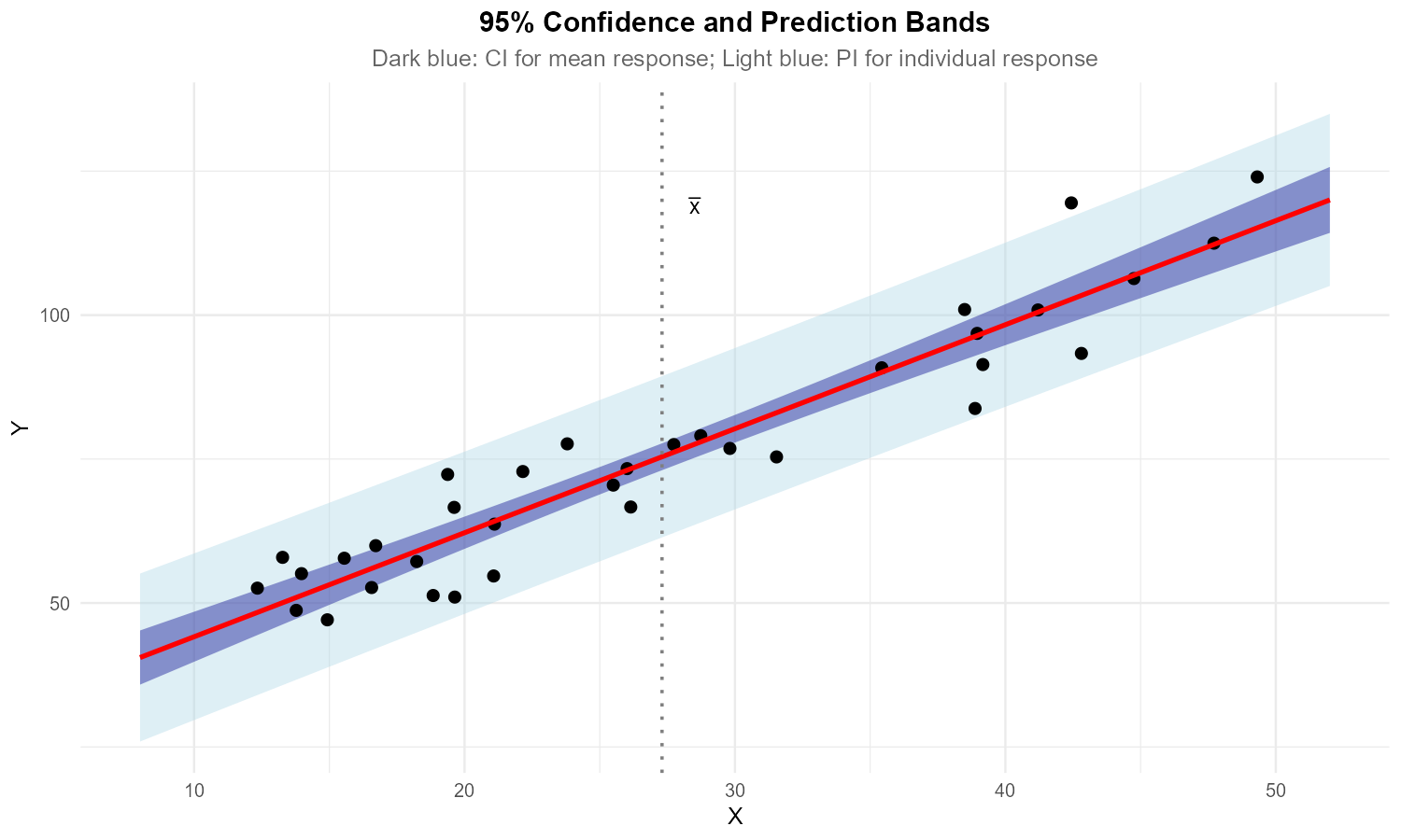
Fig. 13.39 Regression line with confidence and prediction bands
The figure shows a fitted regression line with two sets of bands.
Identify which bands are the confidence bands (for mean response) and which are the prediction bands.
Why do both sets of bands have a “curved” shape rather than being parallel to the regression line?
At what X value are the bands narrowest? Why?
If sample size increased substantially, what would happen to:
The confidence bands?
The prediction bands?
Solution
Part (a): Identifying bands
Inner bands (darker/narrower): Confidence bands for mean response
Outer bands (lighter/wider): Prediction bands for individual observations
The prediction bands are always wider because they include individual variation.
Part (b): Curved shape
Both sets of bands are curved because the variance depends on \((x^* - \bar{x})^2\):
As \(x^*\) moves away from \(\bar{x}\), the second term increases, making the bands wider. This creates the characteristic “bowtie” or “hyperbolic” shape.
Part (c): Narrowest location
Both bands are narrowest at \(x = \bar{x}\) (the mean of X).
At this point, \((x^* - \bar{x})^2 = 0\), minimizing the variance formula. This is where we have the most precise estimates.
Part (d): Effect of increasing n
Confidence bands: Will shrink substantially. The \(\frac{1}{n}\) term decreases, and the overall estimation uncertainty decreases with more data.
Prediction bands: Will shrink only slightly. While the \(\frac{1}{n}\) term decreases, the dominant “+1” term (representing \(\sigma^2\) for individual variation) remains unchanged. Individual observations will always vary around the line regardless of how precisely we estimate the line.
Exercise 9: Comprehensive Case Study
A pharmaceutical company studies the relationship between drug concentration in blood plasma (X, μg/mL) and time to symptom relief (Y, minutes) for \(n = 30\) patients. Complete analysis:
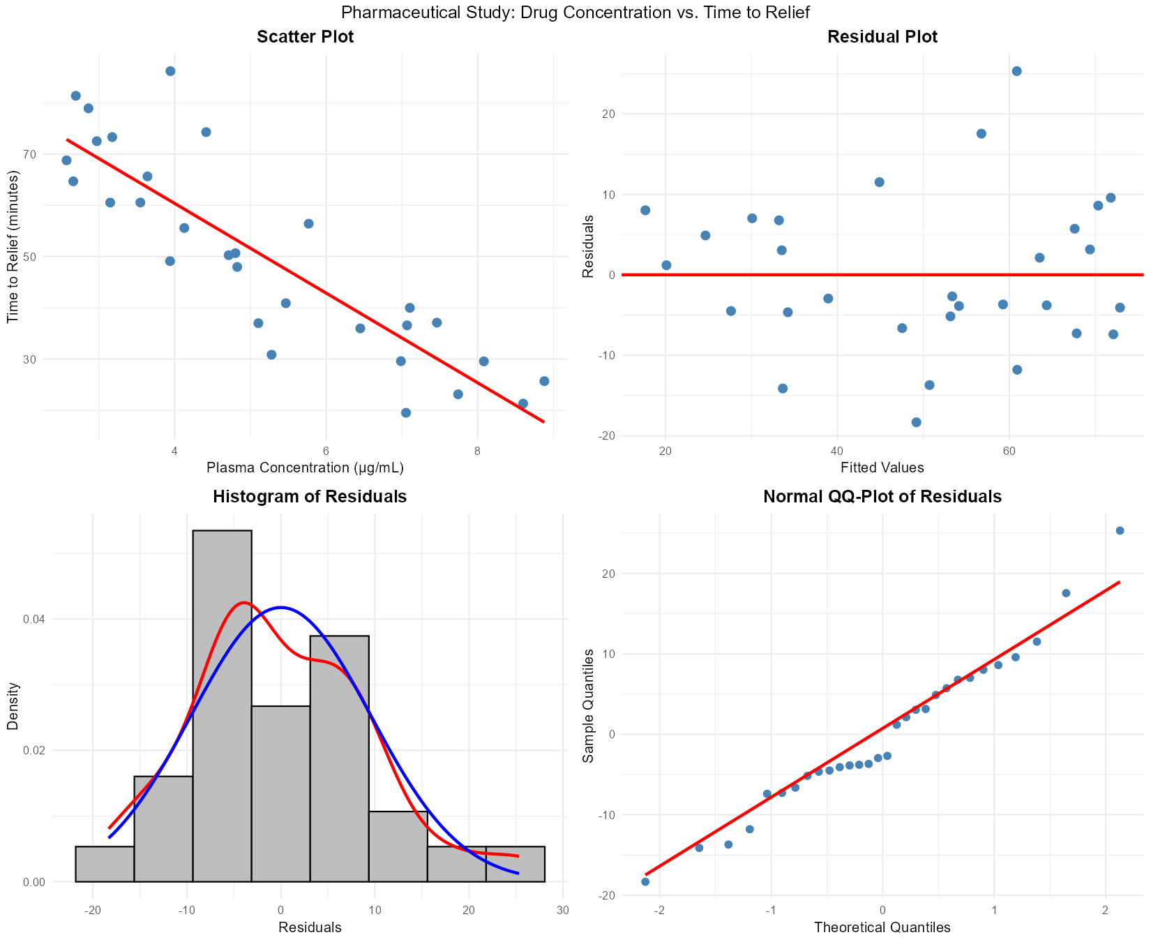
Fig. 13.40 Diagnostic plots for pharmaceutical data
Regression output:
Y_hat = 95.2 - 8.4X

ANOVA:
Source      df    SS       MS        F
Regression   1   4256    4256    42.56
Error       28   2800     100
Total       29   7056

Additional: x_bar = 5.5, S_XX = 168
Assess the model assumptions using the diagnostic plots.
Calculate and interpret \(R^2\).
Test model utility at \(\alpha = 0.01\) using the four-step procedure.
Construct a 99% confidence interval for the slope.
For a patient with plasma concentration \(x^* = 6.0\) μg/mL:
Calculate the predicted time to relief
Construct a 95% CI for mean time to relief
Construct a 95% PI for this patient’s time to relief
Which interval should the doctor quote when counseling the individual patient?
Another patient has \(x^* = 12.0\) μg/mL (outside the data range of 2-9). What should the doctor do?
Solution
Part (a): Assumption assessment
Linearity: ✓ Satisfied — residual plot shows random scatter around zero, no curvature
Independence: Assumed satisfied (cross-sectional patient data)
Normality: ✓ Approximately satisfied — histogram roughly symmetric, QQ-plot points near the line
Equal variance: ✓ Approximately satisfied — residual plot shows consistent spread
All LINE assumptions appear reasonably satisfied.
Part (b): R² calculation and interpretation
Approximately 60.3% of the variation in time to symptom relief is explained by the linear relationship with drug concentration.
Part (c): Model utility test
Step 1: Let \(\beta_1\) = the true change in relief time (minutes) per μg/mL increase in drug concentration.
Step 2:
\(H_0: \beta_1 = 0\) (no linear relationship)
\(H_a: \beta_1 \neq 0\) (linear relationship exists)
Step 3: From ANOVA table: \(F_{TS} = 42.56\) with df = (1, 28)
P-value = pf(42.56, 1, 28, lower.tail = FALSE) = 4.2 × 10⁻⁷
Step 4: At \(\alpha = 0.01\), since p-value (4.2 × 10⁻⁷) < 0.01, we reject \(H_0\).
There is sufficient evidence to conclude that drug concentration has a significant linear relationship with time to symptom relief.
Part (d): 99% CI for slope
\(SE_{b_1} = \sqrt{\frac{MSE}{S_{XX}}} = \sqrt{\frac{100}{168}} = 0.772\)
\(t_{0.005, 28} = 2.763\)
99% CI: (−10.53, −6.27)
Part (e): Predictions at x* = 6.0
Point prediction:
\(\hat{y} = 95.2 - 8.4(6.0) = 95.2 - 50.4 = 44.8\) minutes
SE for mean response:
95% CI: \(t_{0.025, 28} = 2.048\)
\(CI = 44.8 \pm 2.048(1.87) = 44.8 \pm 3.83\)
95% CI: (40.97, 48.63) minutes
SE for individual:
95% PI:
\(PI = 44.8 \pm 2.048(10.17) = 44.8 \pm 20.83\)
95% PI: (23.97, 65.63) minutes
Which to quote? The doctor should quote the prediction interval (24 to 66 minutes) when counseling the individual patient, because this captures the uncertainty for a single person’s response, not just the average.
Part (f): Extrapolation warning
The doctor should NOT use this model for x* = 12.0 μg/mL because:
This is outside the observed data range (2-9 μg/mL)
Extrapolation is unreliable
Drug effects may plateau or become toxic at high concentrations
The linear relationship is not validated at this concentration
Recommendation: Conduct additional studies at higher concentrations before making predictions, or use pharmacokinetic models appropriate for that dose range.
13.4.8. Additional Practice Problems
True/False Questions (1 point each)
A prediction interval for an individual response is always wider than a confidence interval for the mean response at the same value of \(x^*\).
Ⓣ or Ⓕ
Extrapolation—predicting \(Y\) at an \(x^*\) value far outside the range of the observed data—is reliable as long as \(R^2\) is high.
Ⓣ or Ⓕ
Both the confidence interval for \(\mu_{Y|x^*}\) and the prediction interval for \(Y^*\) are narrowest when \(x^* = \bar{x}\).
Ⓣ or Ⓕ
As the sample size \(n \to \infty\), the prediction interval for an individual response shrinks to zero width.
Ⓣ or Ⓕ
Using a regression model fit on data where engine speed ranged from 1000 to 4000 RPM to predict fuel efficiency at 8000 RPM is an example of extrapolation.
Ⓣ or Ⓕ
If the normality assumption is violated but the sample size is large, inference for the slope \(\beta_1\) is still approximately valid due to the Central Limit Theorem.
Ⓣ or Ⓕ
Multiple Choice Questions (2 points each)
A chemical engineer has a regression model with \(n = 50\), \(\bar{x} = 30\), \(S_{XX} = 5000\), and \(MSE = 64\). What is the standard error of the predicted mean response at \(x^* = 35\)?
Ⓐ \(\sqrt{64\left(\frac{1}{50} + \frac{25}{5000}\right)} = \sqrt{64(0.025)} = \sqrt{1.60} \approx 1.265\)
Ⓑ \(\sqrt{64\left(1 + \frac{1}{50} + \frac{25}{5000}\right)} = \sqrt{64(1.025)} = \sqrt{65.60} \approx 8.100\)
Ⓒ \(\sqrt{64\left(\frac{1}{50}\right)} = \sqrt{1.28} \approx 1.131\)
Ⓓ \(\sqrt{64\left(\frac{25}{5000}\right)} = \sqrt{0.32} \approx 0.566\)
Using the same values from Question 7, what is the standard error for predicting an individual response at \(x^* = 35\)?
Ⓐ \(\approx 1.265\)
Ⓑ \(\approx 8.100\)
Ⓒ \(\approx 8.000\)
Ⓓ \(\approx 0.566\)
Which statement best explains why prediction intervals are wider than confidence intervals?
Ⓐ Prediction intervals use a larger critical value from the \(t\)-distribution
Ⓑ Prediction intervals account for individual variation around the regression line in addition to uncertainty in estimating the mean
Ⓒ Prediction intervals use \(n - 1\) degrees of freedom instead of \(n - 2\)
Ⓓ Prediction intervals require a larger sample size to be valid
A data scientist builds a model predicting apartment rent from square footage using data from apartments between 400 and 1500 sq ft. A colleague asks for a prediction at 3000 sq ft. What is the best response?
Ⓐ Use the model — linear regression can predict at any \(x\) value
Ⓑ Refuse — the prediction is an extrapolation far beyond the observed range and the linear relationship may not hold
Ⓒ Use the model but report a wider confidence interval to account for the extrapolation
Ⓓ Use the model only if \(R^2 > 0.90\)
An engineer fits a simple linear regression with \(n = 30\) and wants a 95% confidence interval for the mean response at \(x^* = \bar{x}\). The standard error simplifies to \(SE_{\hat{\mu}^*} = \sqrt{MSE / n}\). What critical value should be used?
Ⓐ \(z_{0.025} = 1.960\)
Ⓑ \(t_{0.025,\, 29}\)
Ⓒ \(t_{0.025,\, 28}\)
Ⓓ \(t_{0.05,\, 28}\)
Which of the following is true about the robustness of simple linear regression inference?
Ⓐ Inference is robust to violations of the linearity assumption when the sample size is large
Ⓑ Inference for \(\beta_1\) is approximately valid for moderate departures from normality when the sample size is large, but prediction intervals may still be affected
Ⓒ The equal variance assumption can always be ignored if \(n > 30\)
Ⓓ Robustness means that no assumptions need to be checked when \(n\) is large enough
Answers to Practice Problems
True/False Answers:
True — The prediction interval includes individual variation (\(\sigma^2\)) on top of the uncertainty in estimating the mean, so it is always wider than the confidence interval at the same \(x^*\).
False — High \(R^2\) describes the fit within the observed range. Outside that range, the relationship may be entirely different (e.g., non-linear), making extrapolation unreliable regardless of \(R^2\).
True — Both intervals contain a \((x^* - \bar{x})^2 / S_{XX}\) term that equals zero when \(x^* = \bar{x}\), minimizing the standard error and thus the width.
False — The prediction interval formula includes a “1” term under the square root representing irreducible individual variation (\(\sigma^2\)). Even as \(n \to \infty\), this term remains, so the prediction interval converges to \(\hat{y} \pm t^* \cdot \sqrt{MSE}\), not to zero.
True — The observed data spans 1000–4000 RPM, and 8000 RPM is well outside this range. Predicting there is extrapolation.
True — The CLT ensures that the sampling distribution of \(b_1\) is approximately normal for large \(n\), making \(t\)-tests and confidence intervals for \(\beta_1\) approximately valid even if the errors are not perfectly normal.
Multiple Choice Answers:
Ⓐ — The standard error for the mean response is \(SE_{\hat{\mu}^*} = \sqrt{MSE\!\left(\frac{1}{n} + \frac{(x^* - \bar{x})^2}{S_{XX}}\right)} = \sqrt{64\!\left(\frac{1}{50} + \frac{(35-30)^2}{5000}\right)} = \sqrt{64(0.02 + 0.005)} = \sqrt{1.60} \approx 1.265\).
Ⓑ — The standard error for an individual prediction is \(SE_{\hat{Y}^*} = \sqrt{MSE\!\left(1 + \frac{1}{n} + \frac{(x^* - \bar{x})^2}{S_{XX}}\right)} = \sqrt{64(1.025)} = \sqrt{65.60} \approx 8.100\). The extra “1” accounts for individual variation.
Ⓑ — The prediction interval includes uncertainty in estimating the mean response plus the natural variation of individual observations around that mean (\(\sigma^2\)). Both intervals use the same critical value and degrees of freedom.
Ⓑ — Predicting at 3000 sq ft using a model built on 400–1500 sq ft data is extrapolation. The linear trend observed in the data may not extend that far, and the model provides no basis for such predictions.
Ⓒ — In simple linear regression, the degrees of freedom for prediction are \(n - 2 = 30 - 2 = 28\). For a 95% CI, the critical value is \(t_{0.025,\, 28}\).
Ⓑ — Inference for slope coefficients benefits from CLT-based robustness with large \(n\), but prediction intervals depend more directly on the normality of individual errors. Linearity and equal variance assumptions are not rescued by large sample sizes alone.