Slides 📊
13.1. Introduction to Linear Regression
So far, we have studied inference methods that describe a single population or the relationship between a quantitative variable and a categorical variable. Regression analysis, in contrast, examines relationships between two quantitative variables. While many core statistical ideas parallel the methods from previous chapters, one major shift occurs—we can now describe the relationship using a functional form, represented by a trendline.
After a brief introduction to general regression analysis, we narrow our focus to variables that exhibit a linear association.
Road Map
Express the core ideas of previous inference methods in model form.
Build the general regression model for two quantitative variables. Understand its components and see how it extends the modeling ideas from earlier methods.
Graphically assess the association of two quantitative variables using scatter plots.
13.1.1. The Evolution of Our Statistical Journey
Before diving into linear regression, let us reflect on our journey through statistical inference. Each major phase has built systematically toward the culminating topic of linear regression.
Model for Single Population Inference
We began with the fundamental problem of inferring an unknown population mean \(\mu\) from sample data. The corresponding model can be written as:
where \(\varepsilon_i\) represent iid errors with \(E(\varepsilon_i)=0\) and \(\text{Var}(\varepsilon_i) = \sigma^2\) for \(i = 1, 2, \ldots, n\). This model captures the essential idea that each observation consists of an underlying mean plus random variation around that mean.
Two-Population Models
A. Independent Two-Sample Inference
We then extended our methods to comparison of two population means, handling both independent and dependent sampling scenarios.
For independent two-sample inference, the assumptions can be expressed using the model:
where
\(\mu_A\) and \(\mu_B\) are the unknown population means,
\(\varepsilon_{Ai}\) are iid with \(E(\varepsilon_{Ai})=0\) and \(\text{Var}(\varepsilon_{Ai}) = \sigma^2_A\) for all \(i=1,\cdots,n_A\),
\(\varepsilon_{Bi}\) are iid with \(E(\varepsilon_{Bi})=0\) and \(\text{Var}(\varepsilon_{Bi}) = \sigma^2_B\) for all \(i=1,\cdots,n_B\), and
error terms of Population A are independent from error terms of Population B.
B. Paired Two-Sample Inference
For paired samples, the difference is modeled directly:
where \(\varepsilon_i\) are iid with \(E(\varepsilon_i)=0\) and \(\text{Var}(\varepsilon_i)=\sigma^2_D\).
The ANOVA Model
ANOVA extended the modeling ideas for the independent two-sample analysis to \(k\)-samples. Each observation \(X_{ij}\) is assumed to satisfy:
where
\(\mu_i\) is the true mean for group \(i\), and
\(\varepsilon_{ij}\) are iid errors with \(E(\varepsilon_{ij})=0\) and \(\text{Var}(\varepsilon_{ij}) = \sigma^2\) for all possible pairs \((i,j)\).
13.1.2. The Regression Framework
Throughout our progression, we consistently worked with a single quantitative variable—either on its own or in connection with a categorical factor variable that divides data into groups.
In regression analyses, we study the relationship of two quantitative variables. Because both variables carry numerical order and magnitude, our interest expands: we now examine not only whether an association exists but also the functional form that characterizes how the two variables relate.
The General Regression Model
Our new modeling framework can be expressed as:
This simple equation contains profound ideas:
The response variable \(Y\) (also called the dependent variable) represents the outcome to be understood and predicted.
The explanatory variable \(X\) (also called the independent variable) represents the variable that may explain, influence, or predict changes in the response variable.
The regression function \(g(X)\) defines the systematic relationship between the explanatory and response variables. This function captures the average behavior of how \(Y\) changes with \(X\).
The error term \(\varepsilon\) represents unexplained variation—everything about \(Y\) that cannot be explained by the functional relationship with \(X\).
Functional Association Does Not Guarantee Causality
Two variables are said to be associated if changes in one variable are accompanied by systematic changes in the other variable.
Causation makes a stronger claim that one variable brings about changes in the other. Establishing causation requires careful experimental design and advanced analytical techniques that allow the causal argument to be statistically rigorous.
‼️ Regression analyses covered in this course can establish association, but not causation.
13.1.3. Preliminary Assessment of Linear Relationship Through Scatter Plots
Before mathematically constructing regression analysis, let us examine the association between two quantitative variables graphically. Scatter plots are the primary tool for this stage.
The Anatomy of a Scatter Plot
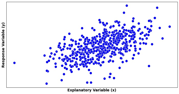
Fig. 13.1 An example of a scatter plot
A scatter plot consists of:
Horizontal X-axis whose range includes all \(x_i\) values in the data set
Vertical Y-axis whose range includes all observed \(y_i\) values
Points at coordinates \((x_i, y_i)\), each representing an observed pair
The assessment of a scatter plot consists of three main steps:
Step 1: Check whether there is any relationship between the two variables, and if yes, identify the form of the relationship (linear, curved, etc.).
Once the relationship is confirmed to be linear, proceed to:
Step 2: Assess the direction and strength of the linear relationship.
Step 3: Check if any horizontal or vertical outliers exist.
Step 1: The Functional Form
During this stage, we visualize a curve which best summarizes the trend created by the data points. Depending on its functional form, we classify the association as linear, exponential, polynomial, clustered, etc. Fig. 13.1 shows a scatter plot with a linear trend.
See Fig. 13.2 for scatter plots exhibiting trends of different functional forms.
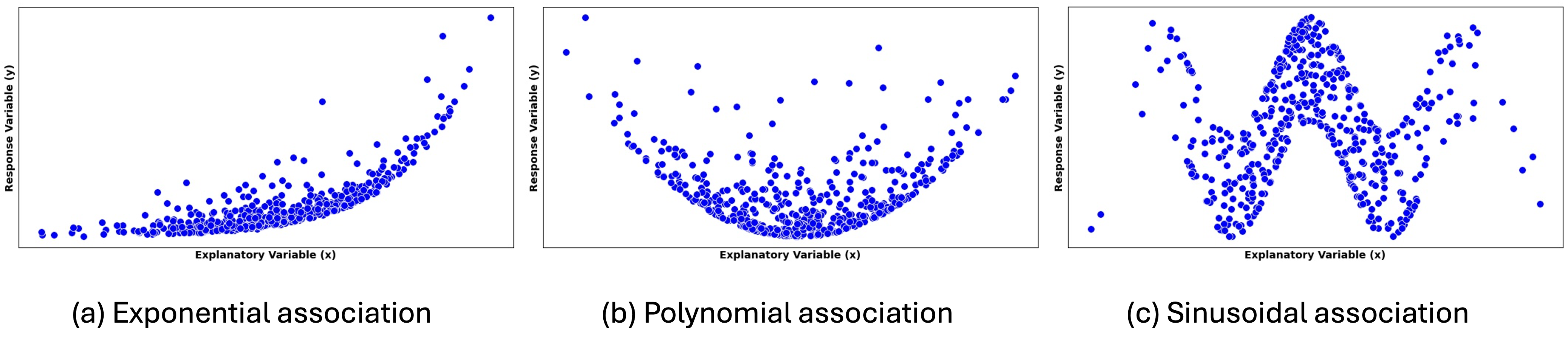
Fig. 13.2 Scatter plots showing trends with exponential, polynomial, and sinusoidal forms
Other possible forms are:
Threshold or breakpoint patterns: The relationship changes character at certain values, requiring different functional forms in different regions.
Clustered form: Points group into distinct clusters rather than following a smooth pattern. This suggests the presence of subgroups or categories within the data.
No pattern: Points appear randomly scattered with no discernible relationship. This suggests that the explanatory variable provides little or no information about the response variable.
Step 2: Direction and Strength of a Linear Relationship
Once a linear form is identified, we characterize the association further with its direction and strength.
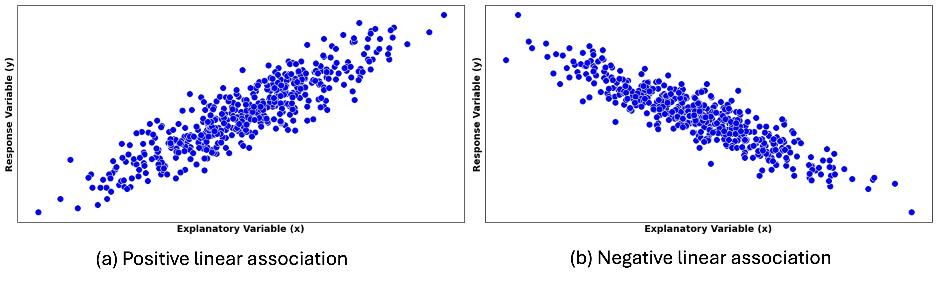
Fig. 13.3 Scatter plots with different directions of linear association
Positive linear association is indicated by an upward trend in the scatter plot. As the explanatory variable \(X\) increases, the response variable \(Y\) tends to increase as well.
Negative linear association is indicated by a downward trend, with the variables moving in “opposite” directions.
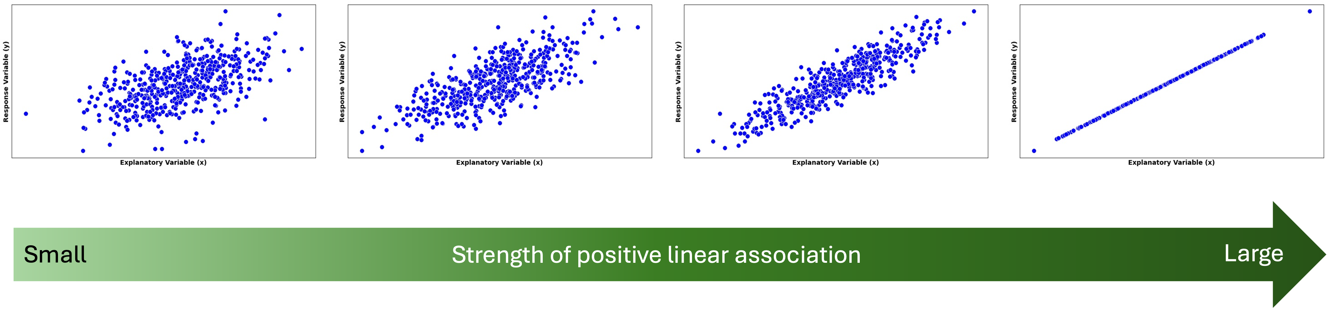
Fig. 13.4 Strength of linear association increases from left to right
Strength of a linear relationship is indicated on a scatter plot by how closely the points gather around the best-fit line. We say that \(X\) and \(Y\) have a deterministic (perfect) linear association when the data points lie on a straight line (first on the right of Fig. 13.4).
Exception: A Perfect Horizontal Line
When the summary line is horizontal, we consider the two random variables to be unassociated, even if the dots draw a perfect line. This may seem contradictory to our prior discussion at first, but recall that two variables are associated if information of one variable gives us extra information about the other. In an association described by a flat line, the knowledge of an \(X\) value gives no additional information on the potential location of \(Y\).
Step 3: Outliers and Influential Points
There are two types of outliers in regression analysis:
\(X\)-outliers deviate horizontally from other \(X\) values (Fig. 13.6).
\(Y\)-outliers show a greater vertical distance from the trendline than other data points (Fig. 13.5).
Note the key distinction: \(Y\)-outliers are determined by their distance from the associational trend with \(X\), not from other \(Y\) values.

Fig. 13.5 Y-outlier is circled in red
We further define an influential point as an observation that has a large impact on the fitted regression line. Removing this point would substantially change the slope, the intercept, or both. We also say that such points have high leverage.
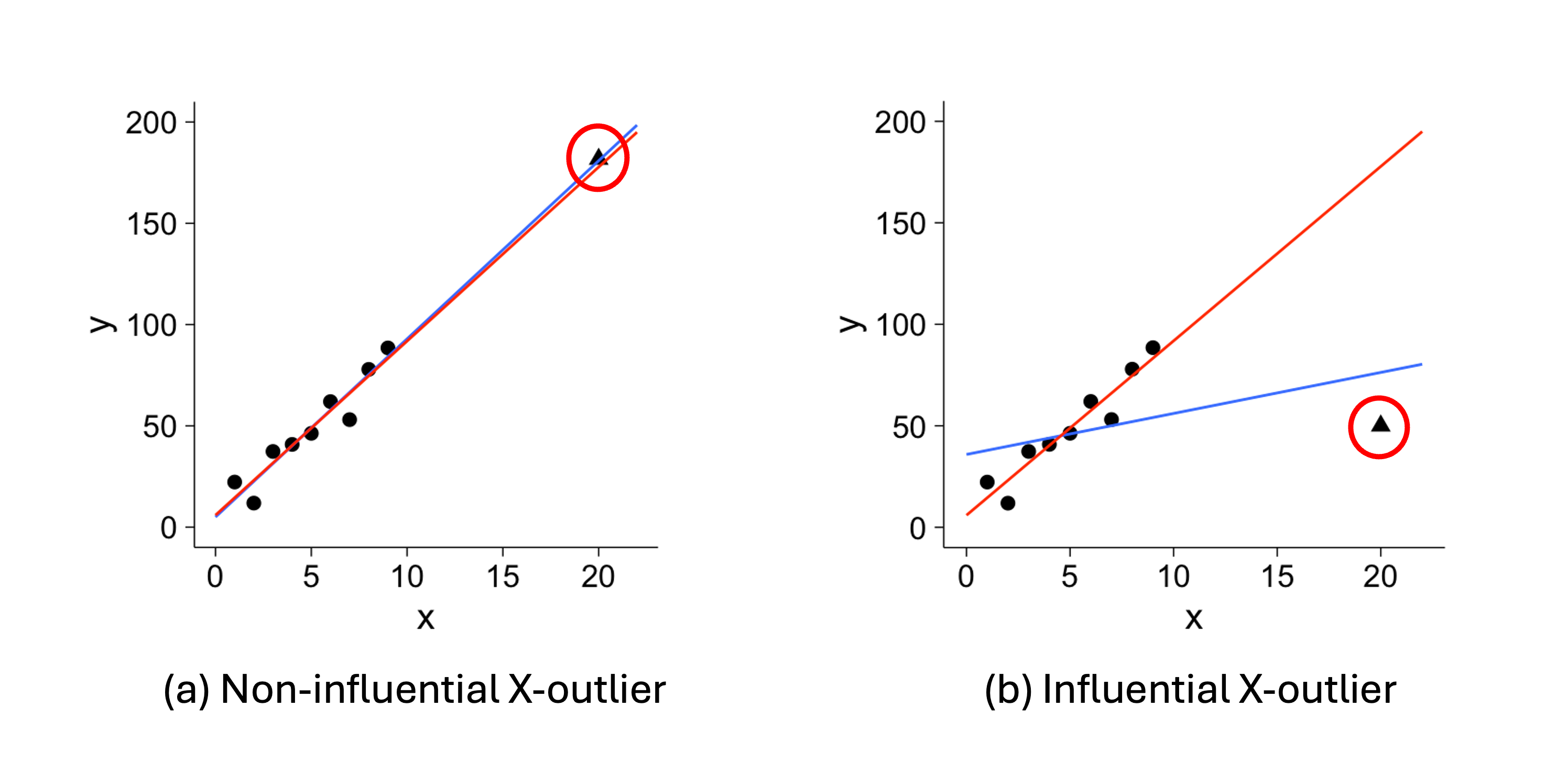
Fig. 13.6 X-outliers
In Fig. 13.5 and Fig. 13.6, the red trend lines summarize all data points, while the blue trend lines summarize the data with outliers removed. These graphs provide important takeaways:
It is problematic if few outliers have high leverage, as they distort the general trend.
Between the two types, \(X\)-outliers are generally more influential than \(Y\)-outliers, often “pulling” the best fit line toward them.
Not all outliers are influential, and not all influential points are outliers.
Example💡: Car Engine Performance 🚘
Automotive engineers collected data on eight four-cylinder vehicles that are considered to be among the most fuel-efficient in 2006. For each vehicle, they measured:
The total displacement of the engine, in cylinder volume (liters)
The power output of the engine, in horsepower (hp)
See the complete dataset below:
2006 Fuel-efficient vehicle data |
|||
|---|---|---|---|
Obs # |
Vehicle |
Cylinder Volume (L) |
Horsepower (hp) |
1 |
Honda Civic |
1.8 |
100 |
2 |
Toyota Prius |
1.5 |
96 |
3 |
VW Golf |
2.0 |
115 |
4 |
VW Beetle |
2.4 |
150 |
5 |
Toyota Corolla |
1.8 |
126 |
6 |
VW Jetta |
2.5 |
150 |
7 |
Mini Cooper |
1.6 |
118 |
8 |
Toyota Yaris |
1.5 |
106 |
Q1: Which variable should be explanatory and which should be response?
From an engineering perspective, the physical size of the engine largely determines its potential power output. Larger engines generally have the capacity to produce more power, though other factors like engine design and tuning also matter. Therefore, we use cylinder volume as the explanatory variable \(X\) and the power output as the response \(Y\).
Q2: Create a Scatter Plot
Save the data set in the
data.frameformat:
car_efficiency <- data.frame(
hp = c(100, 96, 115, 150, 126, 150, 118, 106),
cylinder_volume = c(1.8, 1.5, 2.0, 2.4, 1.8, 2.5, 1.6, 1.5)
)
Use
ggplotto make a scatter plot with a fitted line:
ggplot(car_efficiency, aes(x = cylinder_volume, y = hp)) +
geom_point() +
geom_smooth(method = "lm", se = FALSE, color = "black", size = 1) +
labs(
   title = "2006 Fuel Efficiency",
   x = "Cylinder Volume (L)",
   y = "Horsepower (hp)"
) +
theme_minimal()
The resulting plot is:
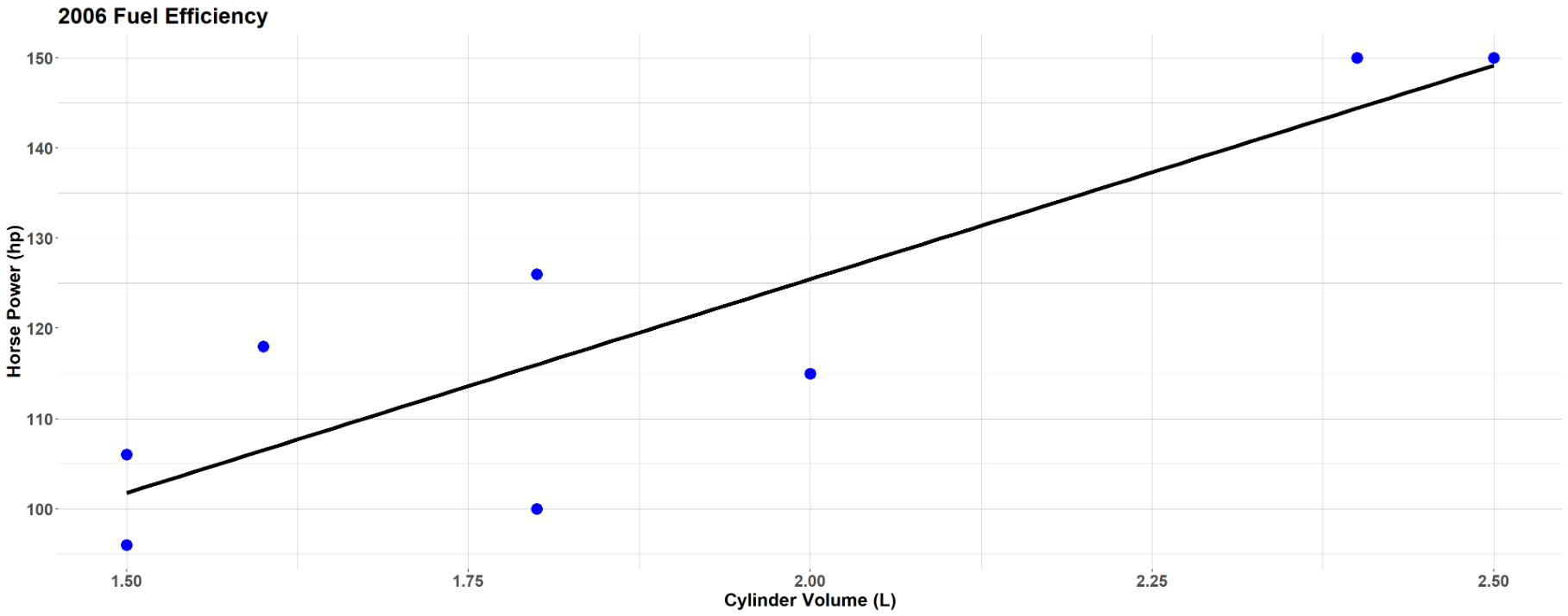
Fig. 13.7 Scatter plot of car engine performance data set
Q3: Identify the form of the relationship between the total displacement and the power output.
The points roughly follow a linear pattern. We don’t see curvature, clustering, or other non-linear patterns.
Q4: If the form is linear, state the direction and strength of the linear relationship. Are there any outliers? If there are, are the outliers influential?
The linear association is positive—as the cylinder volume increases, the power output tends to increase.
The strength is moderate—most points cluster reasonably close to the apparent trend line, though there is some scatter.
There are no obvious outliers or influential points. All data points fall within reasonable ranges in both directions and follow the general pattern.
13.1.4. Bringing It All Together
Key Takeaways 📝
The regression model \(Y = g(X) + \varepsilon\) decomposes observations into systematic relationships plus unexplained variation.
Most regression analyses can only establish association; causation requires well-designed experiments and advanced analysis methods.
Scatter plots are the primary tool for assessing form, direction, and strength of bivariate relationships.
There are two types of outliers in regression analysis. \(X\)-outliers lie far from most \(X\) values. \(Y\)-outliers lie far from the trend line of their association with \(X\).
Outliers and influential points require special attention because they can dramatically affect fitted models and conclusions. \(X\)-outliers are more prone to being influential than \(Y\)-outliers.
13.1.5. Exercises
Exercise 1: Identifying Variables in Regression
A mechanical engineer is studying the relationship between the rotational speed of a CNC lathe (in RPM) and the surface roughness of machined aluminum parts (in micrometers, μm). The engineer collects data by measuring surface roughness on parts that were machined at various speeds during normal production (an observational study).
Identify the explanatory variable and the response variable. Justify your choice.
Write the general regression model \(Y = g(X) + \varepsilon\) for this scenario, clearly defining each component.
Given that this is an observational study, why can’t we conclude that rotational speed causes changes in surface roughness from a regression analysis alone?
Solution
Part (a): Variable Identification
Explanatory variable: Rotational speed (RPM) — this is the variable we believe may influence the outcome
Response variable: Surface roughness (μm) — this is what the engineer measures as an outcome
The choice is based on engineering logic: we hypothesize that machine settings (speed) influence surface quality. Note that in this observational study, the engineer does not control or assign speeds—they simply record what speeds were used during normal production.
Part (b): Regression Model
\(Y = g(X) + \varepsilon\) where:
\(Y\) = Surface roughness (μm)
\(X\) = Rotational speed (RPM)
\(g(X)\) = The true functional relationship between speed and roughness
\(\varepsilon\) = Random error (unexplained variation in surface roughness)
Part (c): Causation
Because this is an observational study, regression can only establish association, not causation. To establish causation, we would need:
A controlled experiment with random assignment of speeds to parts
Control of confounding variables (e.g., cutting tool condition, material batch, operator)
Temporal precedence established
In observational data, confounding variables may simultaneously affect both speed choice and roughness outcome (e.g., experienced operators may choose different speeds AND achieve better surface finish).
Exercise 2: Scatter Plot Interpretation
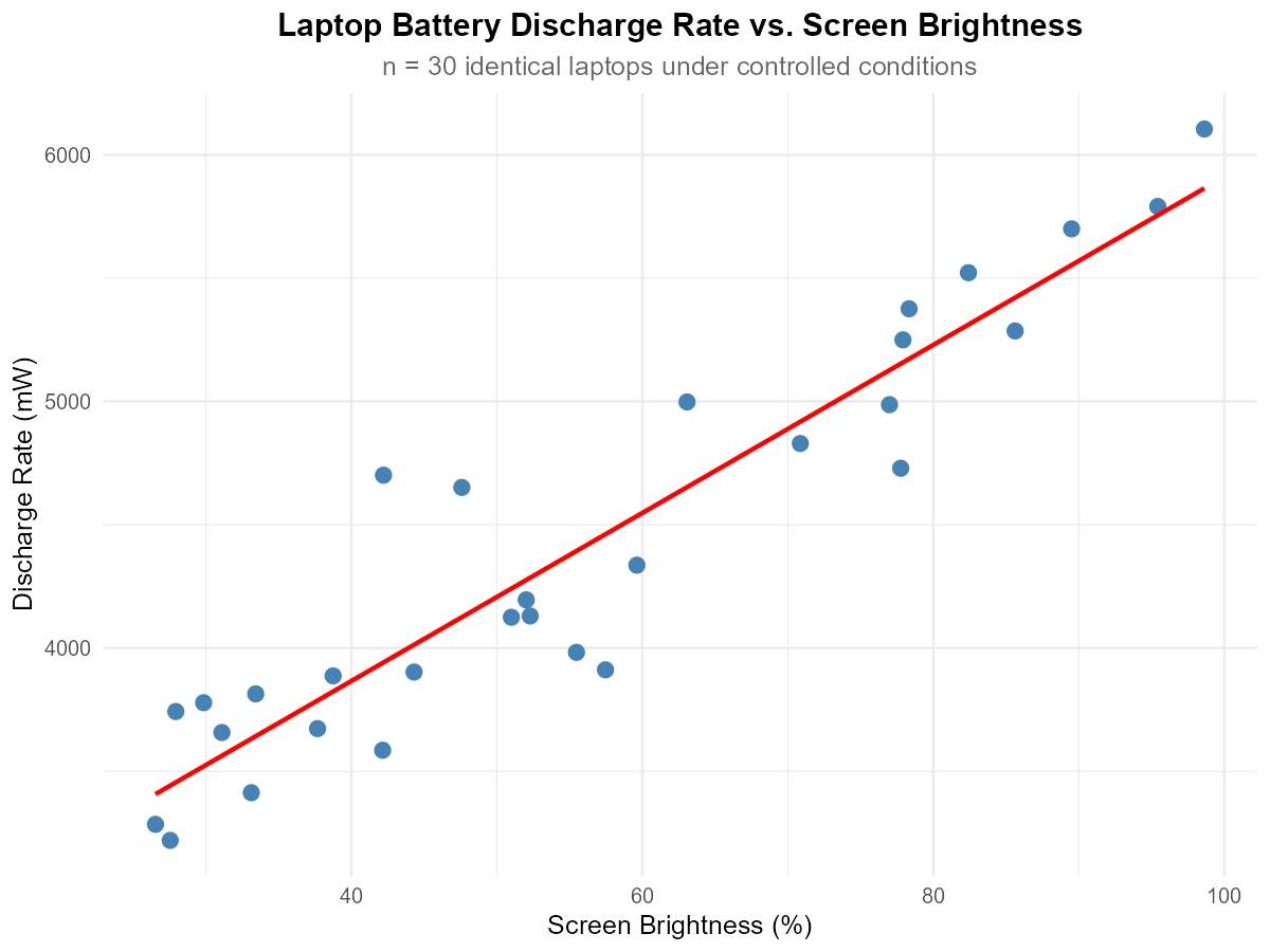
Fig. 13.8 Scatter plot of laptop battery discharge rate vs. screen brightness
A computer scientist conducted a controlled experiment to study laptop battery discharge rate (mW) versus screen brightness level (%). Using 30 identical laptops, the scientist randomly assigned each laptop to a specific brightness level and measured the resulting discharge rate under otherwise identical conditions.
Describe the form of the relationship (linear, curved, or no pattern).
Describe the direction of the association (positive, negative, or none).
Describe the strength of the association (strong, moderate, or weak).
Are there any potential outliers or influential points? If so, describe them.
Solution
Part (a): Form
Linear — the points follow an approximately straight-line pattern.
Part (b): Direction
Positive — as screen brightness increases, discharge rate increases.
Part (c): Strength
Strong — points cluster closely around the trend line with relatively little scatter.
Part (d): Outliers/Influential Points
No obvious outliers or influential points. All observations follow the general pattern consistently.
Exercise 3: Scatter Plot Patterns
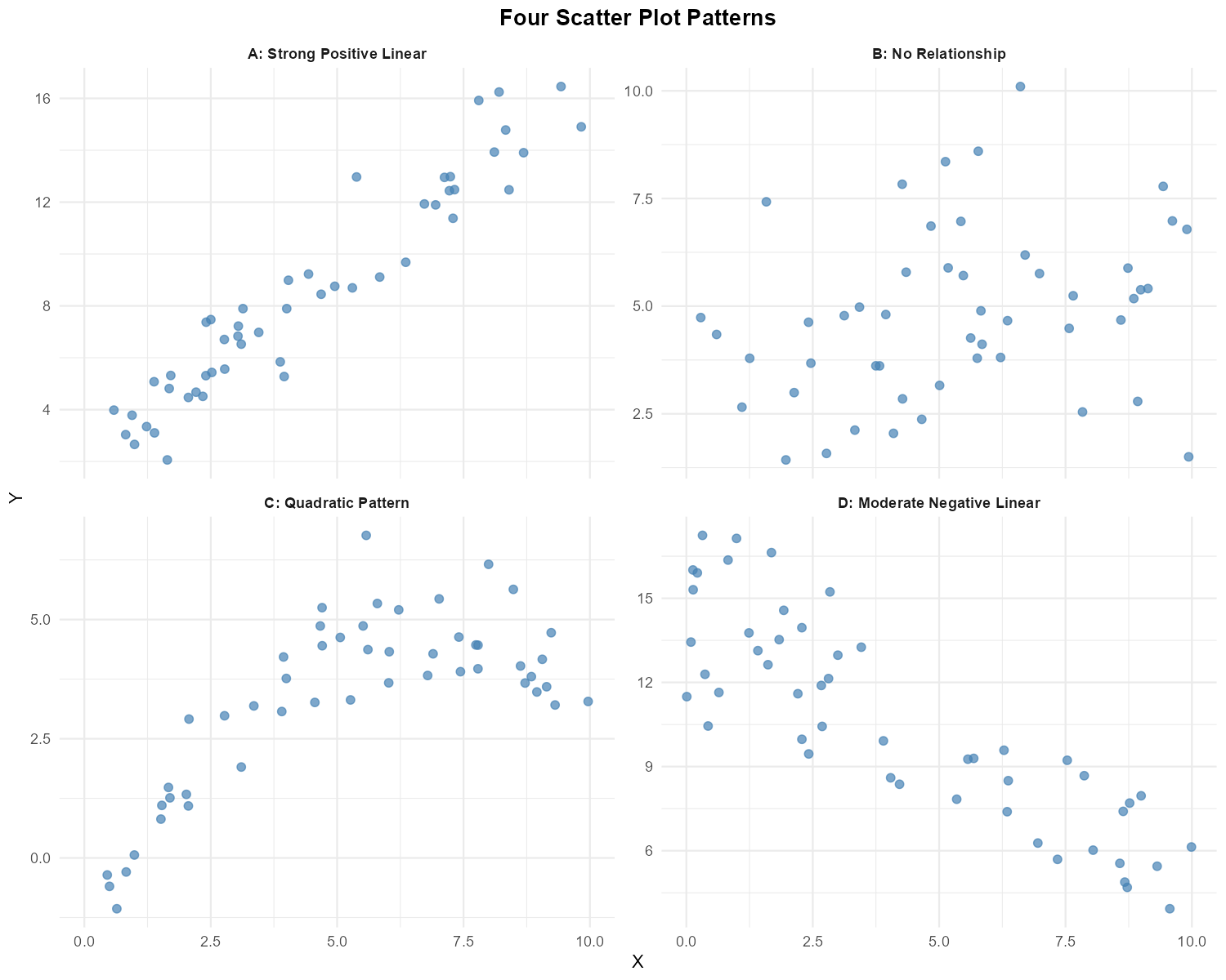
Fig. 13.9 Four scatter plots showing different patterns
For each of the four scatter plots above (labeled A, B, C, D), describe:
The form of the relationship (linear, curved, no pattern)
The direction (positive, negative, none)
The strength (strong, moderate, weak, none)
Whether simple linear regression would be appropriate for modeling the relationship
Solution
Plot |
Form |
Direction |
Strength |
SLR Appropriate? |
|---|---|---|---|---|
A |
Linear |
Positive |
Strong |
Yes |
B |
No pattern |
None |
None |
No — no relationship |
C |
Curved (quadratic) |
N/A |
N/A |
No — non-linear |
D |
Linear |
Negative |
Moderate |
Yes |
Exercise 4: Correlation Coefficient Interpretation
For each scenario below, determine whether the sample correlation coefficient \(r\) would likely be positive, negative, or close to zero:
CPU temperature (°C) and processor utilization (%)
Code review time (hours) and number of bugs found in deployment
Distance from router (meters) and WiFi download speed (Mbps)
Shoe size and programming ability among software engineers
Altitude (feet) and atmospheric pressure (psi)
Solution
Part (a): CPU temp vs. utilization
Positive — higher utilization generates more heat, increasing CPU temperature.
Part (b): Code review time vs. bugs
Negative — more thorough code reviews (longer time) catch more bugs before deployment, reducing bugs found later.
Part (c): Distance from router vs. download speed
Negative — download speed decreases as distance from the router increases due to signal attenuation.
Part (d): Shoe size vs. programming ability
Close to zero — there is no logical connection between shoe size and programming ability.
Part (e): Altitude vs. pressure
Negative — atmospheric pressure decreases at higher altitudes.
Exercise 5: Matching Correlations to Scatter Plots
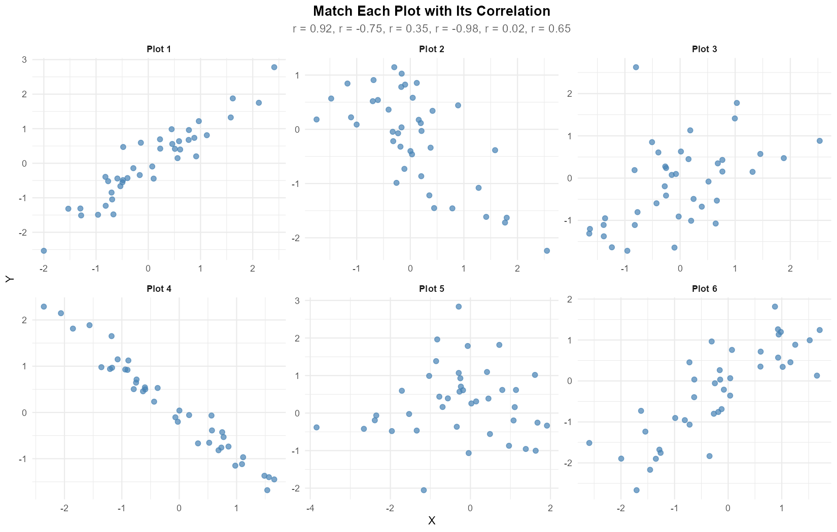
Fig. 13.10 Six scatter plots to match with correlations
The following correlation coefficients were calculated for six different datasets:
\(r = 0.92\), \(r = -0.75\), \(r = 0.35\), \(r = -0.98\), \(r = 0.02\), \(r = 0.65\)
Match each scatter plot (1-6) with its corresponding correlation coefficient. Briefly justify each match.
Solution
Matching (based on visual inspection of direction and scatter):
Plot 1: \(r = 0.92\) — strong positive linear relationship with tight clustering
Plot 2: \(r = -0.75\) — negative relationship with moderate spread
Plot 3: \(r = 0.35\) — weak positive relationship with large scatter
Plot 4: \(r = -0.98\) — nearly perfect negative linear relationship
Plot 5: \(r = 0.02\) — essentially no linear relationship (random scatter)
Plot 6: \(r = 0.65\) — moderate positive relationship
Justification:
The sign of \(r\) indicates direction (positive = upward trend, negative = downward trend)
The magnitude \(|r|\) indicates strength (closer to 1 = tighter clustering around the line)
Exercise 6: Outliers and Influential Points
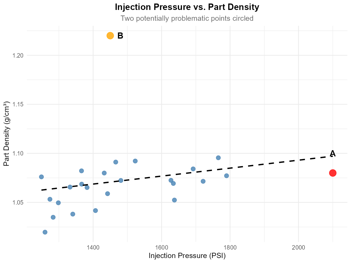
Fig. 13.11 Scatter plot with potential outliers marked
A quality engineer is analyzing the relationship between injection pressure (PSI) and part density (g/cm³) for plastic components. The scatter plot shows the data with two potentially problematic points labeled A and B.
Point A has coordinates (2100, 1.08). Is this an X-outlier, Y-outlier, both, or neither? Explain.
Point B has coordinates (1450, 1.22). Is this an X-outlier, Y-outlier, both, or neither? Explain.
Which point (A or B) is likely to be more influential on the fitted regression line? Justify your answer.
What would you recommend the engineer do before fitting a regression model?
Solution
Part (a): Point A (2100, 1.08)
X-outlier — the X-value (2100 PSI) is far from other X values (mostly 1200-1800). The Y-value appears consistent with what the trend would predict at that X, so it’s not a Y-outlier.
Part (b): Point B (1450, 1.22)
Y-outlier — the X-value is typical (within the normal range), but the Y-value (1.22) is much higher than what the trend line would predict for that X value.
Part (c): Which is more influential?
Point A is more influential. X-outliers have high leverage because they can “pull” the regression line toward them. Point A, being isolated in the X-direction, has more power to change the slope and intercept of the fitted line than Point B, which only affects the fit locally.
Part (d): Recommendations
Investigate the data collection for both points (measurement error? Different conditions?)
Fit the regression with and without each point to assess impact on slope and R²
Check if outliers represent legitimate data or errors
Consider robust regression methods if outliers are legitimate but influential
Exercise 7: Computing Sample Correlation
A biomedical engineer is studying the relationship between ultrasound frequency (MHz) and tissue penetration depth (cm) for a new imaging device. The following data were collected:
Frequency (X) |
Depth (Y) |
|---|---|
2.0 |
15.2 |
3.5 |
10.8 |
5.0 |
7.5 |
7.5 |
4.9 |
10.0 |
3.2 |
Given the following summary statistics:
\(\bar{x} = 5.6\), \(\bar{y} = 8.32\)
\(S_{XX} = \sum_{i=1}^{5}(x_i - \bar{x})^2 = 40.7\)
\(S_{YY} = \sum_{i=1}^{5}(y_i - \bar{y})^2 = 92.068\)
\(S_{XY} = \sum_{i=1}^{5}(x_i - \bar{x})(y_i - \bar{y}) = -58.51\)
Calculate the sample correlation coefficient \(r\).
Interpret the value of \(r\) in context (direction and strength).
Based on your calculated \(r\), is simple linear regression appropriate for this data? Explain.
Solution
Part (a): Calculate r
Part (b): Interpretation
There is a very strong negative linear relationship between ultrasound frequency and tissue penetration depth. As frequency increases, penetration depth decreases substantially.
The strength is “very strong” because \(|r| = 0.956 > 0.8\).
Part (c): Appropriateness of SLR
Yes, simple linear regression is appropriate. The correlation magnitude (\(|r| = 0.956\)) indicates a very strong linear relationship, suggesting that a linear model will fit the data well.
R verification:
x <- c(2.0, 3.5, 5.0, 7.5, 10.0)
y <- c(15.2, 10.8, 7.5, 4.9, 3.2)
cor(x, y)  # -0.9558
Exercise 8: Correlation Limitations
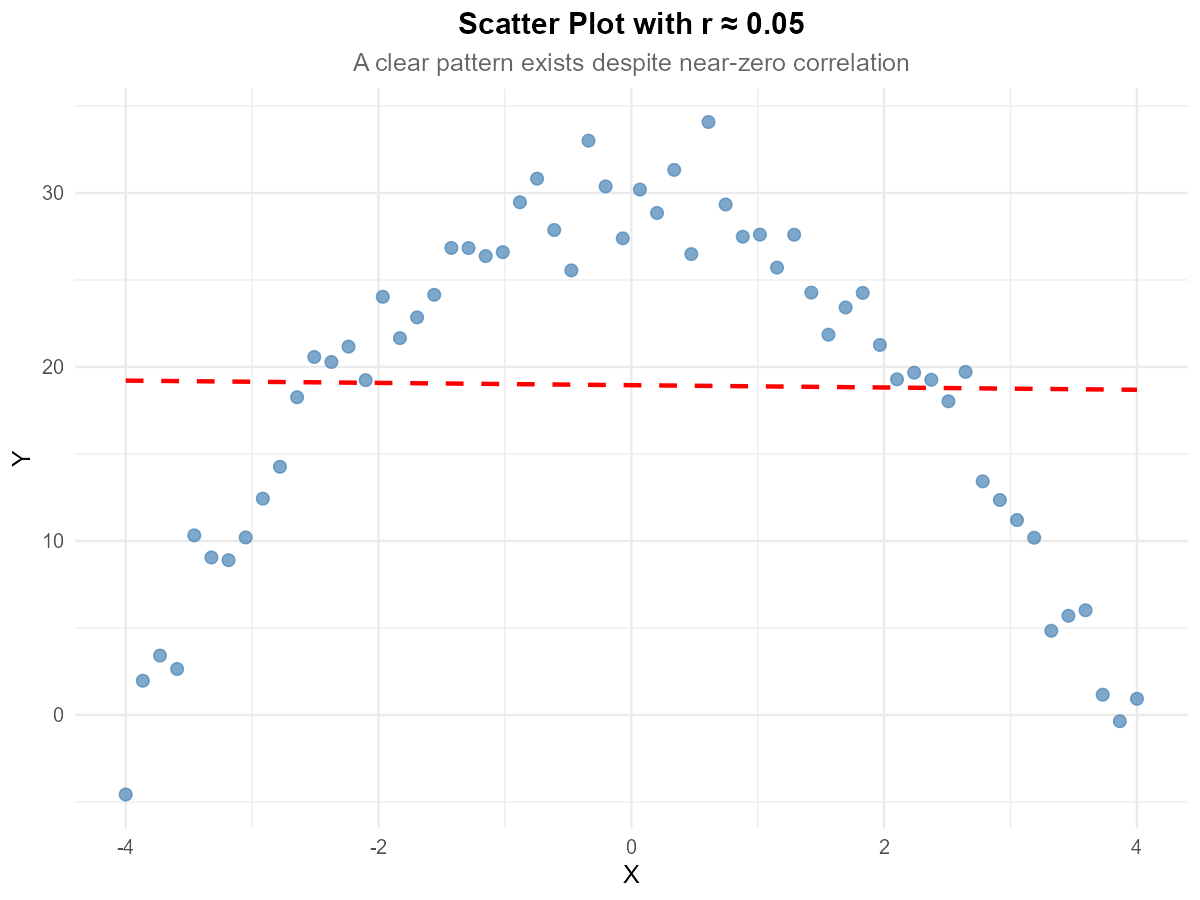
Fig. 13.12 Scatter plot with quadratic pattern
A dataset has sample correlation \(r = 0.05\). The scatter plot of the data is shown above.
Does the near-zero correlation mean there is no relationship between X and Y? Explain.
What type of relationship appears to exist between X and Y?
Why does the correlation coefficient fail to capture this relationship?
What type of transformation or alternative analysis would you recommend?
Solution
Part (a): Does r ≈ 0 mean no relationship?
No. A near-zero correlation only means there is no linear relationship. There can still be a strong non-linear relationship, as evident in the scatter plot.
Part (b): Type of relationship
The scatter plot shows a quadratic (parabolic) relationship — Y increases with X, reaches a maximum, then decreases. This is an inverted U-shape.
Part (c): Why correlation fails
Correlation measures the strength of linear association only. For this symmetric curved pattern:
Points on the left show a positive trend
Points on the right show a negative trend
These cancel out, producing \(r \approx 0\)
The correlation coefficient is simply not designed to detect non-linear patterns.
Part (d): Recommendations
Fit a quadratic model: \(Y = \beta_0 + \beta_1 X + \beta_2 X^2 + \varepsilon\) (polynomial regression)
Transform variables appropriately (e.g., \(X^2\) as a predictor)
Consider piecewise regression
Note: Polynomial regression is covered in later courses, but recognizing when it’s needed is important
Exercise 9: Conceptual Understanding
Consider the following statements about correlation and regression. For each, indicate whether it is TRUE or FALSE and provide a brief justification.
If \(r = 1\), then all data points lie exactly on a line with positive slope.
A correlation of \(r = -0.8\) indicates a weaker relationship than \(r = 0.6\).
The correlation coefficient is affected by the units of measurement.
If two variables have correlation \(r = 0.9\), then changes in X cause changes in Y.
Swapping which variable is X and which is Y changes the value of \(r\).
A single outlier can dramatically change the correlation coefficient.
Solution
Part (a): r = 1 means all points on a line with positive slope
TRUE. When \(r = 1\), there is a perfect positive linear relationship, meaning all points lie exactly on a line with positive slope.
Part (b): r = −0.8 is weaker than r = 0.6
FALSE. Strength is measured by \(|r|\). Since \(|-0.8| = 0.8 > 0.6 = |0.6|\), the correlation \(r = -0.8\) indicates a stronger relationship than \(r = 0.6\).
Part (c): Correlation depends on units
FALSE. Correlation is unitless—changing units (e.g., meters to feet, or Celsius to Fahrenheit) does not change \(r\) because it’s based on standardized values.
Part (d): r = 0.9 implies causation
FALSE. Correlation measures association, not causation. Strong correlation does not imply that X causes Y. There may be confounding variables, reverse causation, or coincidental association.
Part (e): Swapping X and Y changes r
FALSE. Correlation is symmetric: \(r(X,Y) = r(Y,X)\). The formula is symmetric in X and Y.
Part (f): A single outlier can dramatically change r
TRUE. A single outlier, especially an X-outlier with high leverage, can dramatically increase or decrease the correlation coefficient. This is why checking for outliers before computing correlation is important.
13.1.6. Additional Practice Problems
True/False Questions (1 point each)
If \(r = 0\), the two variables must be independent.
Ⓣ or Ⓕ
Adding a constant to every value of \(Y\) does not change the correlation coefficient \(r\).
Ⓣ or Ⓕ
If \(r = -0.95\), the linear relationship between \(X\) and \(Y\) is weaker than when \(r = 0.80\).
Ⓣ or Ⓕ
The correlation between height measured in inches and height measured in centimeters is \(r = 1\).
Ⓣ or Ⓕ
A scatter plot that shows a clear U-shaped pattern can still have a correlation coefficient near \(r = 0\).
Ⓣ or Ⓕ
If two variables have a strong positive correlation, then increasing \(X\) will cause \(Y\) to increase.
Ⓣ or Ⓕ
Multiple Choice Questions (2 points each)
An aerospace engineer collects data on wing surface area (\(X\)) and drag force (\(Y\)) for 20 test configurations. The scatter plot reveals a clear upward linear trend, but one data point has an \(X\)-value far from the rest of the data. Which of the following best describes the concern about this point?
Ⓐ It is a \(Y\)-outlier because its \(Y\)-value is far from the mean of \(Y\)
Ⓑ It is an \(X\)-outlier with potentially high leverage, meaning it could disproportionately influence the slope of the fitted line
Ⓒ It must be removed from the data set before any analysis is performed
Ⓓ It will not affect the correlation coefficient because \(r\) is resistant to outliers
Given \(S_{XX} = 200\), \(S_{YY} = 800\), and \(S_{XY} = -300\), the sample correlation \(r\) is:
Ⓐ \(-1.50\)
Ⓑ \(-0.75\)
Ⓒ \(0.75\)
Ⓓ \(-0.375\)
Which of the following would make a scatter plot an inappropriate tool for assessing the relationship between two variables?
Ⓐ The relationship appears non-linear
Ⓑ Both variables are quantitative
Ⓒ One of the variables is categorical with five categories
Ⓓ The data set contains 500 observations
A researcher finds a strong positive correlation (\(r = 0.88\)) between the number of fire trucks dispatched and the dollar amount of property damage at fire scenes. Which conclusion is most appropriate?
Ⓐ Sending more fire trucks causes more damage
Ⓑ Reducing the number of trucks dispatched would lower damage costs
Ⓒ A lurking variable (fire severity) likely drives both quantities
Ⓓ The correlation must be incorrect because the relationship makes no sense
If every \(Y\) value in a data set is multiplied by \(-2\), which of the following is true about the new correlation \(r_{new}\) compared to the original \(r\)?
Ⓐ \(r_{new} = r\)
Ⓑ \(r_{new} = -r\)
Ⓒ \(r_{new} = 2r\)
Ⓓ \(r_{new} = -2r\)
A materials engineer collects data on annealing temperature (\(X\)) and tensile strength (\(Y\)) for 15 steel specimens. The scatter plot shows a strong linear trend. Which of the following is true about the roles of \(X\) and \(Y\) in computing \(r\)?
Ⓐ \(X\) must be the explanatory variable and \(Y\) the response variable for \(r\) to be valid
Ⓑ Switching which variable is \(X\) and which is \(Y\) would change the sign of \(r\)
Ⓒ Switching which variable is \(X\) and which is \(Y\) does not change \(r\)
Ⓓ \(r\) is only valid when there is a clear causal relationship between the variables
Answers to Practice Problems
True/False Answers:
False — Zero correlation means no linear relationship. The variables could have a strong non-linear relationship (e.g., quadratic) and still be dependent.
True — Adding a constant shifts all values equally and doesn’t change the deviations from the mean, so \(r\) is unaffected.
False — The strength of a linear relationship is measured by \(|r|\). Since \(|-0.95| = 0.95 > 0.80\), the relationship when \(r = -0.95\) is actually stronger.
True — Height in centimeters is a perfect positive linear function of height in inches (cm = 2.54 × inches), so \(r = 1\).
True — Correlation measures linear association only. A symmetric U-shape has equal positive and negative linear components that cancel out, yielding \(r \approx 0\).
False — Correlation measures association, not causation. A strong positive \(r\) means that \(X\) and \(Y\) tend to increase together, but this does not establish that changes in \(X\) cause changes in \(Y\). Confounding variables or reverse causation may be at play.
Multiple Choice Answers:
Ⓑ — An \(X\)-outlier is a point whose \(X\)-value is far from the other \(X\)-values. Such points have high leverage because they can “pull” the fitted line toward them, disproportionately influencing the slope. Option Ⓐ confuses \(X\)- and \(Y\)-outliers. Option Ⓒ is too extreme — outliers should be investigated, not automatically removed. Option Ⓓ is false because \(r\) is not resistant to outliers.
Ⓑ — \(r = \frac{S_{XY}}{\sqrt{S_{XX} \cdot S_{YY}}} = \frac{-300}{\sqrt{200 \times 800}} = \frac{-300}{400} = -0.75\).
Ⓒ — Scatter plots require both variables to be quantitative. If one variable is categorical, side-by-side boxplots or grouped summaries are more appropriate.
Ⓒ — Correlation does not imply causation. The severity of the fire is a lurking variable that drives both the number of trucks dispatched and the amount of damage.
Ⓑ — Multiplying all \(Y\) values by a negative constant reverses the sign of \(r\), but the magnitude is unchanged because correlation is unitless and scale-invariant. \(r_{new} = -r\).
Ⓒ — The formula for \(r\) is symmetric in \(X\) and \(Y\) (i.e., \(S_{XY}\) appears in the numerator with \(\sqrt{S_{XX} \cdot S_{YY}}\) in the denominator). Swapping variables does not change \(r\).